




The handwritten notes on Class 11 Applied Mathematics Chapter 10 Descriptive Statistics have been carefully prepared for quick revision, according to the latest 2026-27 CBSE syllabus. The PDF covers data types, graph selection, averages, measures of spread, skewness, kurtosis, percentile rank and correlation in short revision pages.
- Best for quick revision: definitions, formulas, graphs and interpretation cues stay in one PDF.
- Aligned to 2026-27: follows the current Class 11 Applied Mathematics descriptive statistics scope.
- Exam ready: mean, median, mode, standard deviation and correlation are revised through compact examples.
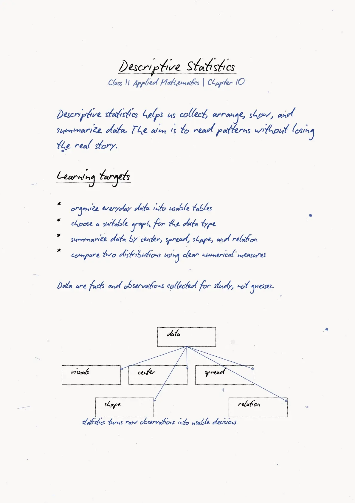
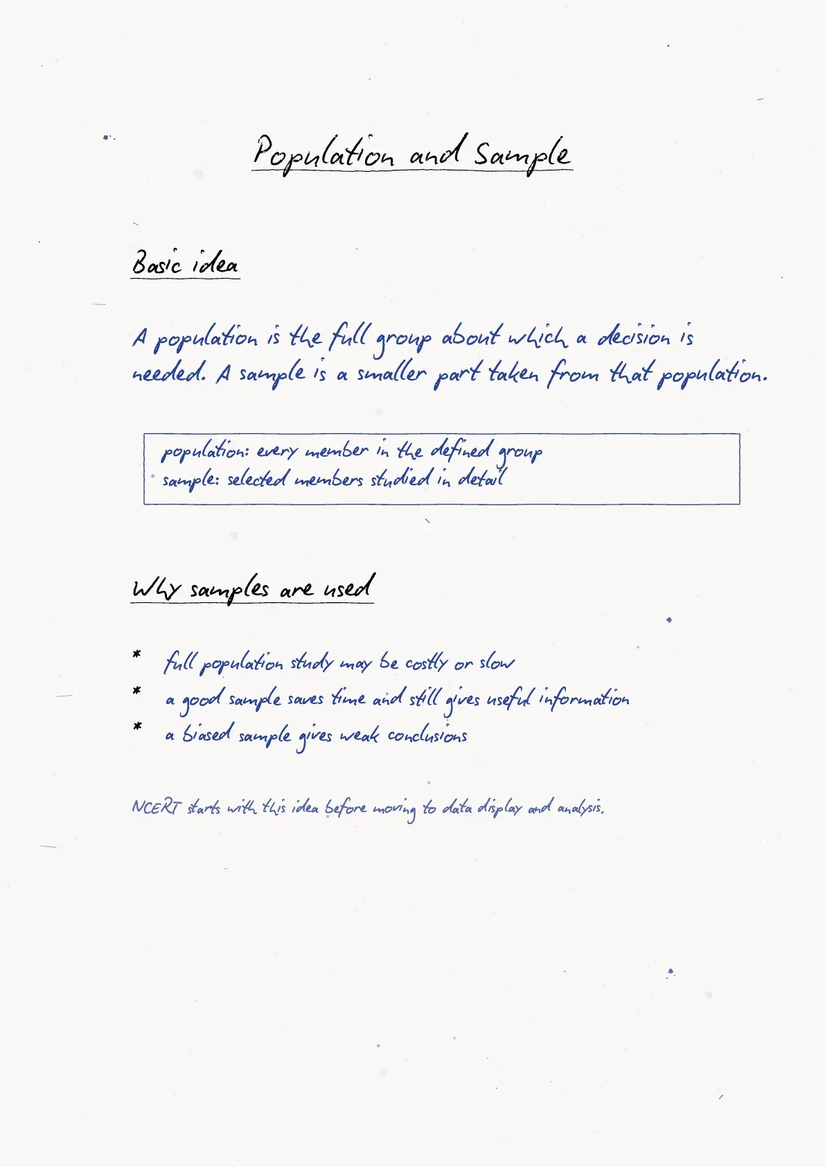
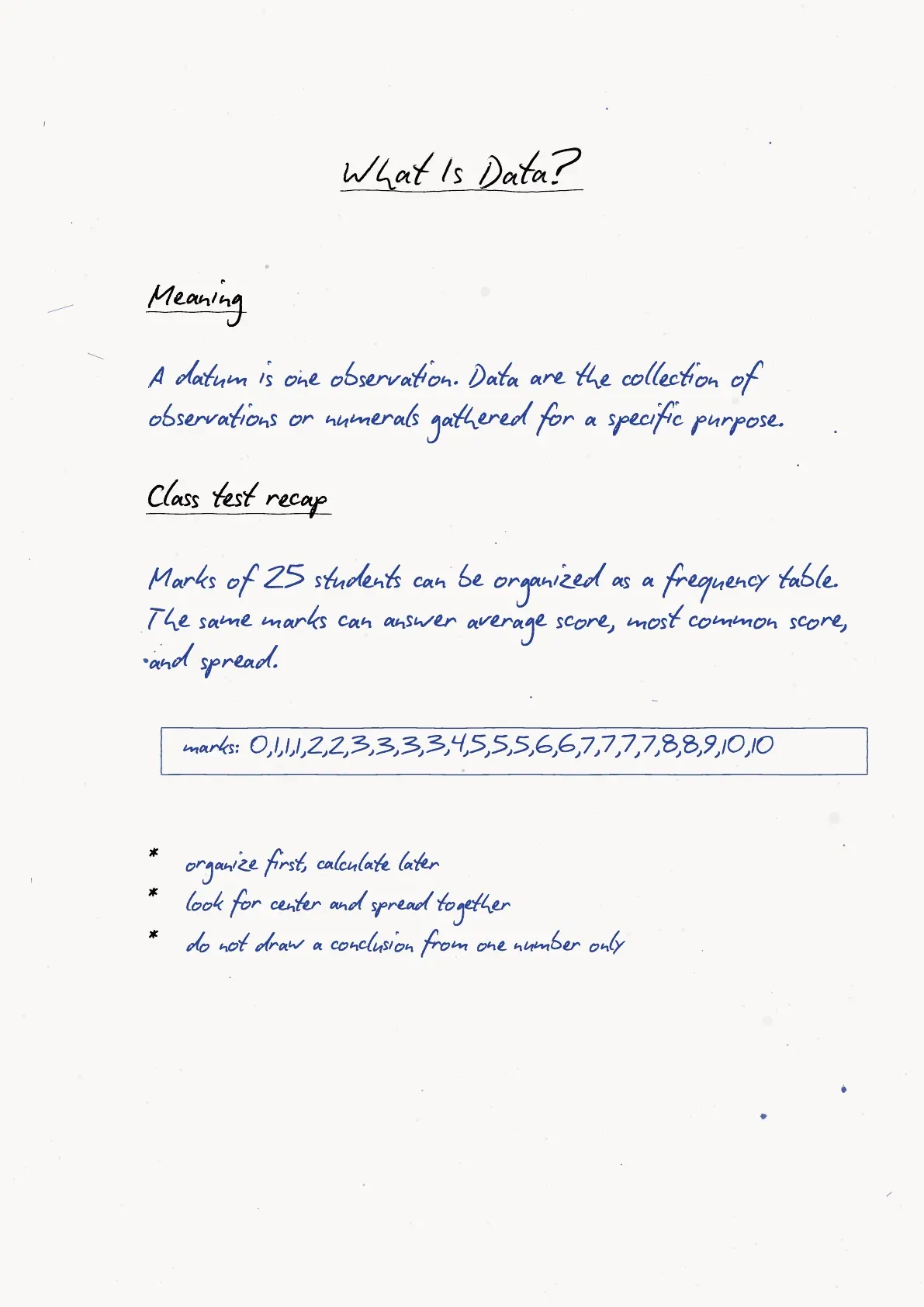
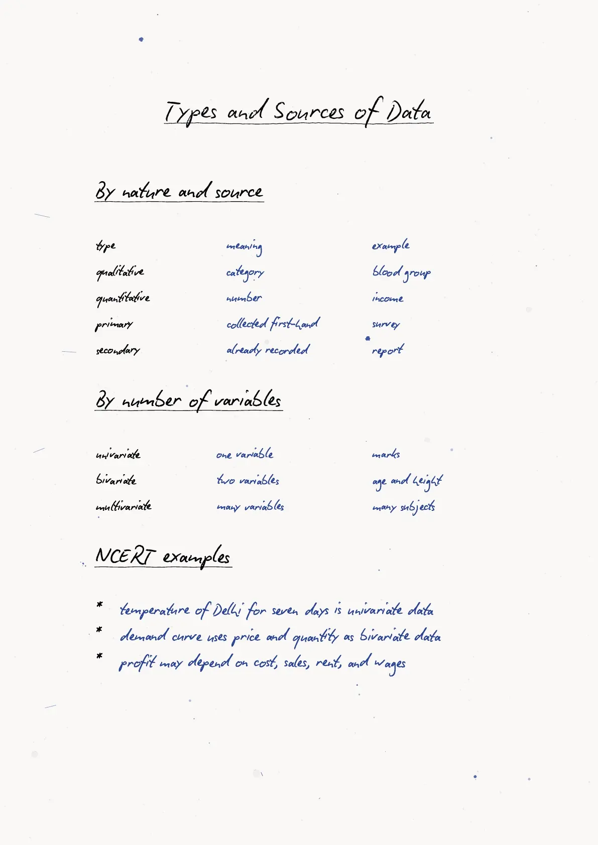
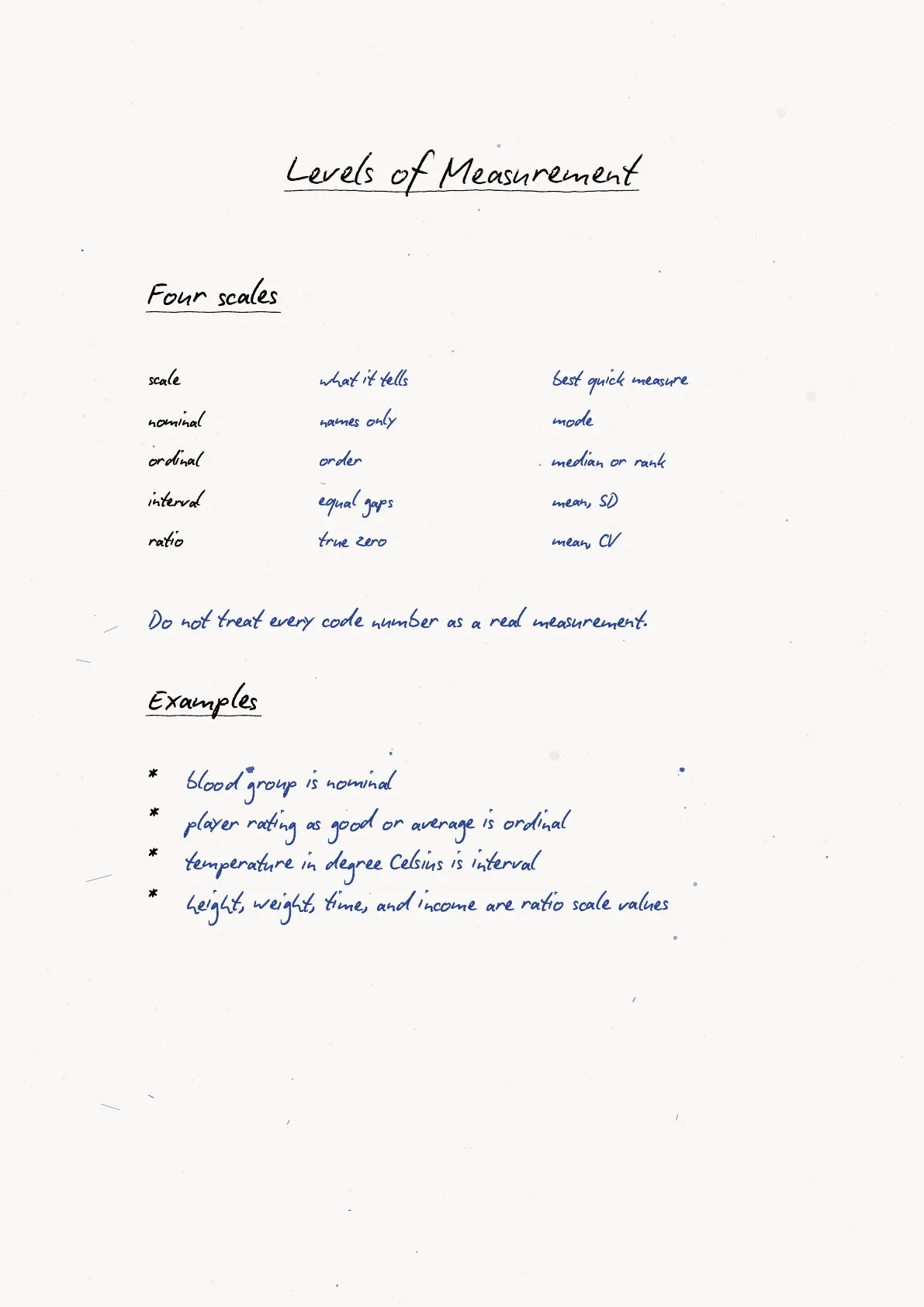
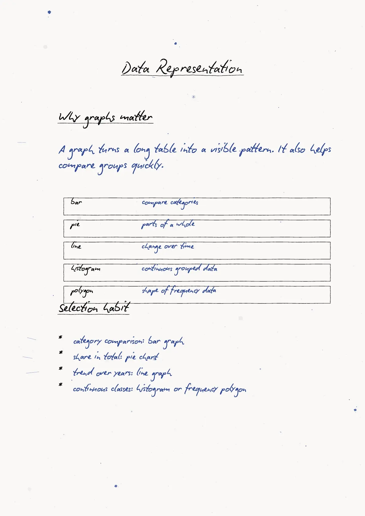
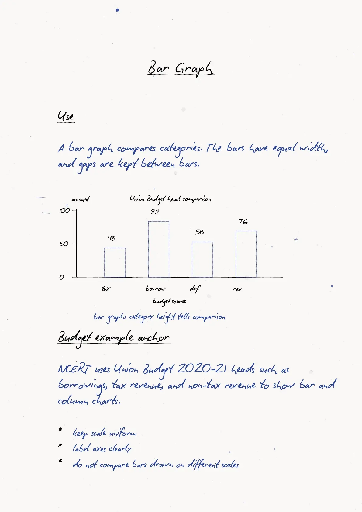
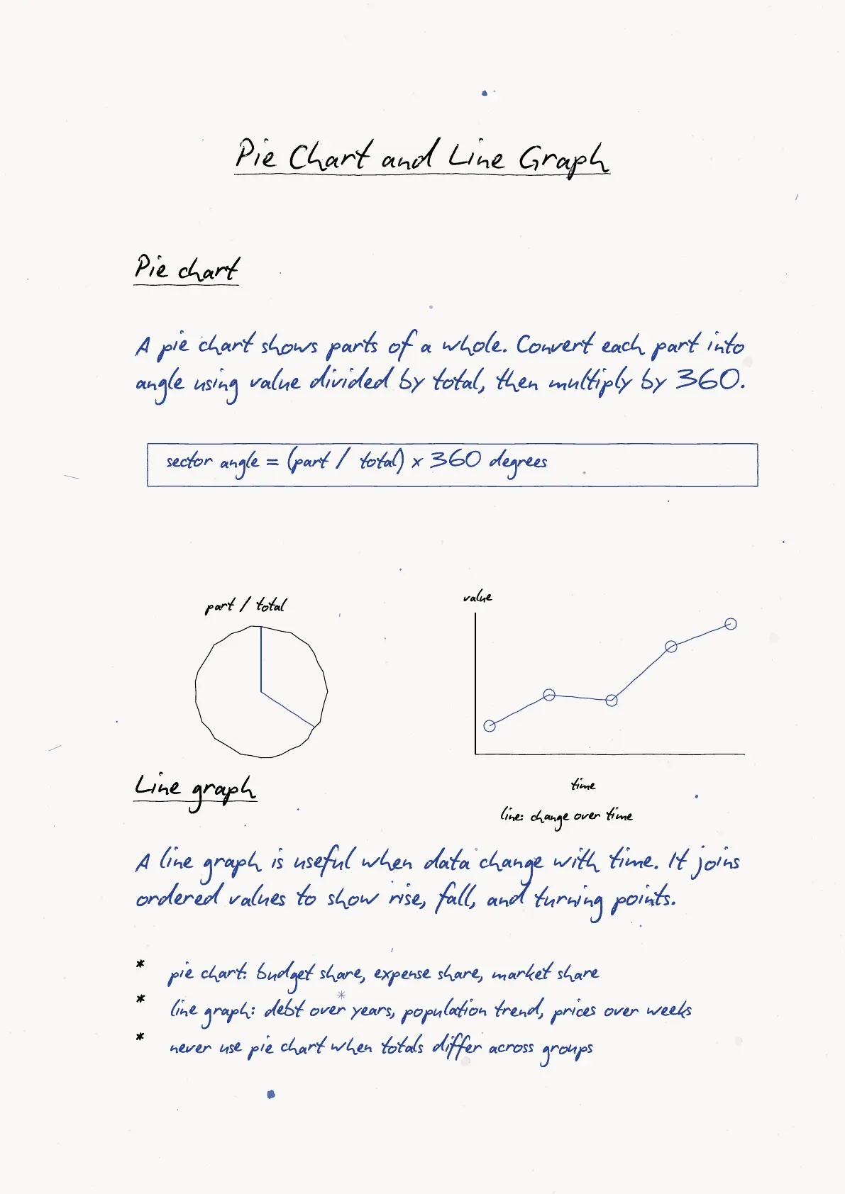
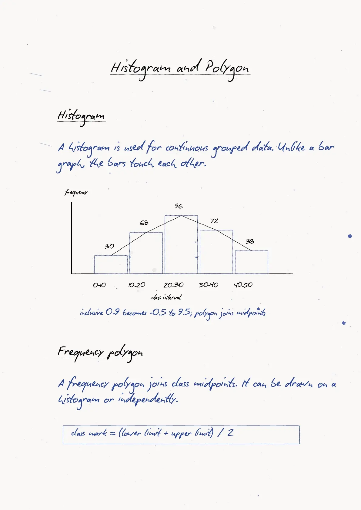
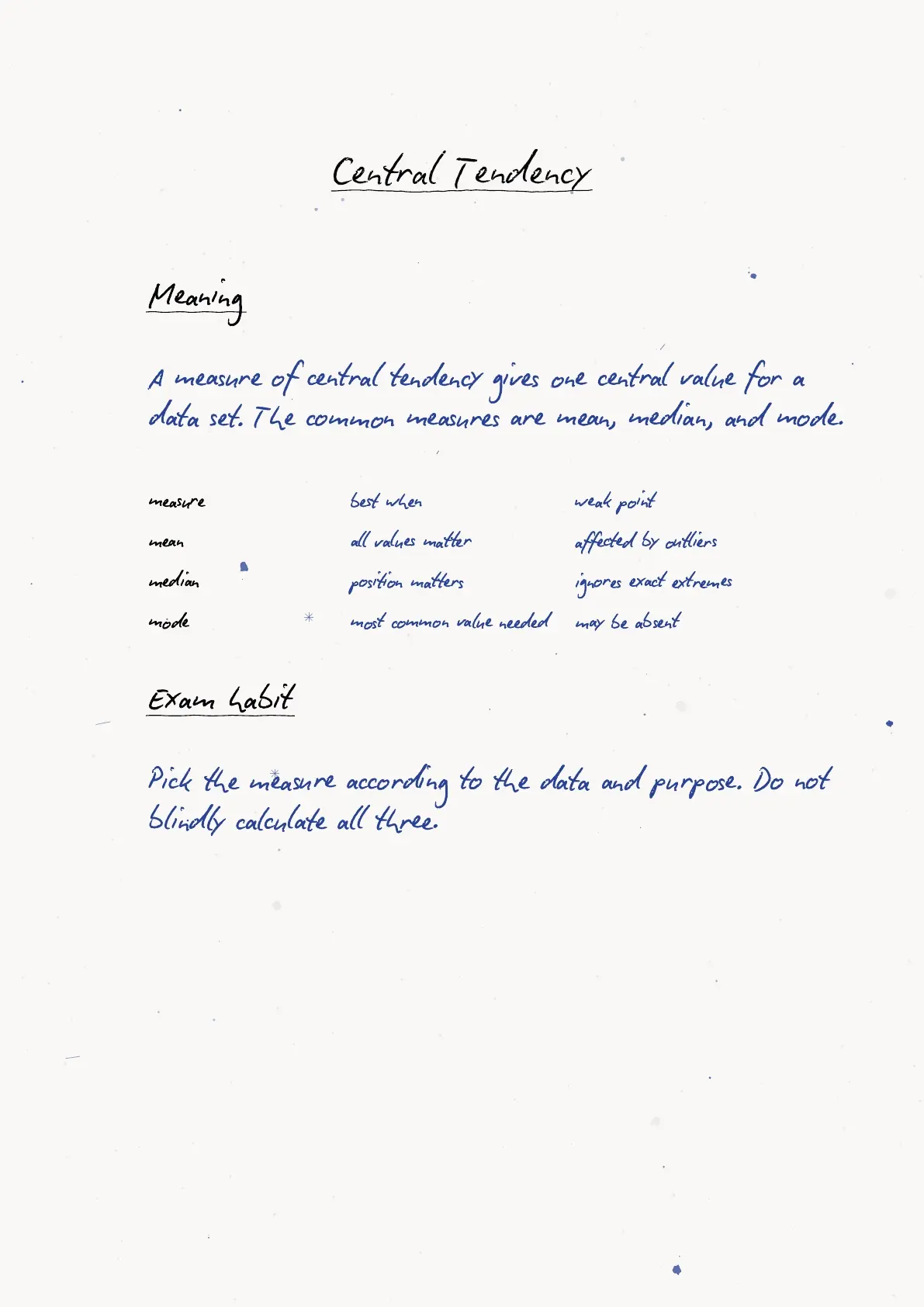
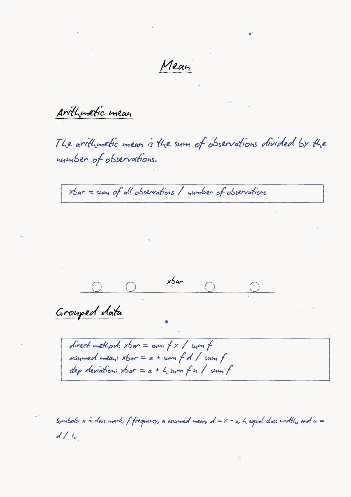
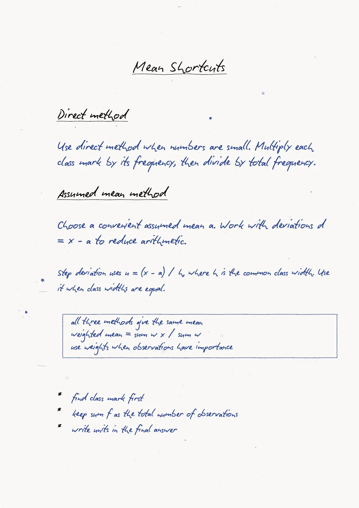
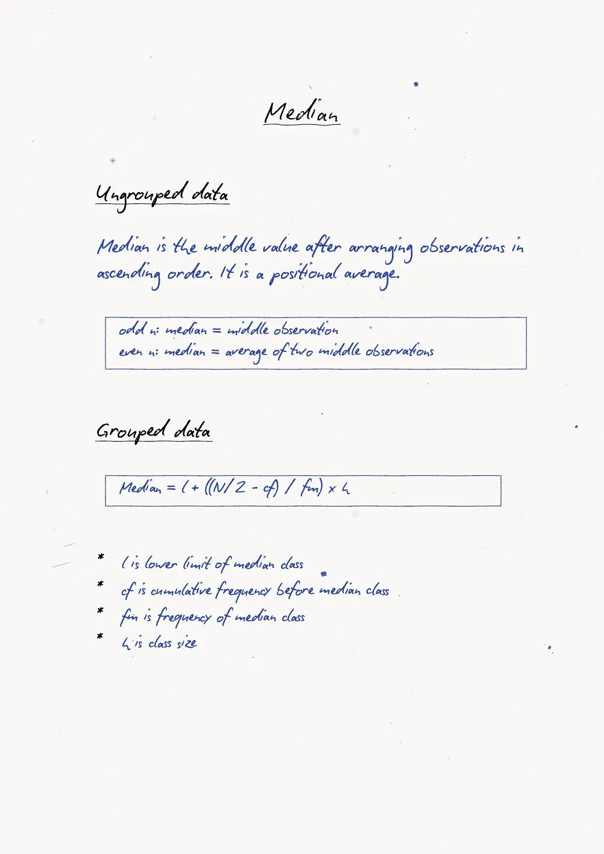
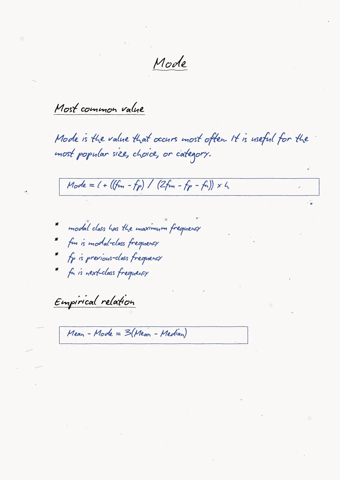
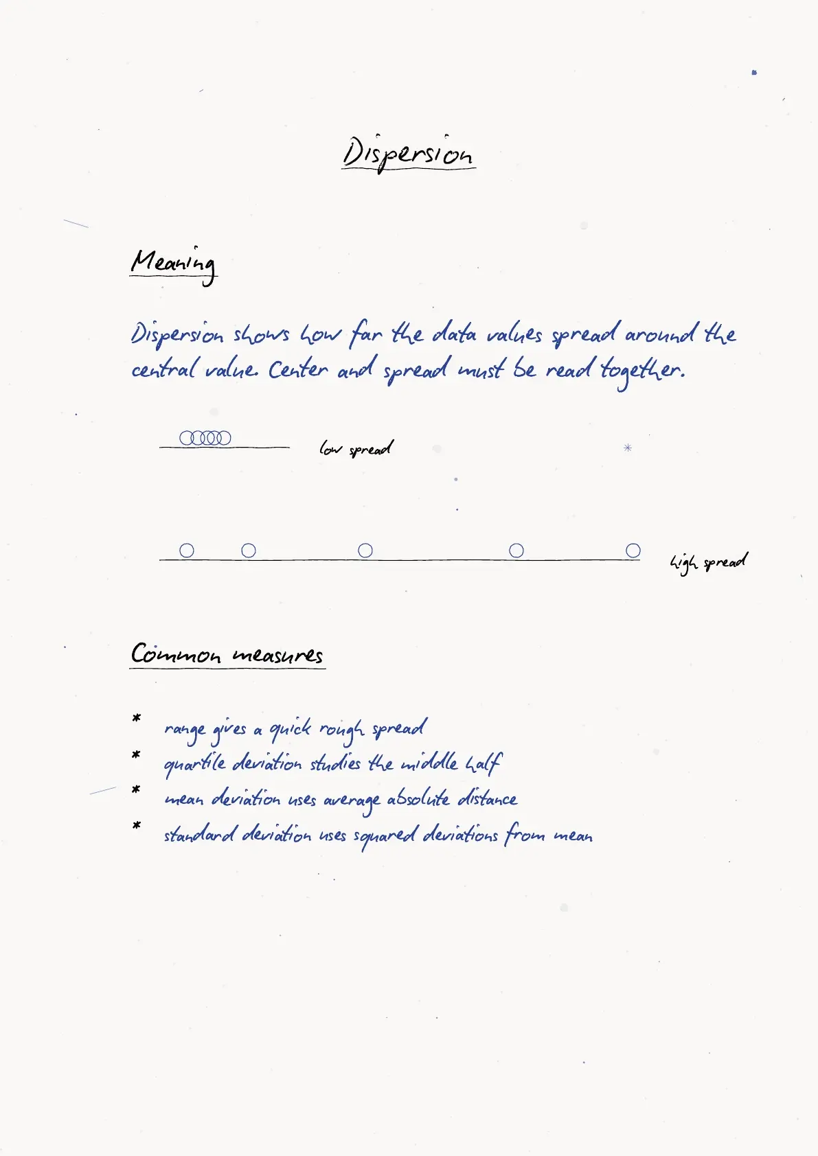
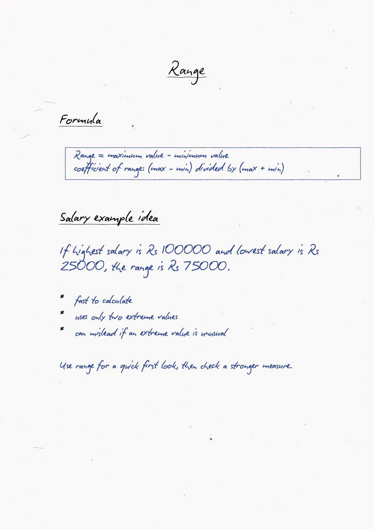
Each Class 11 Applied Mathematics Descriptive Statistics handwritten notes PDF is checked against the 2026-27 NCERT chapter for formulas, examples and revision flow.
Student Feedback: In a Collegedunia poll of 12,180 students conducted before the 2026 boards, most students said Descriptive Statistics became easier after separating graph choice, average choice and spread choice into three revision steps.
Descriptive Statistics Handwritten Notes PDF Contents
Descriptive Statistics starts with raw data and turns it into readable summaries. These notes keep the flow simple: identify the data scale, choose a graph, calculate a centre value, compare spread and then interpret association.
| Block | What students revise | Quick check |
|---|---|---|
| Data and scales | Primary, secondary, nominal, ordinal, interval and ratio data | Name the scale before calculation |
| Graphs | Bar chart, pie chart, line graph, histogram and frequency polygon | Match graph to data type |
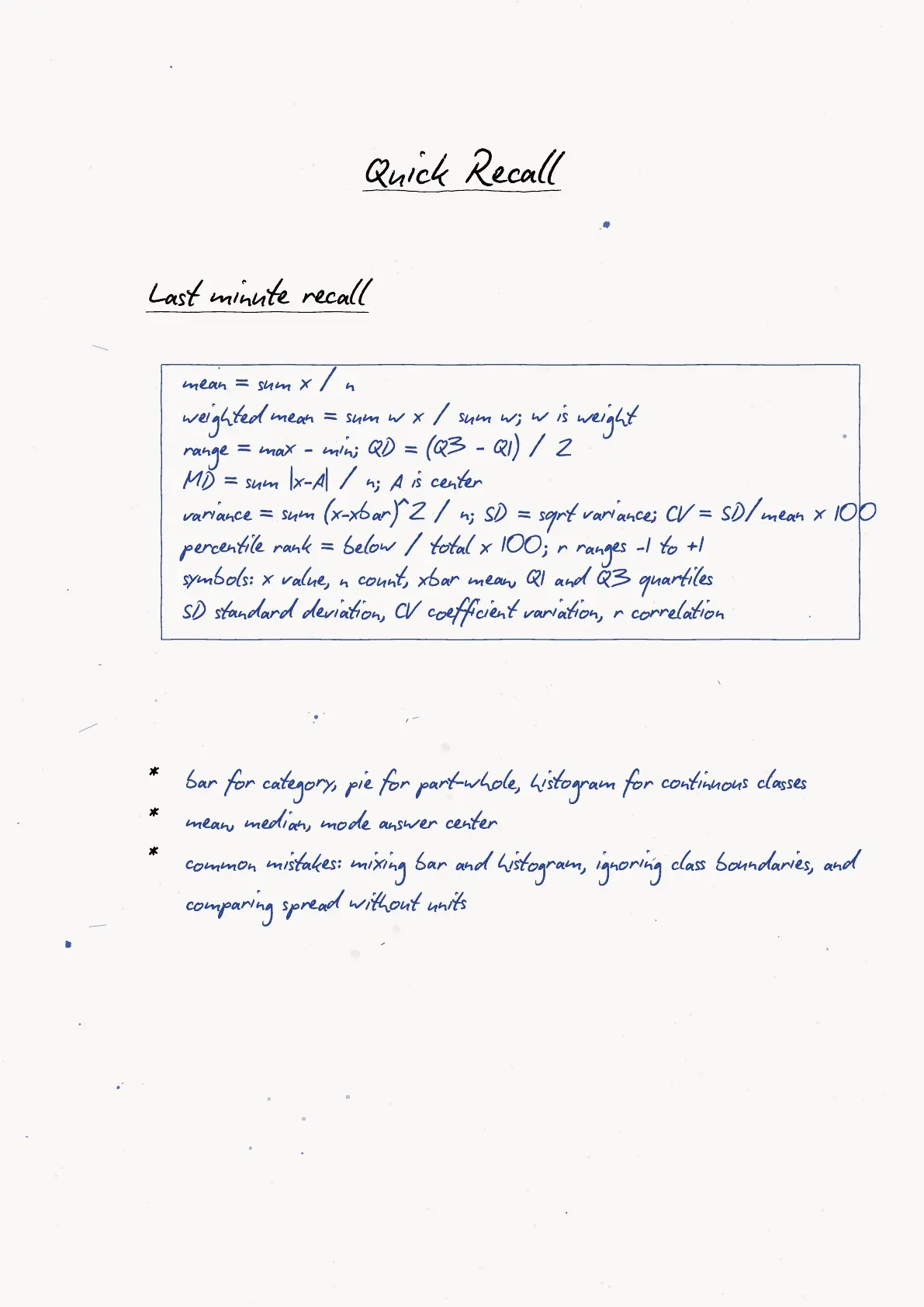
| Central tendency | Mean, median and mode | Use median when extremes pull the mean |
| Dispersion and relation | Range, quartile deviation, mean deviation, variance, standard deviation and correlation | Compare spread before comparing groups |
Descriptive Statistics Graphs and Data Types
A data set becomes useful only after the type of data is clear. Qualitative data is described through categories, while quantitative data uses numbers that can be counted, measured and compared.
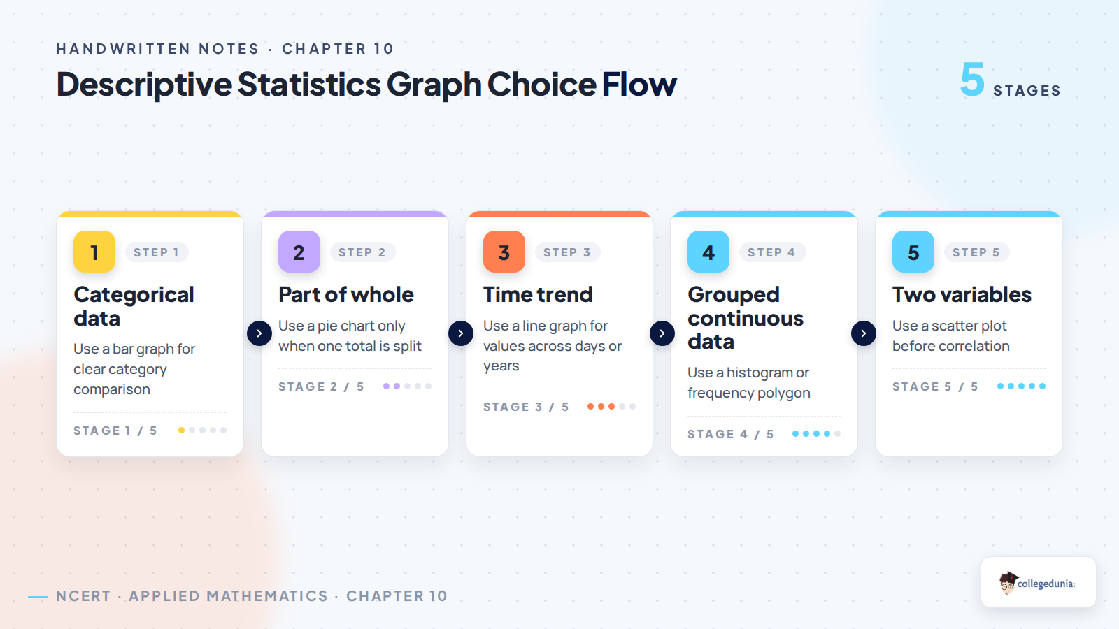
Graph choice depends on that first decision. A bar chart compares categories, a pie chart shows parts of a whole, a line graph tracks change, and a histogram groups continuous values into class intervals.
- Use a bar chart when labels are separate categories.
- Use a pie chart when all parts add up to one full total.
- Use a histogram when data is grouped into continuous intervals.
- Use a frequency polygon when two distributions must be compared quickly.
Descriptive Statistics Revision Video for Class 11
Source: Commerce Wallah by PW on YouTube
Mean Median Mode and Spread in Descriptive Statistics
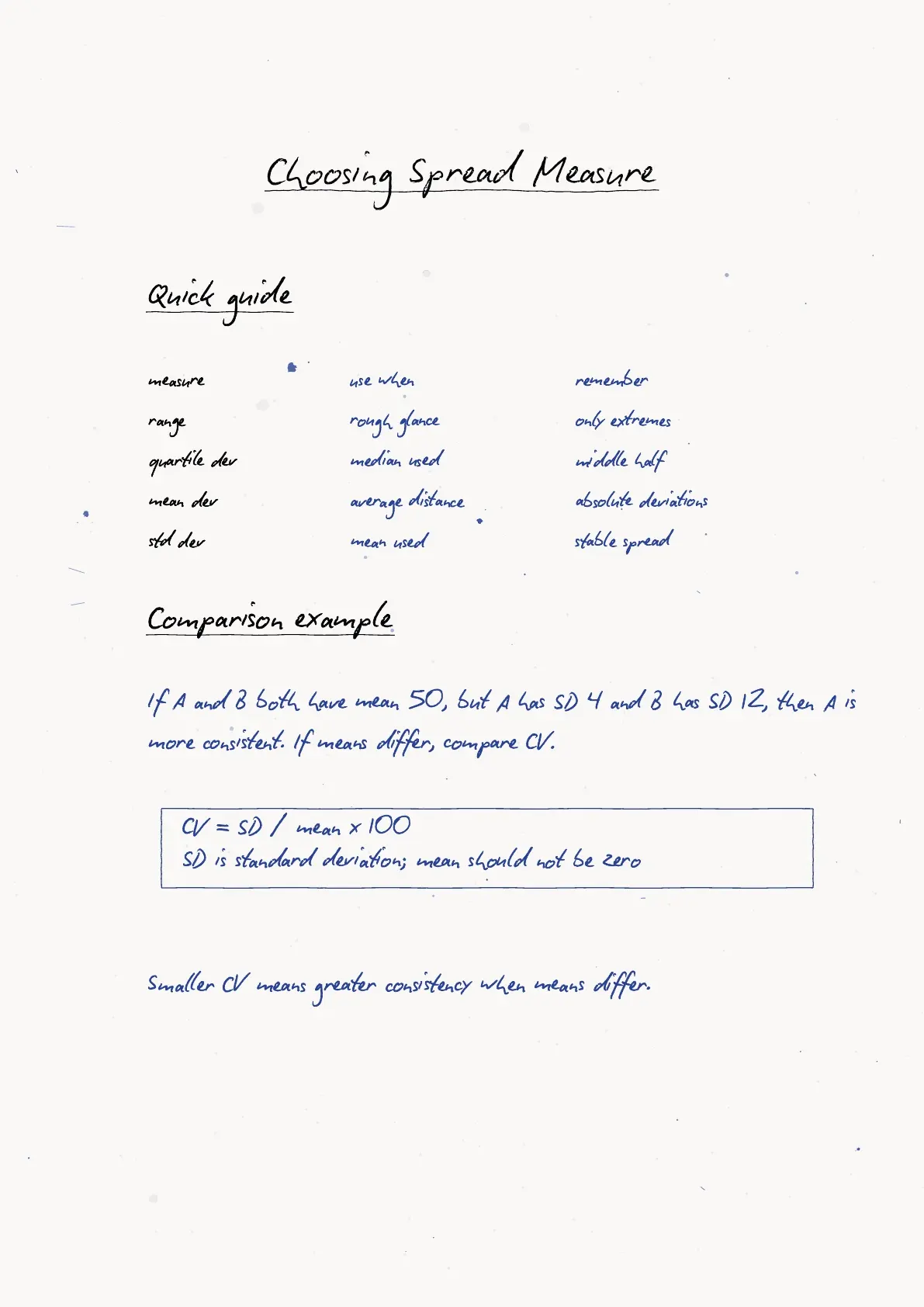
The three averages answer different questions. Mean uses every observation, median gives the middle position, and mode gives the most frequent value. In a skewed distribution, the median often gives a more stable summary than the mean.
| Measure | Formula idea | Use it when |
|---|---|---|
| Range | Largest value minus smallest value | A quick spread estimate is enough |
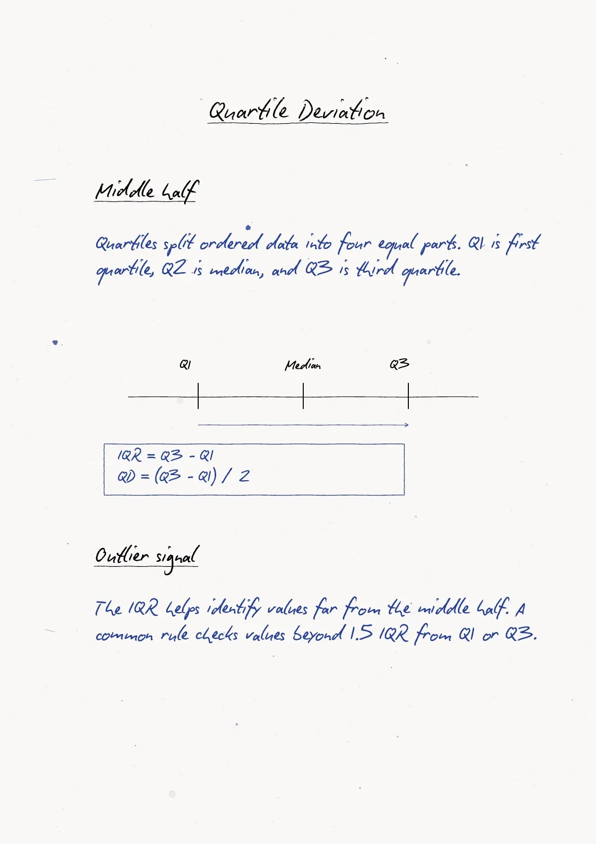
| Quartile deviation | Half of Q3 minus Q1 | The middle 50 percent matters most |
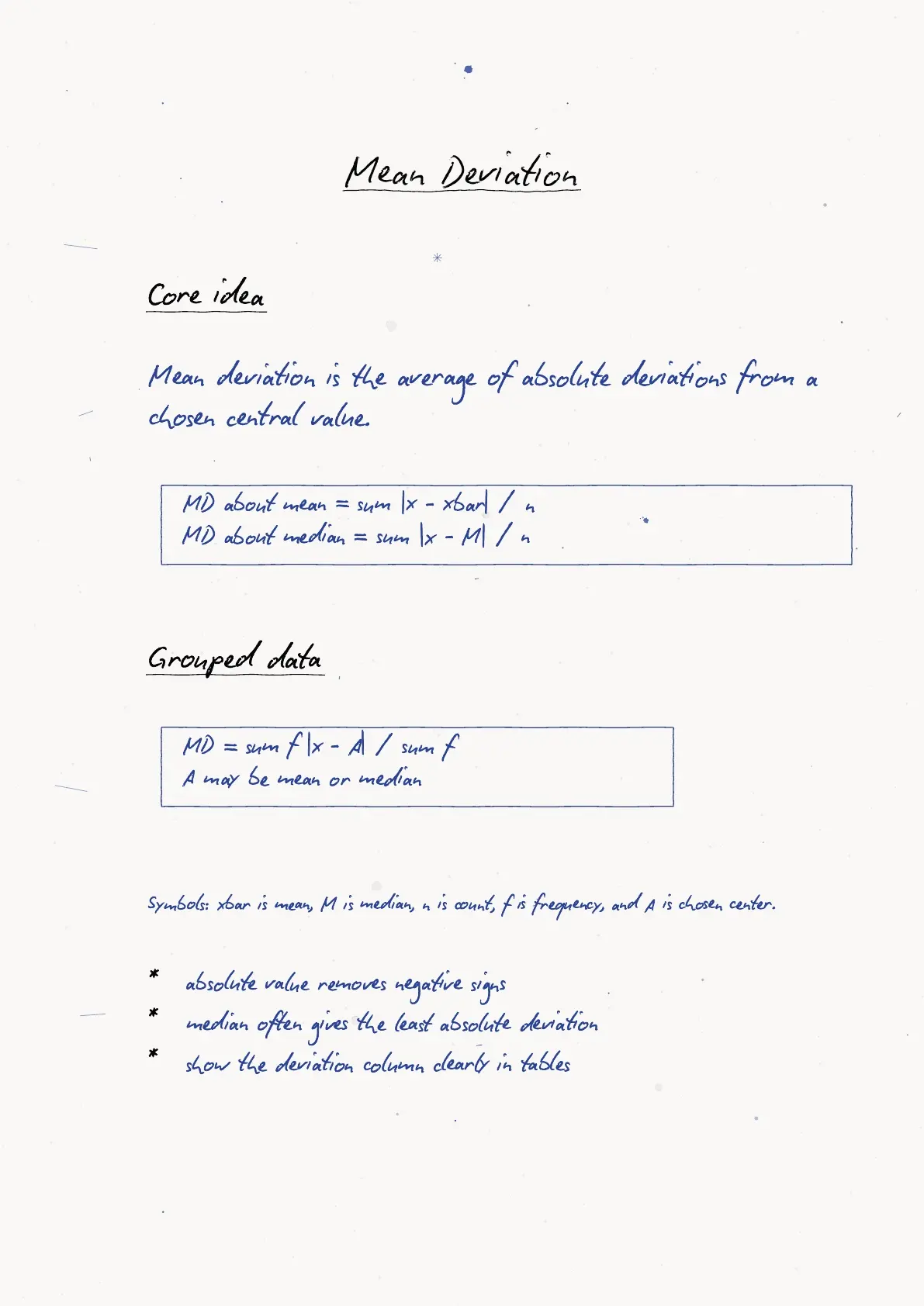
| Mean deviation | Average absolute distance from a centre | Distances from mean or median are needed |
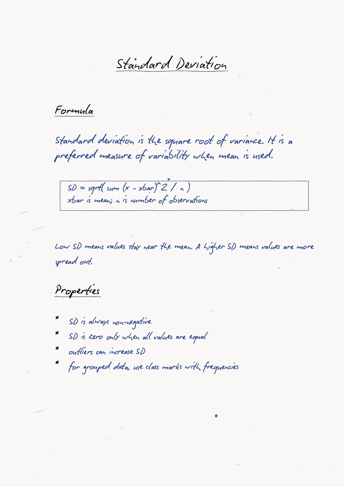
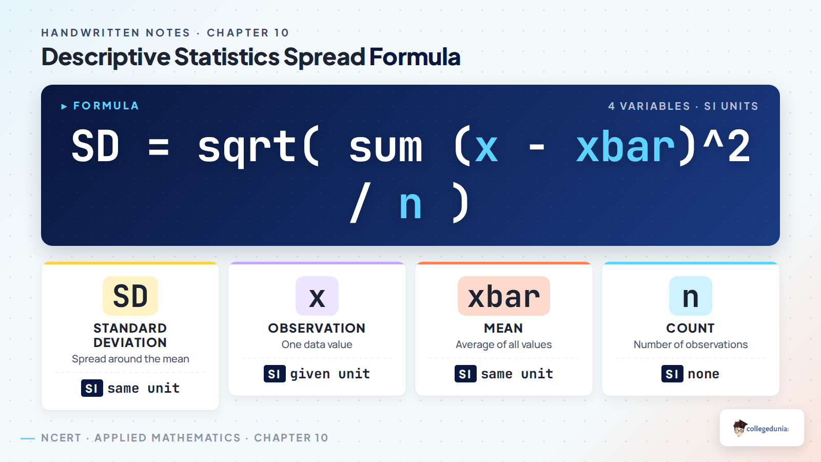
| Standard deviation | Square root of variance | A complete spread measure is needed |
Skewness Kurtosis Percentile Rank and Correlation
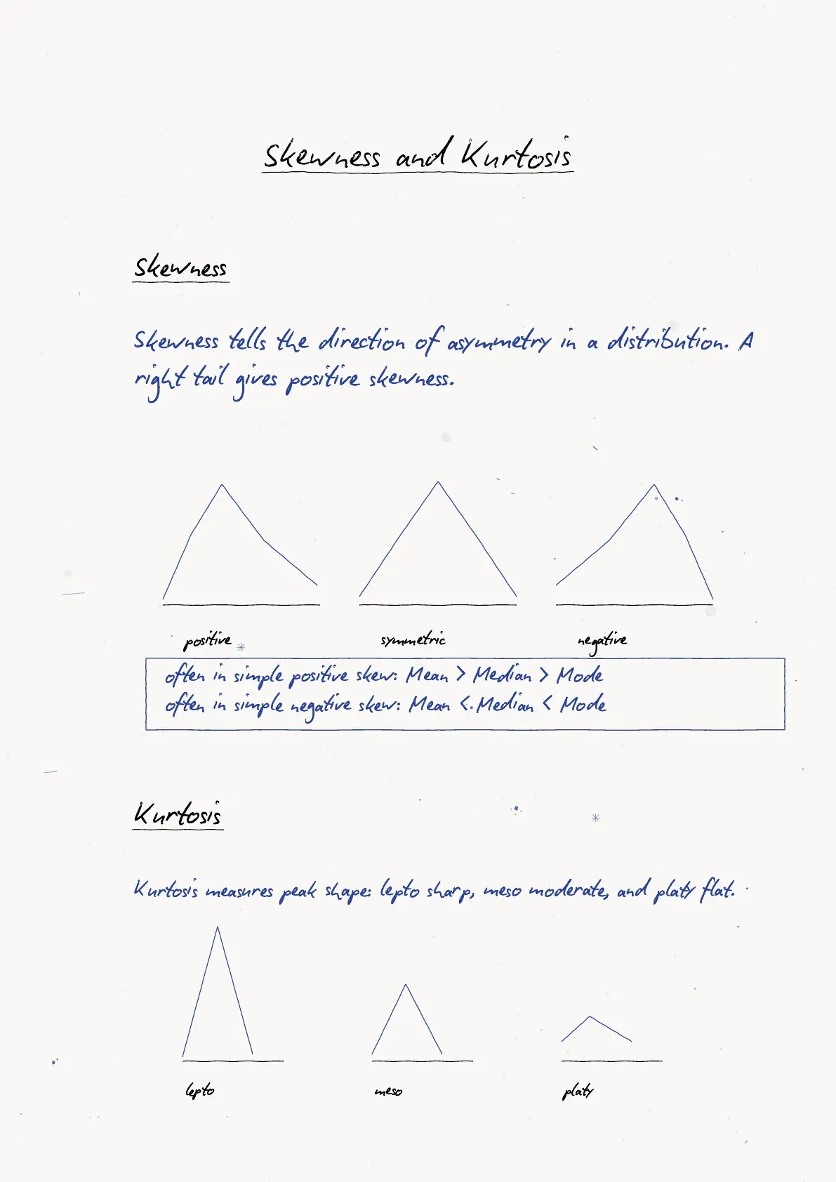
Skewness tells whether the data has a longer tail on one side. A positive skew has a longer right tail, while a negative skew has a longer left tail. Kurtosis describes whether the data is sharply peaked or flatter than a normal pattern.
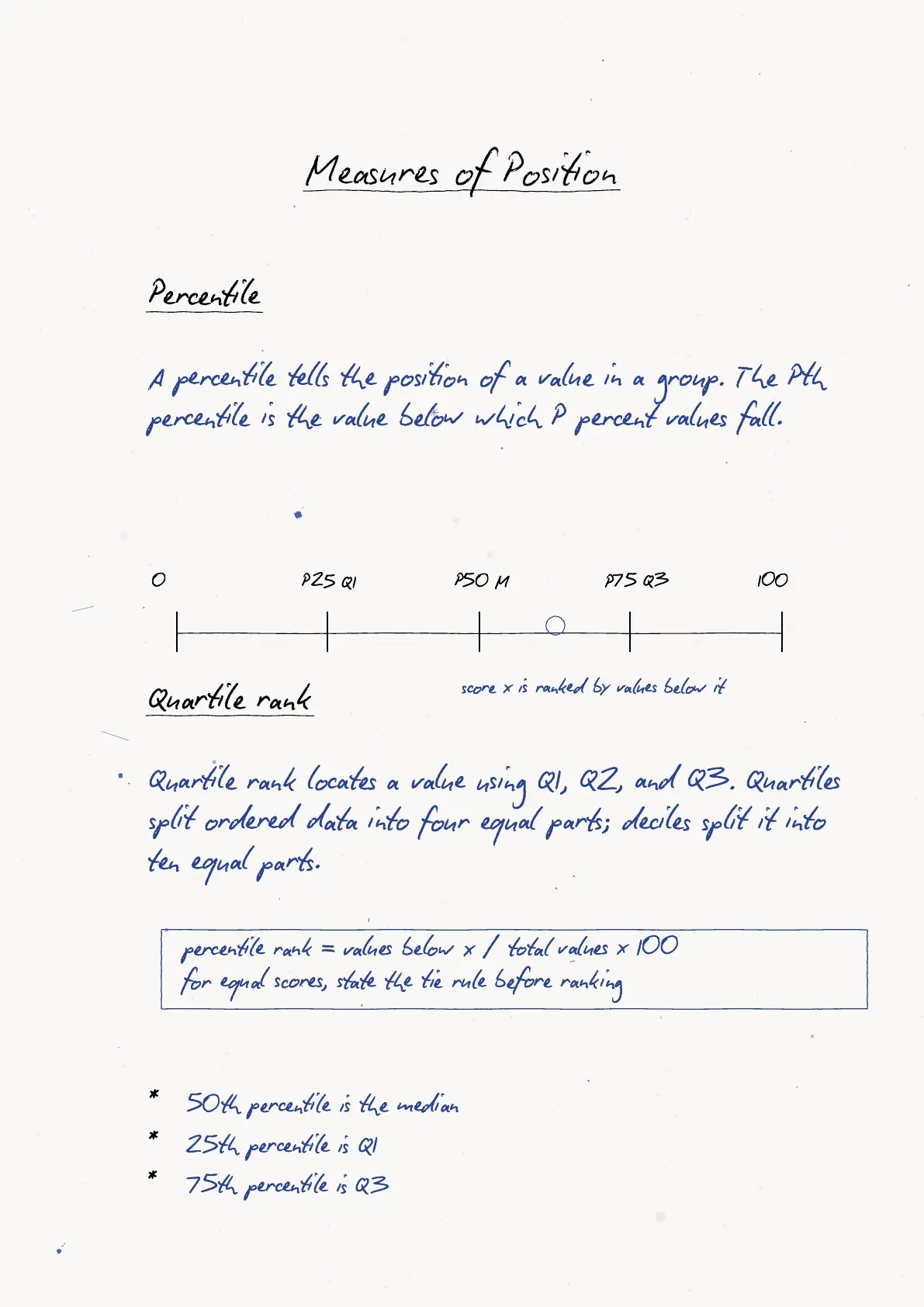
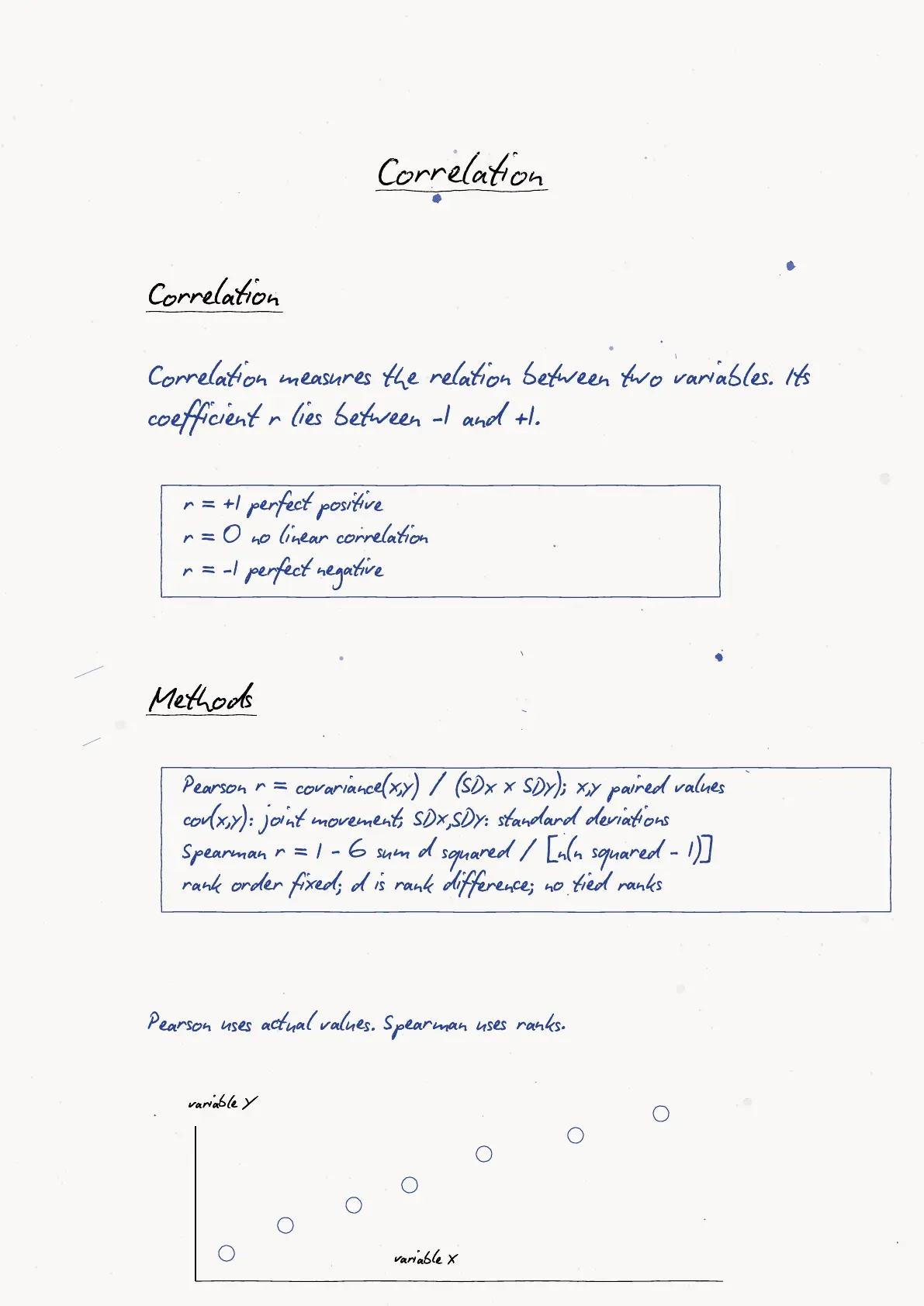
Percentile rank compares a value with the rest of the data. Correlation checks how two variables move together. A positive correlation means both tend to move in the same direction, while a negative correlation means one increases as the other decreases.
| Concept | What to remember | Common mistake |
|---|---|---|
| Skewness | Mean, median and mode shift when the tail is long | Calling every unequal distribution skewed without checking direction |
| Kurtosis | Compare peak and tail behaviour | Using it as a measure of average |
| Percentile rank | Counts how many values lie below a score | Confusing percentile with percentage marks |
| Correlation | Coefficient lies between -1 and +1 | Reading correlation as causation |
How to Use Descriptive Statistics Handwritten Notes Before Tests
Use the Descriptive Statistics handwritten notes in three short passes. First revise data types and graphs. Then practise one mean-median-mode comparison. Finally, revise dispersion and correlation formulas with the notation page beside you.
Quick tip: Do not calculate the mean before checking whether extreme values are present. If the data has outliers, compare the median as well.
- Write the data scale before choosing the graph.
- Arrange data in order before finding median, quartiles or percentile rank.
- Keep variance and standard deviation units separate.
- Interpret the sign and size of correlation in words after calculation.
Related Resources for Descriptive Statistics Class 11
| Resource | Use it for | Link |
|---|---|---|
| NCERT Book PDF | Official theory and examples | Descriptive Statistics Class 11 NCERT Book PDF |
| NCERT Notes | Typed explanation and formula tables | Descriptive Statistics Class 11 Notes |
| NCERT Solutions | Step-by-step answers for exercises | Descriptive Statistics Class 11 NCERT Solutions |
| Formula Sheet | Formula-only revision before practice | Descriptive Statistics Class 11 Formula Sheet |
Applied Mathematics Handwritten Notes for All Chapters
| Chapter | Handwritten Notes |
|---|---|
| Chapter 1 | Numbers and Quantification Class 11 Handwritten Notes |
| Chapter 4 | Relations Class 11 Handwritten Notes |
| Chapter 5 | Sequences and Series Class 11 Handwritten Notes |
| Chapter 6 | Permutations and Combinations Class 11 Handwritten Notes |
| Chapter 8 | Calculus Class 11 Handwritten Notes |
| Chapter 9 | Probability Class 11 Handwritten Notes |
| Chapter 10 | Descriptive Statistics Class 11 Handwritten Notes |
Descriptive Statistics Class 11 Applied Mathematics Handwritten Notes FAQs
Ques. What is covered in Class 11 Applied Mathematics Chapter 10 Descriptive Statistics handwritten notes?
Ans. The handwritten notes cover data types, scales of measurement, charts, mean, median, mode, range, quartile deviation, mean deviation, variance, standard deviation, skewness, kurtosis, percentile rank and correlation.
Ques. Which graphs are important in Descriptive Statistics?
Ans. Bar charts, pie charts, line graphs, histograms and frequency polygons are important. The notes explain when each graph should be selected.
Ques. What is the difference between variance and standard deviation?
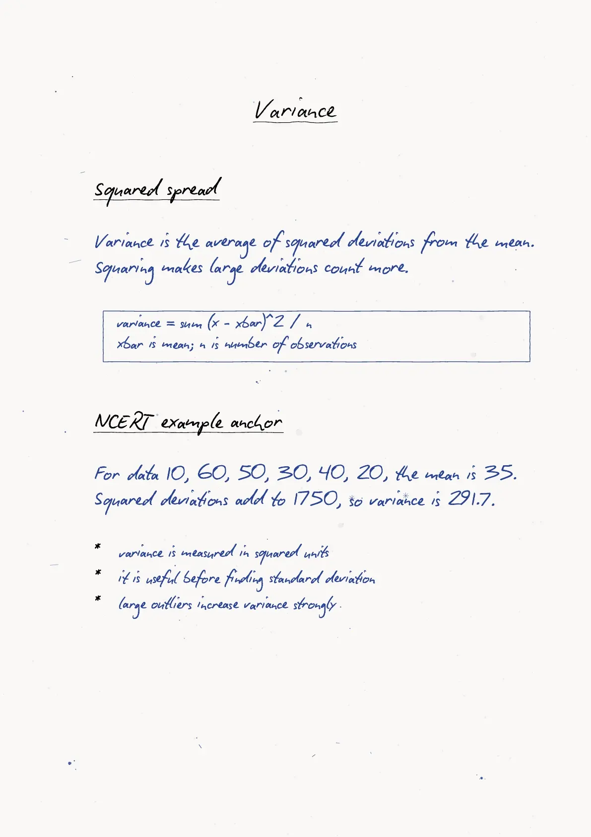
Ans. Variance is the average squared deviation from the mean. Standard deviation is the square root of variance and is easier to compare with the original data unit.
Ques. Are these Descriptive Statistics handwritten notes aligned with the 2026-27 syllabus?
Ans. Yes. The notes follow the current 2026-27 Class 11 Applied Mathematics chapter scope for Descriptive Statistics.



Comments