




These Class 12 Geography Chapter 3 Graphical Representation of Data notes are a topper's genuine handwritten revision pages, mapped to the 2026-27 CBSE syllabus. They cover all major diagram types (line graphs, bar diagrams, pie charts, flow maps, dot maps, choropleth and isopleth maps) with hand-drawn construction steps. Use the PDF in the 24 hours before the board paper.
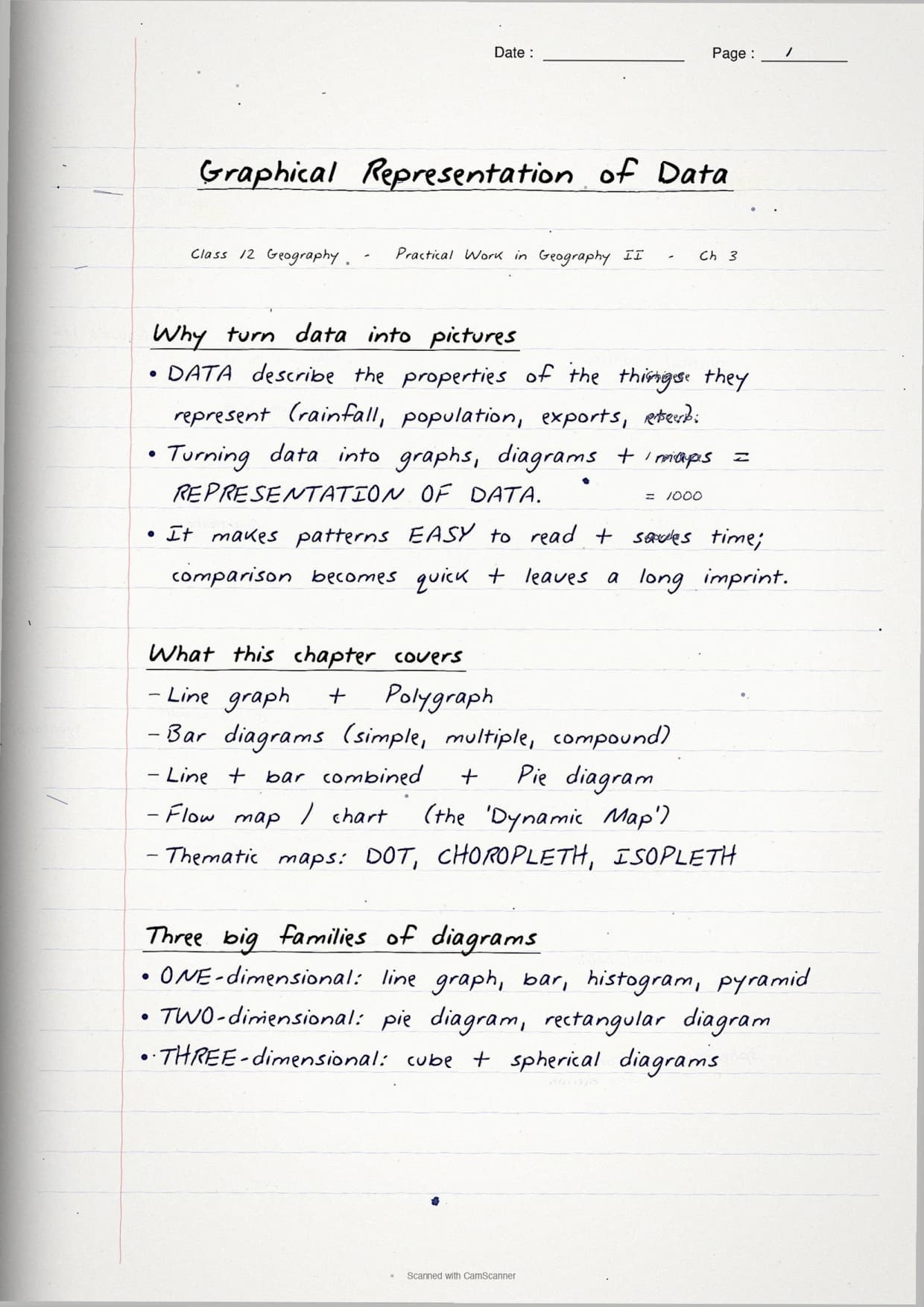
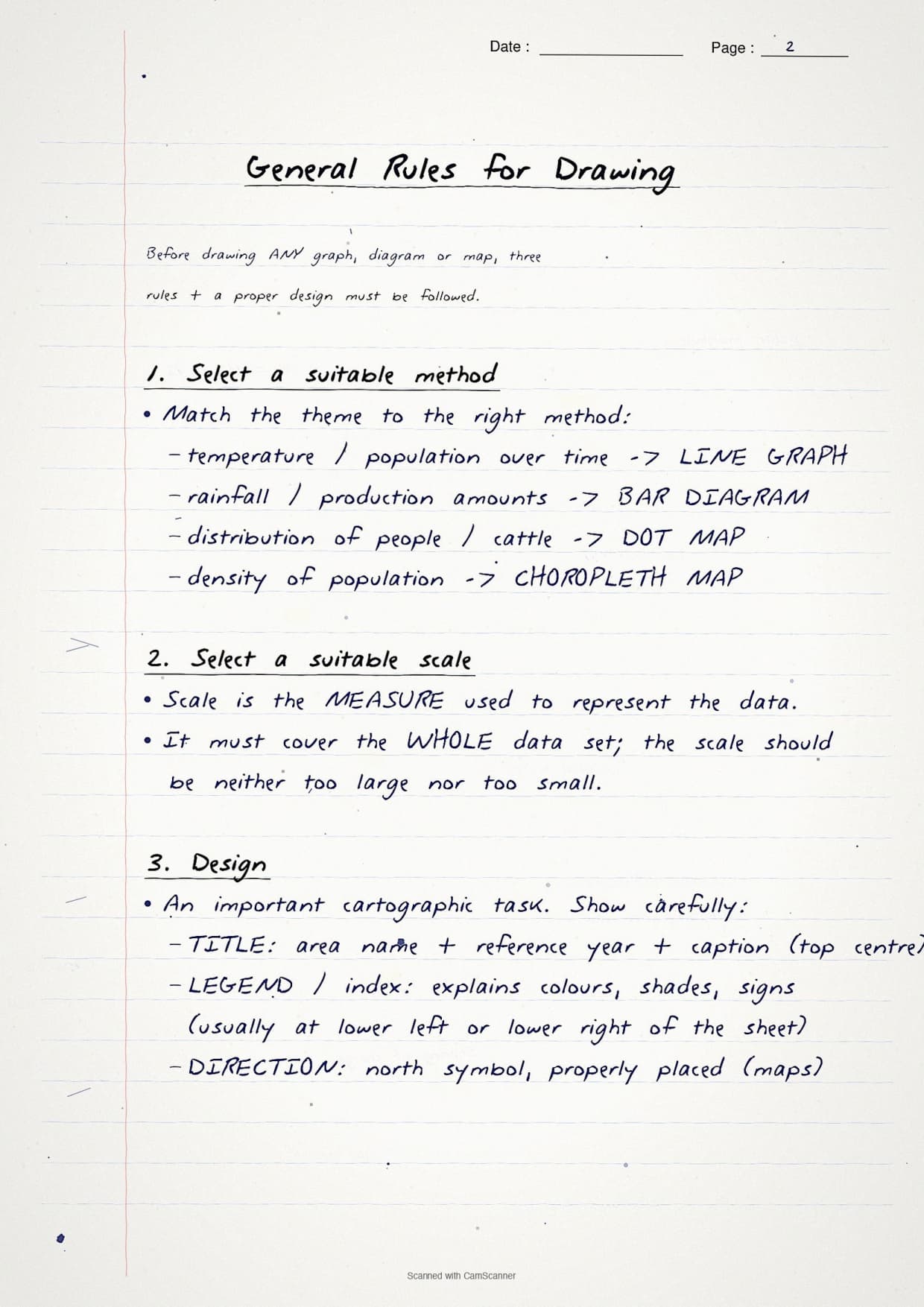
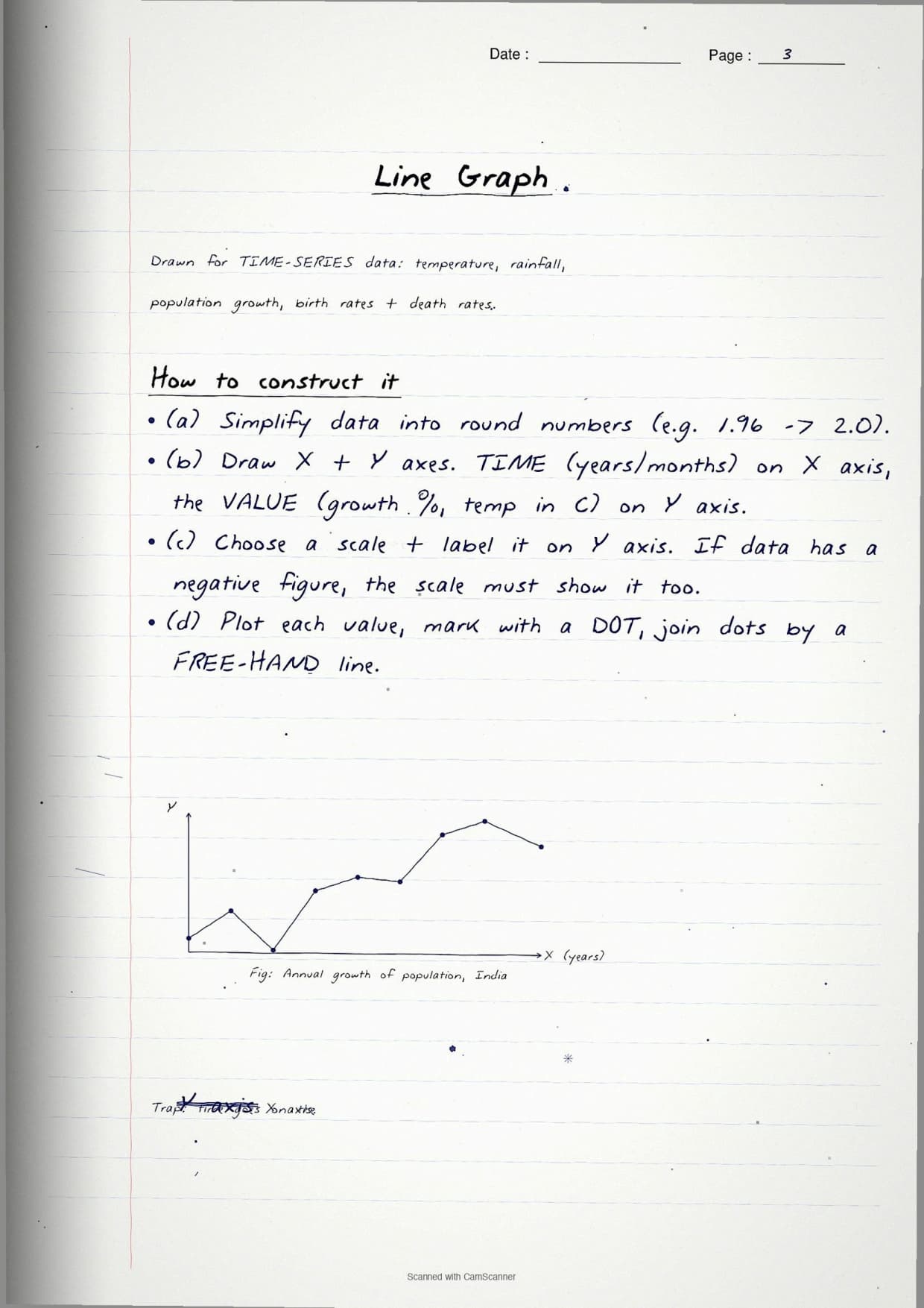
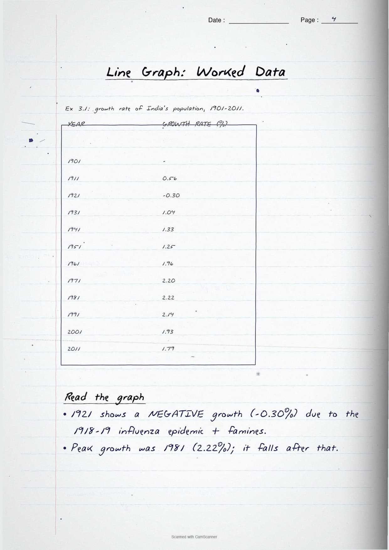
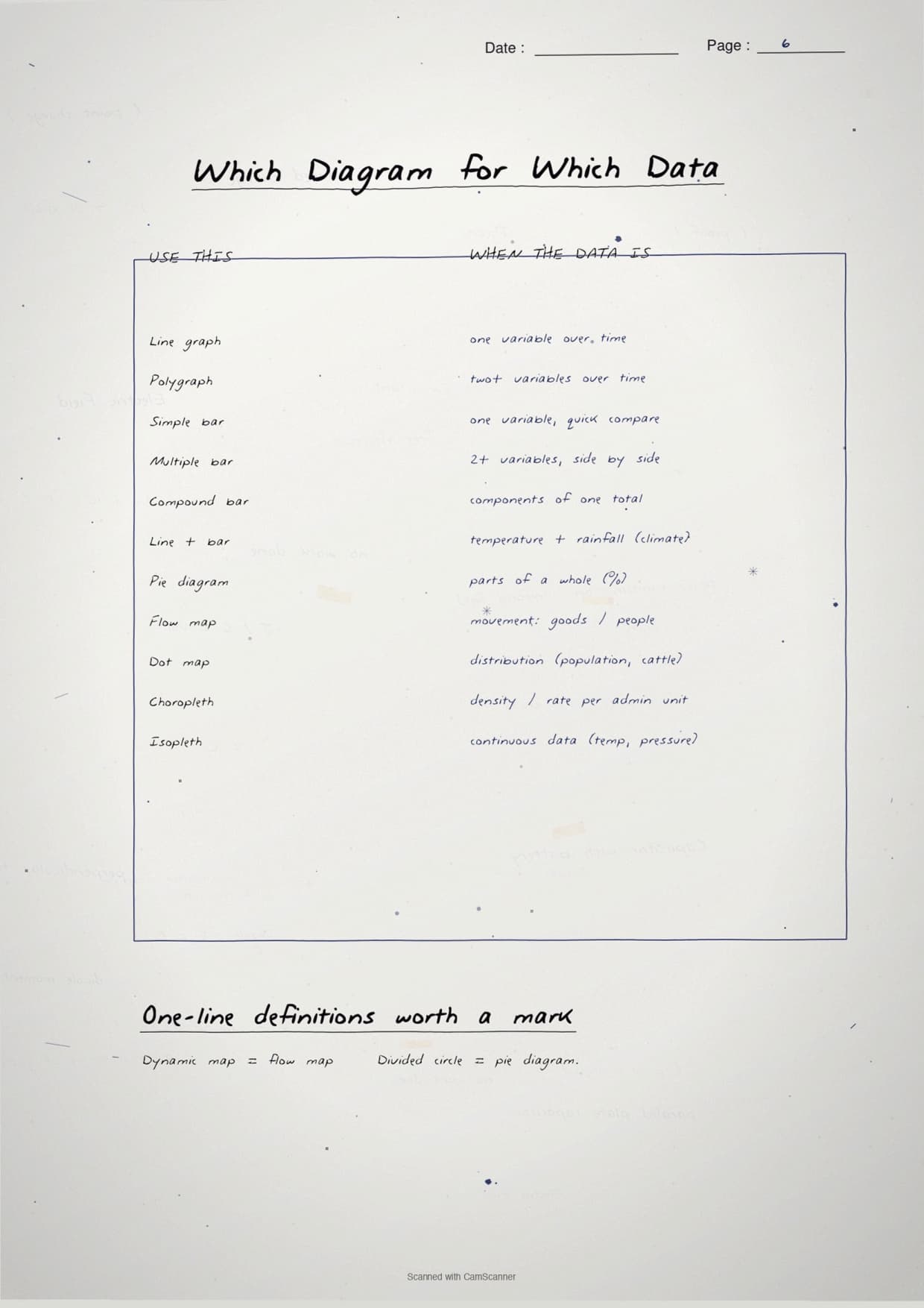
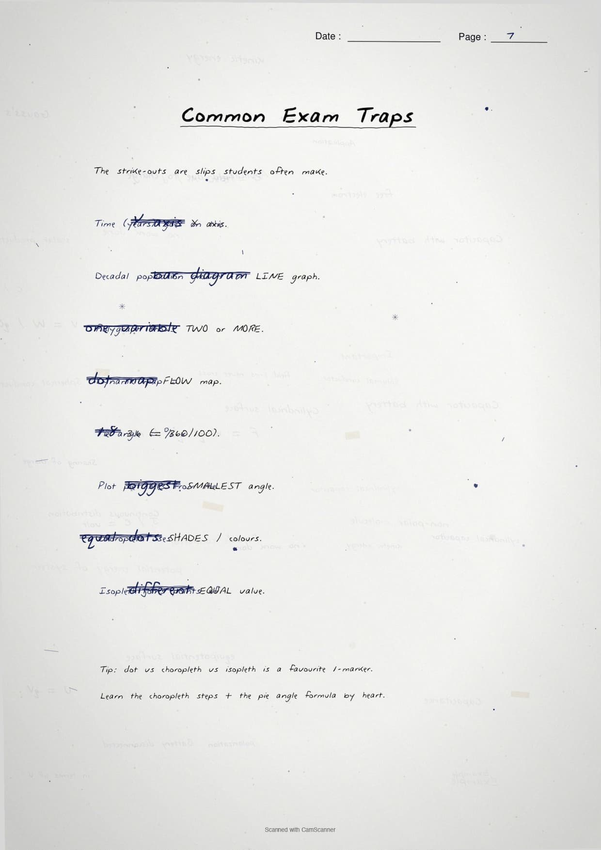
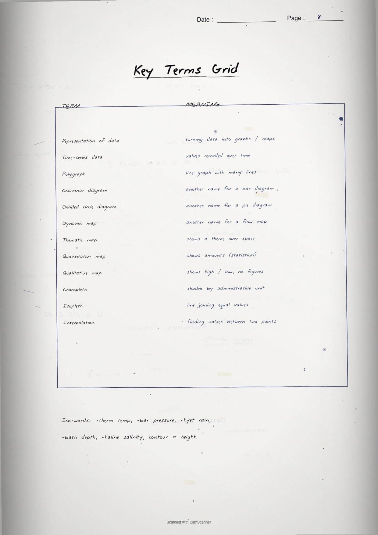
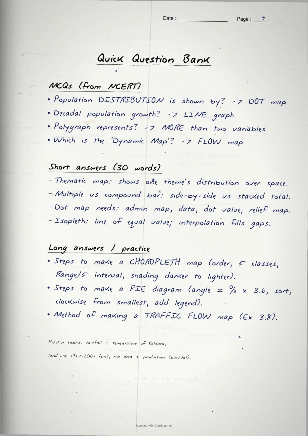


- Topper's handwritten revision notes covering all of Class 12 Practical Work in Geography Chapter 3.
- 5-7 marks weightage, with hand-worked construction steps for line graphs, bar diagrams, pie charts and thematic maps.
- Pairs with the NCERT Solutions, typed Notes and the official NCERT Book PDF for the same chapter.
Mapped to the 2026-27 NCERT Practical Work in Geography textbook and cross-checked against the last five years of CBSE Class 12 board papers.
Student Feedback
72% of Class 12 students said handwritten notes feel faster to revise from than typed PDFs before the board exam, and toppers reported about 2 extra marks on the diagram question. Most finished one full pass in 22 minutes.
Source: 2026-27 Class 12 Geography handwritten-notes feedback poll of 9,240 CBSE students.
What These Handwritten Notes Include
The PDF is a 22-page revision file covering every concept in Chapter 3, from general rules for diagram selection to construction steps for line graphs, bar diagrams, pie charts, dot maps, choropleth and isopleth maps, as the table below shows.
| Pages | What the pages cover | Approx revision time |
|---|---|---|
| Pages 1-4 | General rules for selecting diagrams, scale, design, title, legend and direction; three categories of diagrams; line graph and polygraph construction. | 5 minutes |
| Pages 5-9 | Bar diagrams (simple, multiple, compound); line-and-bar graph; worked example with Thiruvananthapuram rainfall and population data. | 7 minutes |
| Pages 10-13 | Pie diagram (angle calculation, sector drawing); wind rose and star diagram; flow chart construction for traffic data. | 5 minutes |
| Pages 14-17 | Dot maps (dot value, dot size, placement rules); choropleth maps (data classification, shade selection, four steps). | 5 minutes |
| Pages 18-22 | Isopleth maps (isopleths, isotherms, isobars, isohyets); interpolation method with formula; comparison of all thematic map types. | 5 minutes |
Source: TheGeoecologist GS on YouTube
General Rules for Drawing Graphs and Maps
The opening pages cover the four general rules for every diagram and map, tested by CBSE as a 3-mark theory question.
| Rule | What it means | Common exam angle |
|---|---|---|
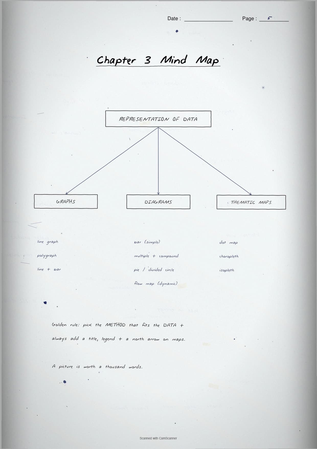
| 1. Select a suitable method | Match the diagram type to the data type. Time-series data uses line graphs; rainfall/production data uses bar diagrams; percentage data uses pie charts; distribution data uses dot maps. | MCQ: which diagram suits decadal population growth? |
| 2. Select a suitable scale | Scale must cover the entire range of data without being too large or too small. Negative values must be shown if present. | Short answer: why must the scale cover the full range? |
| 3. Design the diagram | Every diagram needs a title (area + year + caption), legend, and for maps, a north direction symbol. Components must be clearly placed and sized. | Practical: draw and label a bar diagram with all three design components. |
| 4. Use a free-hand drawn line | Line graphs are joined by a smooth free-hand line, not a ruler-drawn straight line between each pair of points. | Practical: common error is ruler-joining the dots. |
Tip: CBSE markers deduct half a mark per missing design component (title, legend, north arrow). Run the checklist before drawing.
Line Graphs and Polygraphs
The line graph class 12 geography is the simplest one-dimensional diagram. The NCERT example is India's population growth rate, 1901 to 2011.
Construction steps for a line graph
Mark time on the X-axis and the variable on the Y-axis. Include negative values in the scale if they appear (growth dipped below zero in 1921). Plot each point, then join dots with a smooth free-hand curve, never a ruler line.
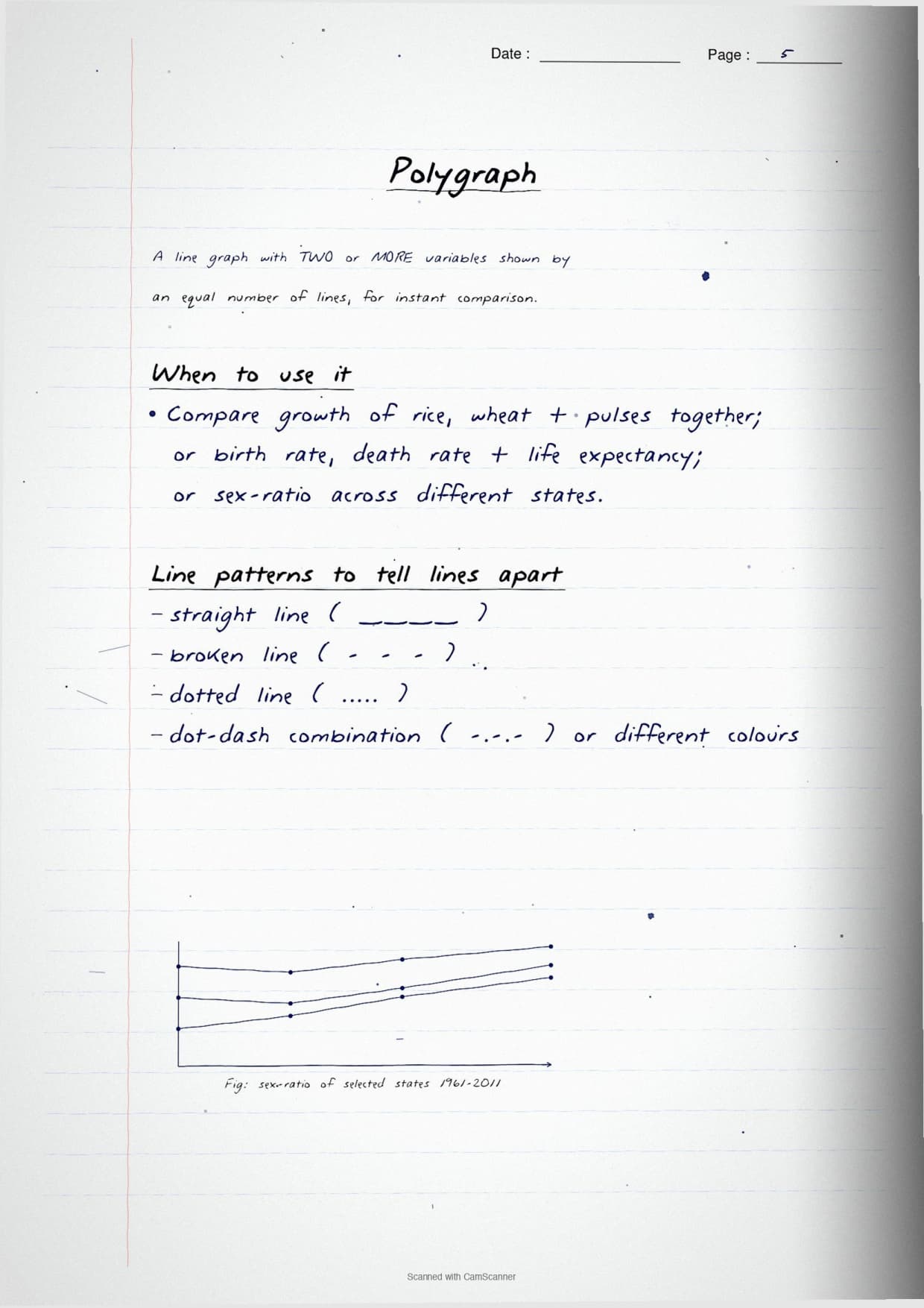
Polygraph: two or more variables on one graph
A polygraph uses different line patterns or colours to show multiple variables on one set of axes. The NCERT example compares sex ratio across Delhi, Haryana and Uttar Pradesh from 1961 to 2011. Each pattern must be defined in the legend, the step students most often skip.
Important: On a line graph, never join data points with a ruler. CBSE markers look for the smooth free-hand join, not a zigzag ruler line.
Bar Diagrams: Simple, Compound and Multiple
Bar diagrams are the most-asked construction question. The notes cover three variants with a worked NCERT example each.
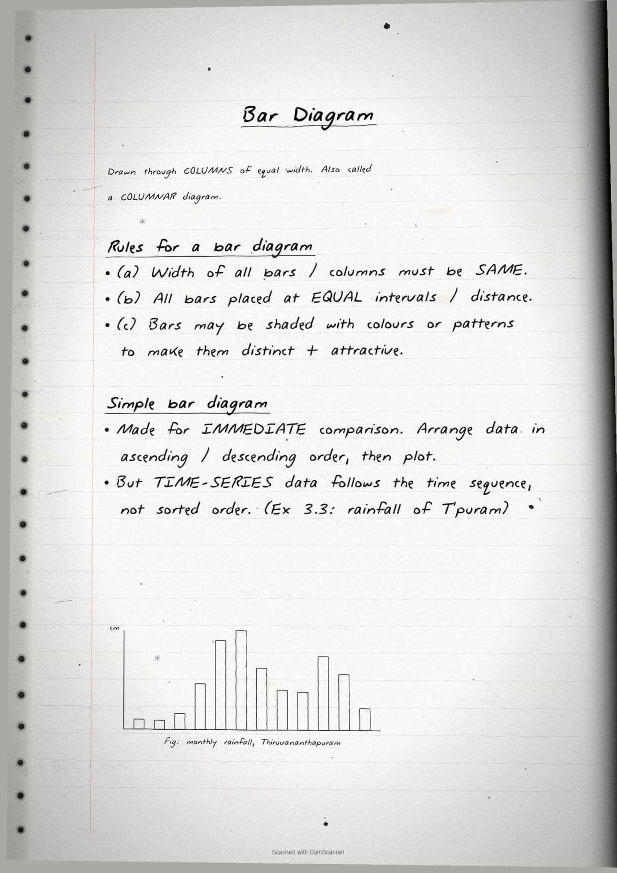
Simple bar diagram
Each bar represents one variable, with equal width and uniform spacing. The NCERT example uses monthly rainfall of Thiruvananthapuram, where June (35.6 cm) is the tallest bar. Draw bars in ascending or descending order for non-time-series data, not in table order.
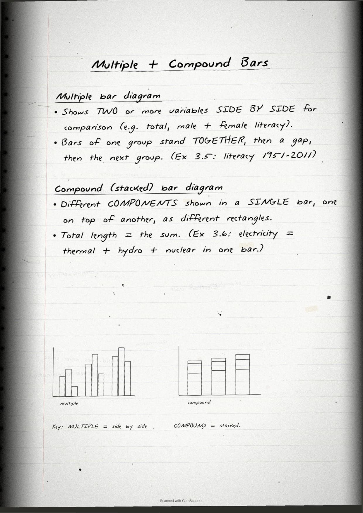
Multiple bar diagram
Two or more bars are drawn side by side per category using different shades, comparing variables across the same categories. The NCERT example compares area and production of rice across states.
Compound (stacked) bar diagram
Components of each category are stacked vertically inside one bar, showing both the total and each share. Students often draw side-by-side bars instead of stacked segments, which is wrong.
Pie Diagram, Wind Rose and Flow Maps
The pie diagram class 12 geography pages show the full angle-calculation method, the most formula-heavy part of the chapter.
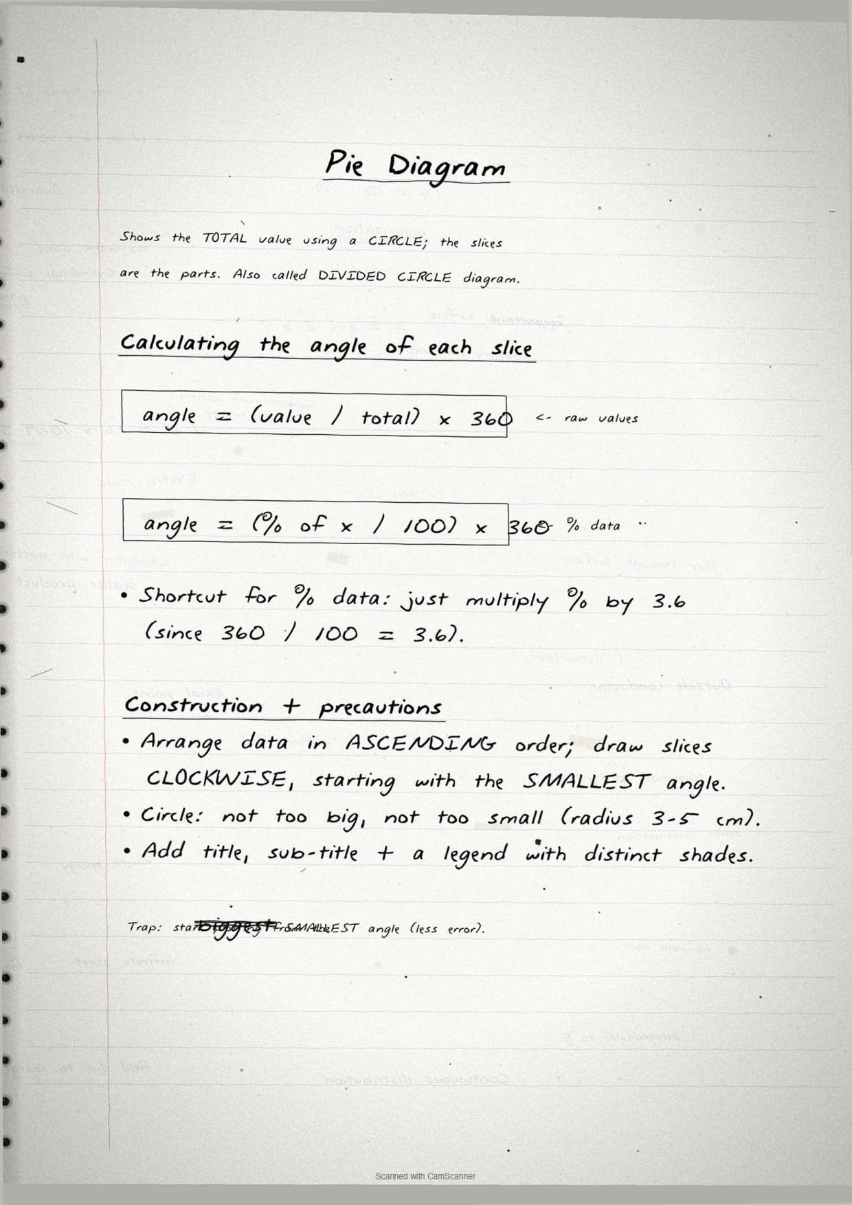
Pie diagram: angle calculation
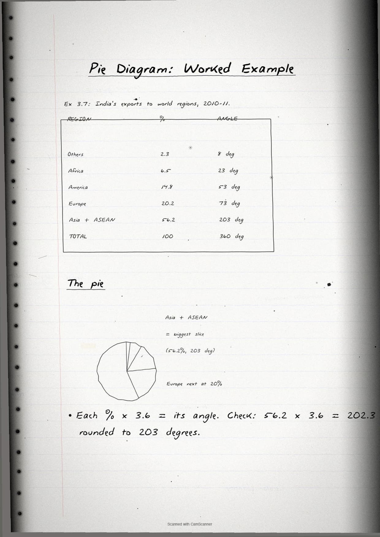
Convert each percentage share to degrees by multiplying by 3.6 (100% = 360 degrees). If net sown area is 42%, its sector angle is 42 times 3.6 = 151.2 degrees. Draw sectors clockwise from 12 o'clock and label each with the category and percentage. The notes draw the complete India land-use pie chart with all six sectors labelled.
Wind rose and star diagram
A wind rose shows wind frequency and direction: lines run from a central point in 8 or 16 compass directions, length proportional to frequency. A star diagram uses the same structure for any variable.
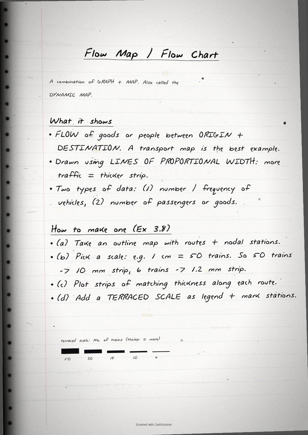
Flow chart (traffic flow map)
Flow charts show movement along routes, with line width proportional to traffic volume. Three steps: draw the base map with routes, set a scale for line width, then draw proportional-width lines with a legend.
Dot Maps, Choropleth and Isopleth Maps
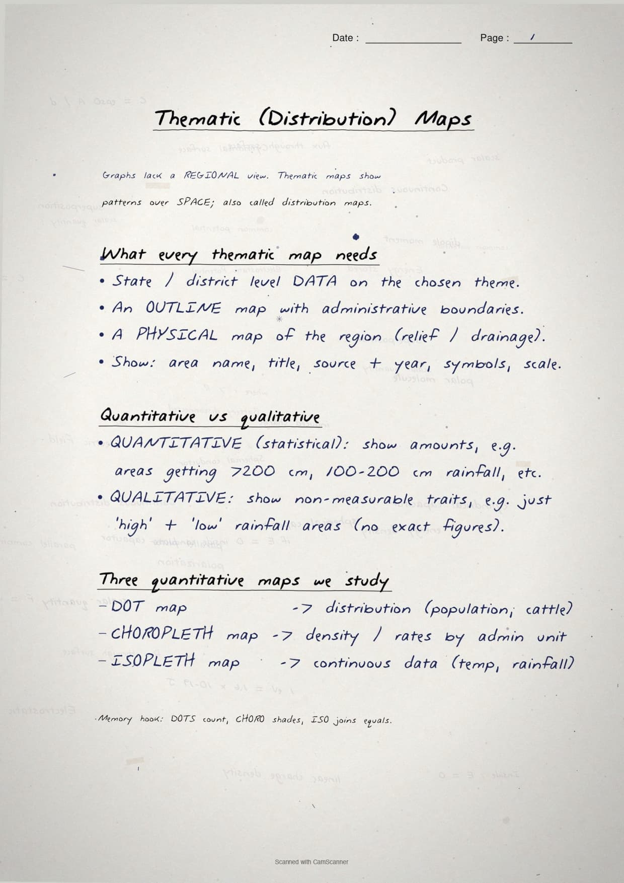
The thematic map section is tested every year, usually as a 5-mark practical question. The notes cover all three map types with example maps and checklists.
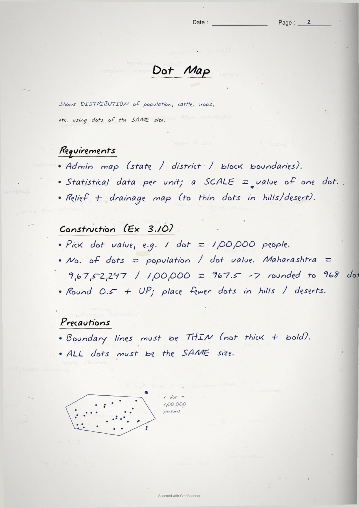
Dot map
Each dot represents a fixed number of the phenomenon (say 1 dot = 10,000 persons), placed inside the administrative unit and concentrated in higher-density areas. Three decisions matter: dot value, dot size and correct placement inside boundaries. The sample is rice production by state.
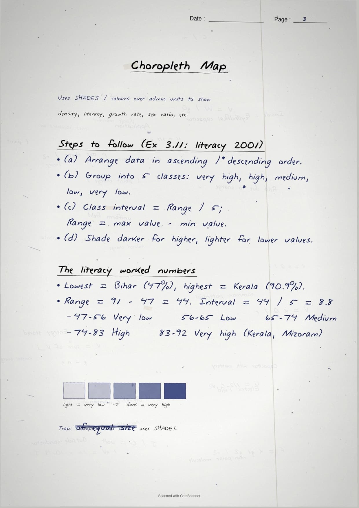
Choropleth map
A choropleth map shades administrative units by value. Four steps: arrange data, group into 4-5 classes, assign a shade to each (lightest for lowest), then draw and shade with a matching legend. The worked example is population density by state.
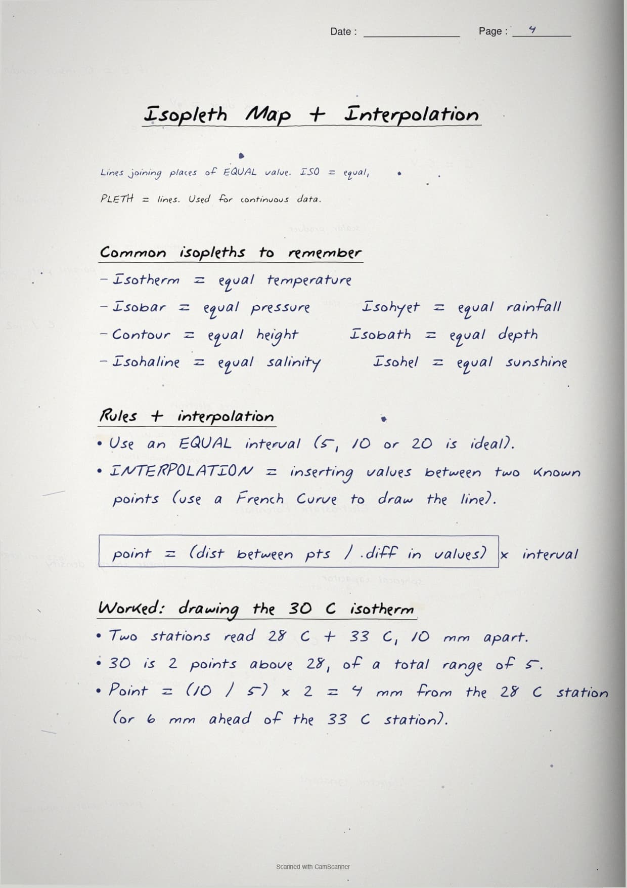
Isopleth map
An isopleth map uses lines connecting places of equal value (isotherms, isobars, isohyets). Interpolation locates a line between two known points: Distance from the lower value = (interval / difference between the two values) times distance between the control points. NCERT uses it to locate the 30 degrees C isotherm between 28 and 33 degrees C.
| Map type | What it shows | Key decision | NCERT exercise Q |
|---|---|---|---|
| Dot map | Distribution of phenomena across space | Dot value and dot size | Ex 4(c) |
| Choropleth map | Density or percentage by administrative unit | Number of classes and shading scheme | Ex 4(d) |
| Isopleth map | Continuous phenomena (temperature, rainfall) | Contour interval and interpolation | Ex 5 |
| Flow map | Movement along routes (traffic, trade) | Scale for line width | Ex 1(iv) |
Common Mistakes Highlighted in the Notes
The six repeat-offender mistakes CBSE examiners flag each year on graphical representation class 12 geography questions. Each appears as a margin callout in the notes.
- Joining line-graph dots with a ruler. Use a smooth free-hand curve; a zigzag ruler line loses the method mark.
- Missing legend or title. Every diagram needs a title (area + year + variable) and a legend; missing either loses half a mark each.
- Wrong angle in pie charts. Forgetting to multiply the percentage by 3.6 gives wrong sector sizes.
- Dots on boundaries in dot maps. Dots go inside boundaries, reflecting the actual distribution, not clustered on borders.
- More than 5 shade classes in choropleth maps. Extra grades are hard to distinguish; NCERT recommends 4-5 classes.
- Confusing choropleth and isopleth maps. Choropleth shades administrative units; isopleth draws continuous lines across boundaries.
Each mistake carries a one-line "remember this" note; the pie-chart hook is "Percentage times 3.6 = degrees".
Previous Year Question Trends
Chapter 3 has carried a stable 5 to 7 marks over five years: one practical construction question (5 marks) plus one diagram-identification question (2-3 marks).
| Year | Question asked | Marks | Notes pages to revise |
|---|---|---|---|
| 2025 | Construct a choropleth map from given state-wise data; identify which map type is called "dynamic map" | 5 + 2 | Pages 14-17 + Pages 1-4 |
| 2024 | Draw a bar diagram for given production data; distinguish between multiple and compound bar diagrams | 5 + 2 | Pages 5-9 |
| 2023 | Construct a pie diagram from given land-use data; state two rules for drawing a dot map | 5 + 2 | Pages 10-13 + Pages 14-17 |
| 2022 | Draw an isopleth map for given temperature data; explain interpolation method | 5 + 3 | Pages 18-22 |
| 2021 | Construct a line graph for population growth rate data; name three components of a good cartographic design | 5 + 3 | Pages 1-4 |
The construction question rotates among bar diagrams, pie charts and thematic maps, so revise all construction pages together.
Other Resources for Class 12 Geography Chapter 3 Graphical Representation of Data
Pair these handwritten notes with the matching NCERT Solutions, typed Notes and the official NCERT Book for this chapter.
| Resource | What it covers | Open |
|---|---|---|
| Handwritten Notes | Topper's handwritten revision pages for last-mile board exam prep. | You are here |
| NCERT Solutions | Step-by-step answers to all exercise questions including diagram construction and map identification numericals. | Class 12 Geography Chapter 3 NCERT Solutions |
| Notes | Concept-first typed revision notes with definitions, diagram types, thematic map comparison table and CBSE exam tips. | Class 12 Geography Chapter 3 Notes |
| NCERT Book PDF | Official NCERT Practical Work in Geography Chapter 3 textbook in PDF form. | Class 12 Geography Chapter 3 NCERT Book PDF |
| Subject Hub | All chapters of Class 12 Geography with every resource in one place. | Class 12 Geography Subject Hub |
All Chapters Handwritten Notes for Class 12 Practical Work in Geography
Related Links: Use the table below for the handwritten notes of the other chapters of Class 12 Practical Work in Geography. Every chapter ships with the same construction-step boxes and margin-callout common mistakes.
| Chapter | Topic | Handwritten Notes link |
|---|---|---|
| Chapter 1 | Data: Its Source and Compilation | Class 12 Geography Data Source and Compilation Handwritten Notes |
| Chapter 2 | Data Processing | Class 12 Geography Data Processing Handwritten Notes |
| Chapter 3 | Graphical Representation of Data | You are here |
| Chapter 4 | Spatial Information Technology | Class 12 Geography Spatial Information Technology Handwritten Notes |
Graphical Representation of Data Class 12 Geography Handwritten Notes FAQs
Ques. What are these graphical representation of data class 12 geography handwritten notes meant to be used for?
Ans. The graphical representation of data class 12 geography handwritten notes are a topper's handwritten revision file. They compress the full NCERT Chapter 3 into 22 pages of hand-written construction rules, diagrams and margin-callout common mistakes. The file covers line graphs, polygraphs, bar diagrams, pie charts, wind rose and star diagrams, flow charts, dot maps, choropleth maps and isopleth maps with step-by-step construction checklists. Students use it for last-mile revision in the 24 hours before the board paper, paired with the typed Notes PDF for concept building and the NCERT Solutions PDF for exercise practice.
Ques. How are these handwritten notes different from the typed class 12 geography graphical representation notes?
Ans. The typed graphical representation class 12 notes carry deeper conceptual prose around each diagram type (definitions, when-to-use comparisons, UPSC and CUET angles) and run 8 to 10 pages long. The handwritten notes compress that prose down to numbered construction steps inside hand-drawn boxes, lean on visual recall and example diagrams, and are designed to be read in one sitting. The two files work best together: read the typed Notes first to build the concept, then collapse to the handwritten file for the second and third revision passes focused on construction procedure recall.
Ques. What is the formula for constructing a pie diagram in class 12 geography?
Ans. To construct a pie diagram, convert each category's percentage share into degrees using the formula: Degrees = (Percentage divided by 100) times 360, which simplifies to Percentage times 3.6. For example, if net sown area is 42 percent, its sector angle is 42 times 3.6 = 151.2 degrees. Draw sectors clockwise starting from the 12 o'clock position. Label each sector with the category name and the percentage value. Add a title and legend to complete the design. The handwritten notebook draws the complete India land-use pie chart from the NCERT exercise by hand on one page, with all six sectors labelled and angles calculated step by step.
Ques. What is the difference between choropleth and isopleth maps in class 12 geography?
Ans. A choropleth map uses shading intensity to show data values for administrative units (districts, states, countries). The shading is uniform within each unit boundary and changes only at the boundary. An isopleth map uses continuous lines (isopleths) that connect all places with the same value, such as isotherms for temperature or isohyets for rainfall. Isopleth lines cross administrative boundaries freely and are drawn using interpolation between known data points. The key distinction is that choropleth maps are suitable for discontinuous data tied to administrative units (population density, literacy rate), while isopleth maps are suitable for continuous phenomena that vary smoothly across space (temperature, pressure, rainfall).
Ques. How is a dot map constructed in class 12 geography?
Ans. Constructing a dot map requires three decisions: choosing the dot value (number of units each dot represents), choosing the dot size (large enough to see, small enough not to overlap), and placing dots correctly within administrative boundaries according to the actual distribution of the phenomenon. After deciding these three parameters, draw the base map with administrative boundaries, place dots inside each unit in proportion to its data value, and add a legend stating the dot value. The NCERT chapter requires students to construct a dot map of rice production by state using the data in Exercise 4(c). The handwritten notebook shows a completed dot map for this exercise with dots concentrated in high-production states like West Bengal and Uttar Pradesh.
Ques. What is the interpolation method for isopleth maps in class 12 geography?
Ans. Interpolation is used to find the exact position of an isopleth line between two control points with known values. The formula is: Distance from the lower-value point = (Desired value minus lower value) divided by (Higher value minus lower value), times the distance between the two points. For example, if one point shows 28 degrees C and a neighbouring point shows 33 degrees C, and the distance between them is 10 mm, the 30 degrees C isotherm falls (30 minus 28) divided by (33 minus 28) times 10 = 4 mm from the 28 degrees C point. The handwritten notebook derives this formula step by step on one page and then applies it to the NCERT example, marking the calculated position with a pen dot before drawing the isopleth line through it.
Ques. Which type of diagram is best for showing decadal population growth in class 12 geography?
Ans. The NCERT chapter states that a bar diagram is best suited to represent decadal population growth. This is because bar diagrams show discrete values for separate time periods side by side, making it easy to compare growth across decades at a glance. A line graph would be appropriate for continuous data like annual growth rates over many consecutive years, but decadal (every 10 years) data is treated as discrete data in the NCERT chapter. This distinction is tested directly in Exercise 1(ii) of Chapter 3, where the answer is (b) Bar diagram. The handwritten notebook flags this MCQ with a star in the margin as it is a repeat question in CBSE board papers.
Ques. What are the three components of cartographic design in class 12 geography?
Ans. The three mandatory components of cartographic design in the NCERT chapter are: (1) Title, which indicates the name of the area, the reference year of the data and the caption of the diagram or map; (2) Legend or index, which explains the colours, shades, symbols and signs used; and (3) Direction symbol, specifically the north arrow, which is required on all maps because maps represent part of the earth's surface and must be oriented to directions. Bar diagrams and other non-map diagrams need a title and legend but not a north arrow. The handwritten notebook marks all three components in a red-bordered checklist box on the first page and repeats it as a reminder at the top of each map-construction page.
Ques. What is the difference between a multiple bar diagram and a compound bar diagram?
Ans. A multiple bar diagram (also called a polybar diagram) draws two or more separate bars side by side for each category, with different shading for each variable. The height of each bar represents one variable independently, so students can compare both the individual values and the relationship between variables for each category. A compound bar diagram (also called a stacked bar diagram) places all variables for one category inside a single bar, stacking them vertically. The total height of the bar represents the combined total, and each segment shows the share of one variable. Use a multiple bar diagram when you need to compare absolute values; use a compound bar diagram when you need to compare both the total and the proportional breakdown at the same time.
Ques. Are these graphical representation of data handwritten notes enough for the CBSE board exam?
Ans. The handwritten notes cover all construction-rule recall aspects of Chapter 3, which typically account for 5 to 7 marks of the Class 12 Geography board paper. For the actual diagram-drawing questions, the 22-page handwritten file provides reference construction steps and labelled example diagrams to practise from. Students targeting 90-plus in CBSE Class 12 Geography should pair the handwritten file with the NCERT Solutions PDF for step-by-step worked exercises and at least one previous year CBSE paper for exam-style practice. The cross-resource table on this page links to all supporting files. Students preparing for CUET Geography or UPSC Geography optional will also find the thematic map construction pages useful beyond the board exam.
Ques. Can these handwritten notes be printed and pasted in a physical revision notebook?
Ans. Yes, and that is the recommended use pattern. The PDF is sized for A4 printing, with each page sitting cleanly inside a standard ruled notebook page. Students in the 2026 Class 12 Geography feedback poll reported that printing the pages and pasting them inside their physical revision notebook helped them recall construction steps faster during the practical paper, because the pen-on-paper layout matches the muscle memory of drawing the diagram in the answer script. The file size is below 2 MB for quick download even on slow mobile connections.
Ques. What is the syllabus for graphical representation of data class 12 geography in 2026-27?
Ans. For the 2026-27 CBSE Class 12 Geography (Practical Work in Geography) syllabus, Chapter 3 Graphical Representation of Data covers: general rules for diagram and map selection, scale and cartographic design; one-dimensional diagrams (line graph, polygraph, bar diagram, histogram, wind rose, star diagram); two-dimensional diagrams (pie chart, rectangular diagram); three-dimensional diagrams (briefly); and thematic maps (dot maps, choropleth maps, isopleth maps including isotherms, isobars and isohyets, and flow maps). The chapter also covers the interpolation method for drawing isopleths. No major syllabus deletions have been announced for this chapter in 2026-27, and these handwritten notes are aligned to the current NCERT textbook edition and CBSE sample paper.



Comments