


CEED 2019 Question paper with answer key pdf conducted on January 18, 2019 is available for download. The exam was successfully organized by IIT Bombay. In terms of difficulty level, CEED 2019 was of Moderate level. The question paper comprised a total of 53 questions.
CEED 2019 Question Paper with Solutions PDF
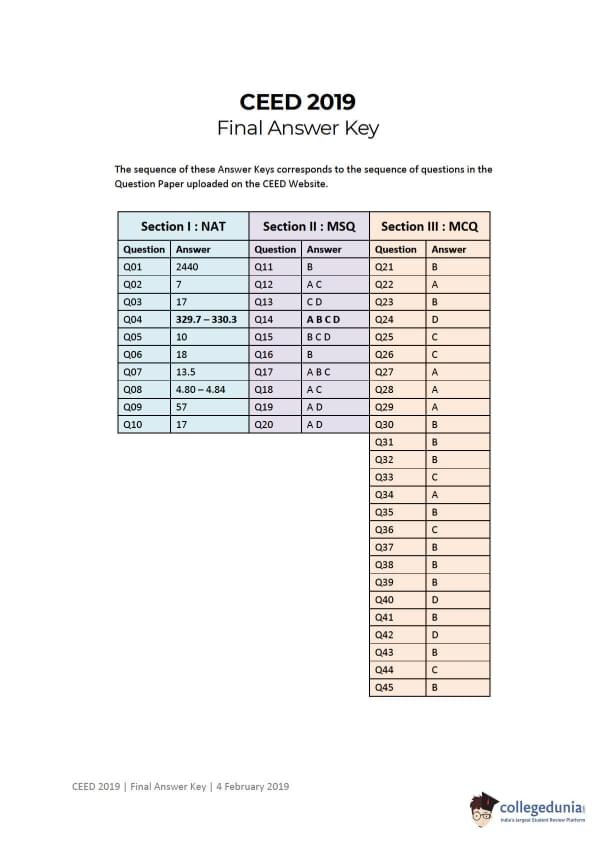
| CEED 2019 Question Paper with Solutions PDF | Check Solutions |

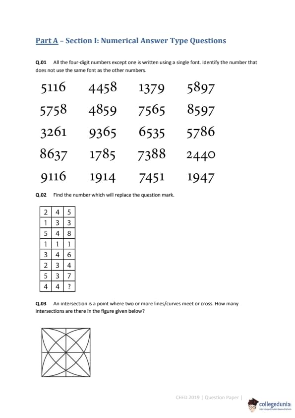
All the four-digit numbers except one is written using a single font. Identify the number that does not use the same font as the other numbers.

Find the number which will replace the question mark.

An intersection is a point where two or more lines/curves meet or cross. How many intersections are there in the figure given below?

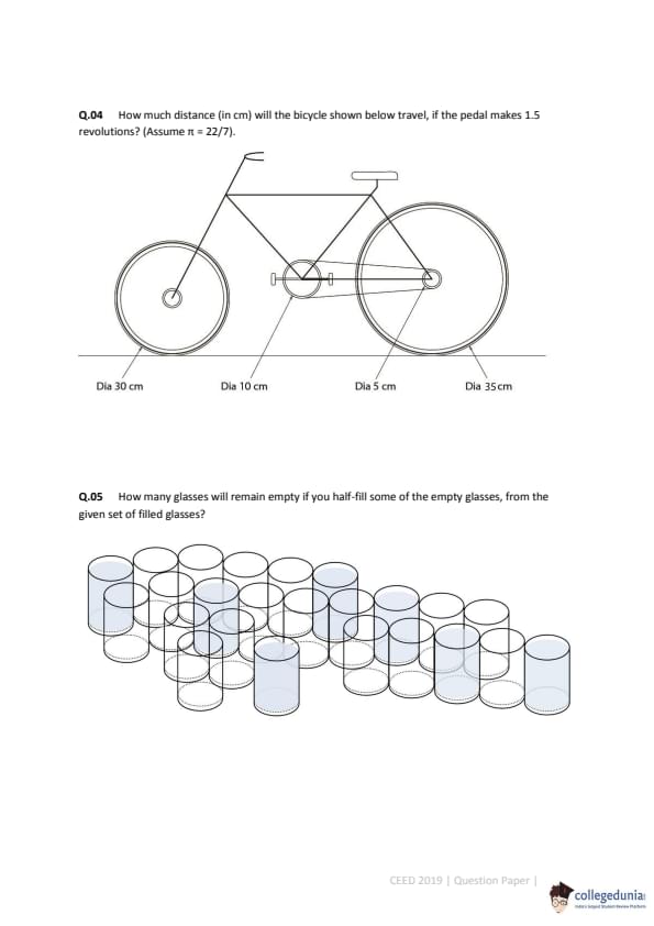
How much distance (in cm) will the bicycle shown below travel, if the pedal makes 1.5 revolutions? (Assume \(\pi = 22/7\)).

How many glasses will remain empty if you half-fill some of the empty glasses, from the given set of filled glasses?

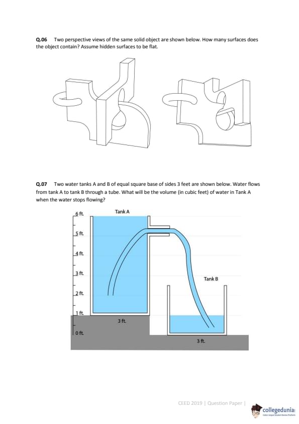
Two perspective views of the same solid object are shown below. How many surfaces does the object contain? Assume hidden surfaces to be flat.

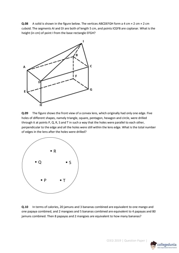
Two water tanks A and B of equal square base of sides 3 feet are shown below. Water flows from tank A to tank B through a tube. What will be the volume (in cubic feet) of water in Tank A when the water stops flowing?

A solid is shown in the figure below. The vertices ABCDEFGH form a 4 cm x 2 cm x 2 cm cuboid. The segments AI and DI are both of length 5 cm, and points I, C, G, F, B are coplanar. What is the height (in cm) of point I from the base rectangle EFGH?

The figure shows the front view of a convex lens, which originally had only one edge. Five holes of different shapes, namely triangle, square, pentagon, hexagon and circle, were drilled through it...What is the total number of edges in the lens after the holes were drilled?

In terms of calories, 20 jamuns and 3 bananas combined are equivalent to one mango and one papaya combined, and 2 mangoes and 5 bananas combined are equivalent to 4 papayas and 80 jamuns combined. Then 8 papayas and 2 mangoes are equivalent to how many bananas?
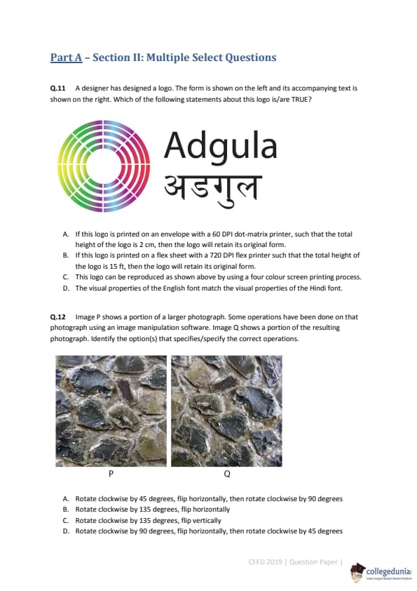
A designer has designed a logo. The form is shown on the left and its accompanying text is shown on the right. Which of the following statements about this logo is/are TRUE?

Image P shows a portion of a larger photograph. Some operations have been done on that photograph using an image manipulation software. Image Q shows a portion of the resulting photograph. Identify the option(s) that specifies/specify the correct operations.

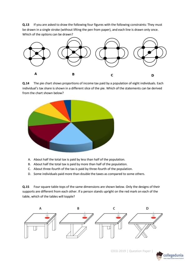
If you are asked to draw the following four figures with the following constraints: They must be drawn in a single stroke (without lifting the pen from paper), and each line is drawn only once. Which of the options can't be drawn?

The pie chart shows proportions of income tax paid by a population of eight individuals. Each individual's tax share is shown in a different slice of the pie. Which of the statements can be derived from the chart shown below?

Four square table-tops of the same dimensions are shown below. Only the designs of their supports are different from each other. If a person stands upright on the red mark on each of the table, which of the tables will topple?

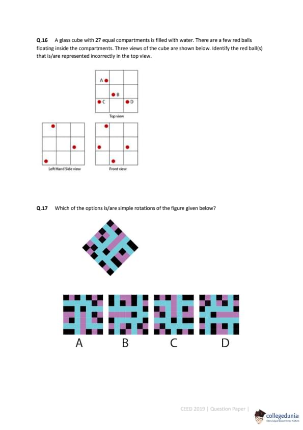
A glass cube with 27 equal compartments is filled with water. There are a few red balls floating inside the compartments. Three views of the cube are shown below. Identify the red ball(s) that is/are represented incorrectly in the top view.

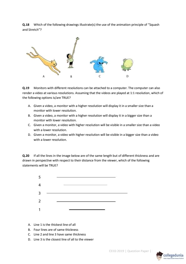
Which of the options is/are simple rotations of the figure given below?

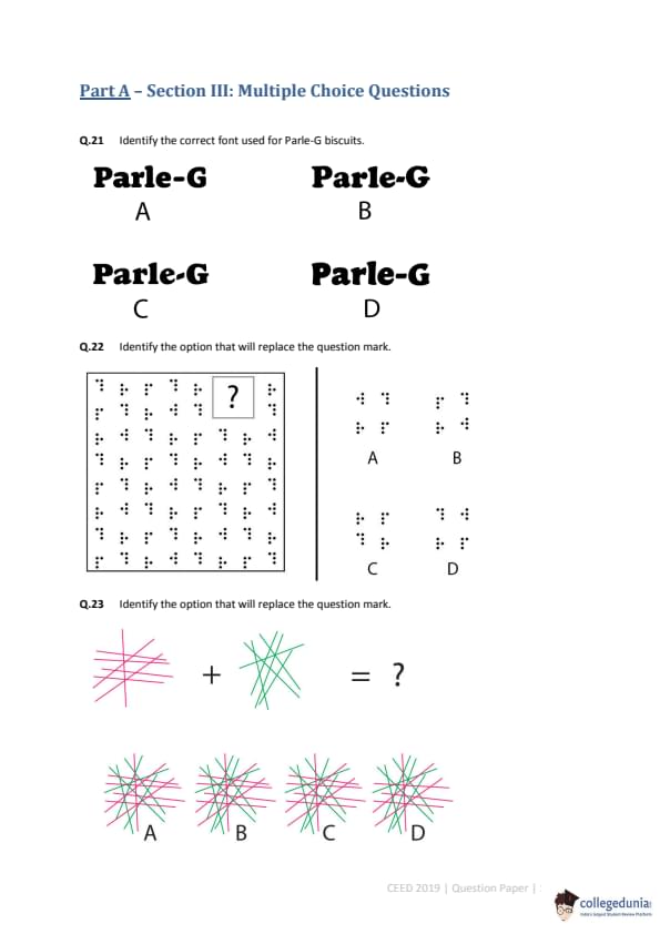
Which of the following drawings illustrate(s) the use of the animation principle of "Squash and Stretch"?

Monitors with different resolutions can be attached to a computer. The computer can also render a video at various resolutions. Assuming that the videos are played at 1:1 resolution, which of the following options is/are TRUE?
If all the lines in the image below are of the same length but of different thickness and are drawn in perspective with respect to their distance from the viewer, which of the following statements will be TRUE?

Identify the correct font used for Parle-G biscuits.
Identify the option that will replace the question mark.

Identify the option that will replace the question mark.

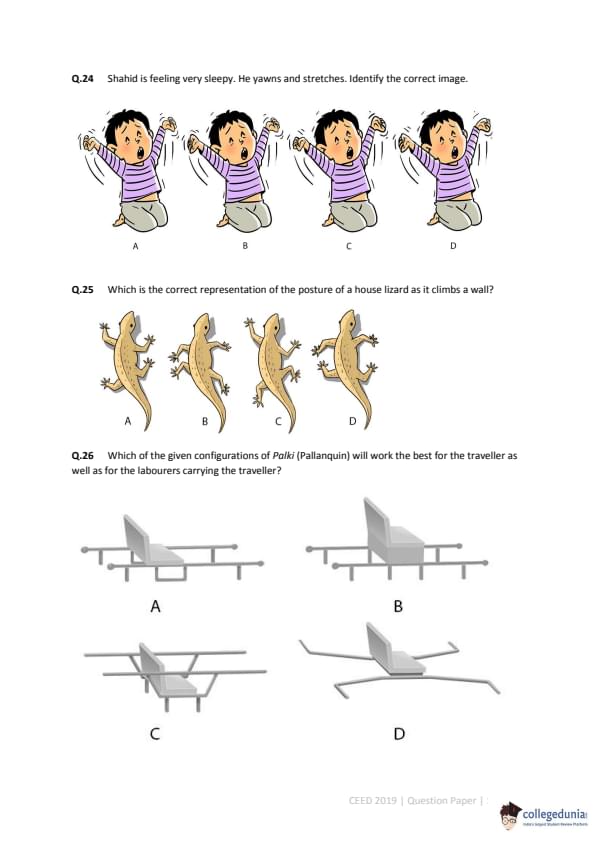
Shahid is feeling very sleepy. He yawns and stretches. Identify the correct image.

Which is the correct representation of the posture of a house lizard as it climbs a wall?

Which of the given configurations of Palki (Palanquin) will work the best for the traveller as well as for the labourers carrying the traveller?

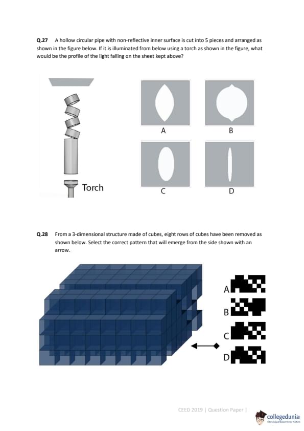
A hollow circular pipe with non-reflective inner surface is cut into 5 pieces and arranged as shown in the figure below. If it is illuminated from below using a torch as shown in the figure, what would be the profile of the light falling on the sheet kept above?

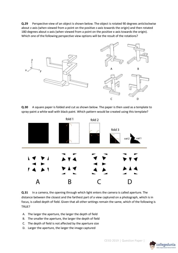
From a 3-dimensional structure made of cubes, eight rows of cubes have been removed as shown below. Select the correct pattern that will emerge from the side shown with an arrow.

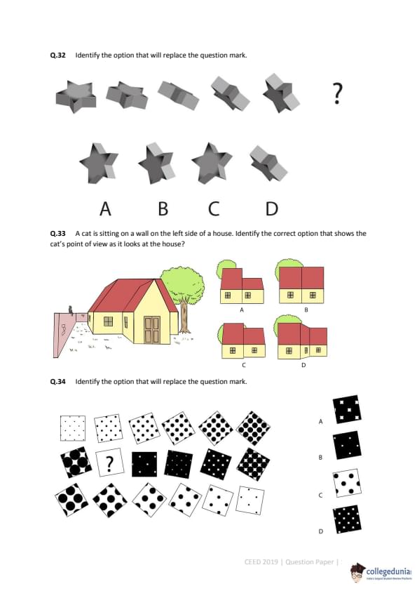
Perspective view of an object is shown below. The object is rotated 90 degrees anticlockwise about z-axis (when viewed from a point on the positive z-axis towards the origin) and then rotated 180 degrees about x-axis (when viewed from a point on the positive x-axis towards the origin). Which one of the following perspective view options will be the result of the rotations?

A square paper is folded and cut as shown below. The paper is then used as a template to spray-paint a white wall with black paint. Which pattern would be created using this template?

In a camera, the opening through which light enters the camera is called aperture. The distance between the closest and the farthest part of a view captured on a photograph, which is in focus, is called depth of field. Given that all other settings remain the same, which of the following is TRUE?
Identify the option that will replace the question mark.

A cat is sitting on a wall on the left side of a house. Identify the correct option that shows the cat's point of view as it looks at the house?

Identify the option that will replace the question mark.

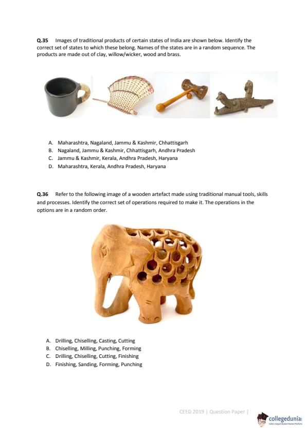
Images of traditional products of certain states of India are shown below. Identify the correct set of states to which these belong. Names of the states are in a random sequence. The products are made out of clay, willow/wicker, wood and brass.

Refer to the following image of a wooden artefact made using traditional manual tools, skills and processes. Identify the correct set of operations required to make it. The operations in the options are in a random order.

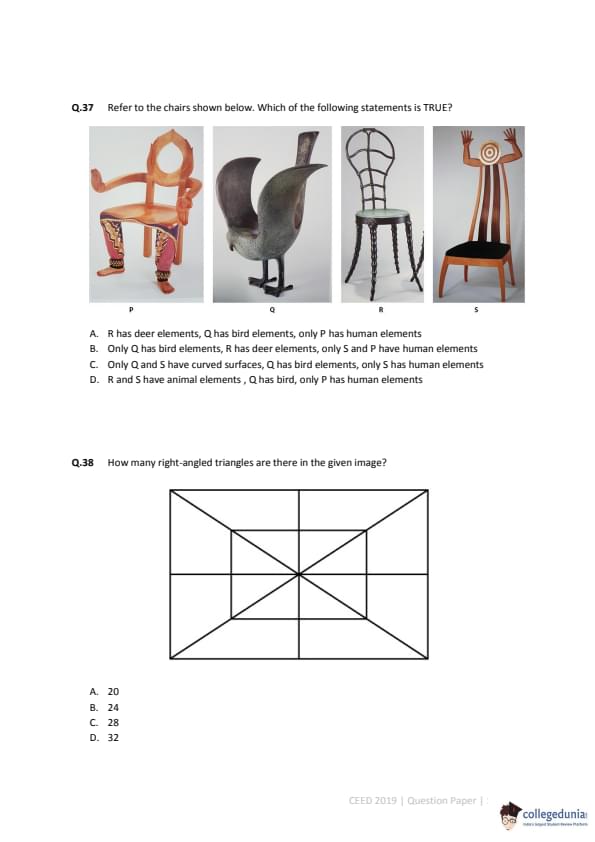
Refer to the chairs shown below. Which of the following statements is TRUE?

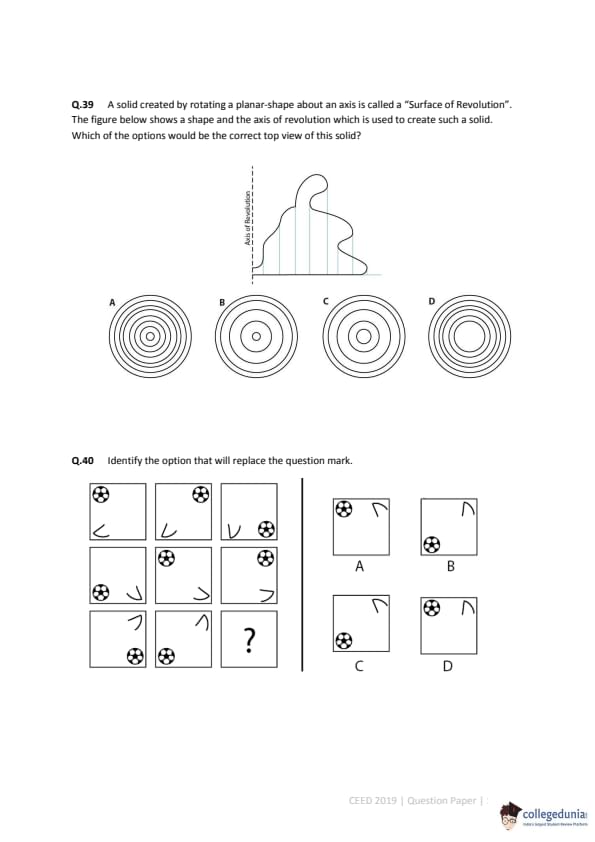
How many right-angled triangles are there in the given image?

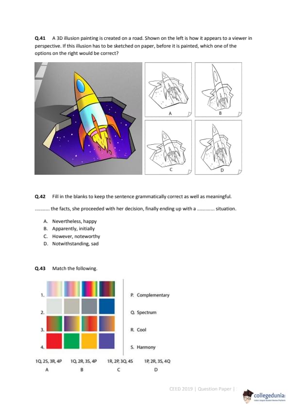
A solid created by rotating a planar-shape about an axis is called a "Surface of Revolution". The figure below shows a shape and the axis of revolution which is used to create such a solid. Which of the options would be the correct top view of this solid?

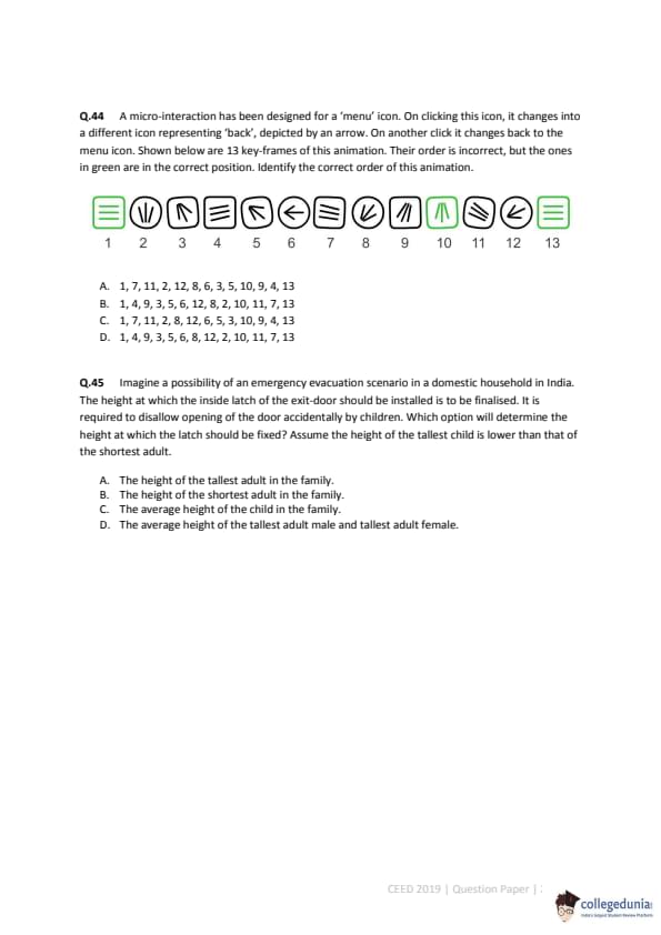
Identify the option that will replace the question mark.

A 3D illusion painting is created on a road. Shown on the left is how it appears to a viewer in perspective. If this illusion has to be sketched on paper, before it is painted, which one of the options on the right would be correct?

Fill in the blanks to keep the sentence grammatically correct as well as meaningful.
........... the facts, she proceeded with her decision, finally ending up with a ........... situation.
Match the following.
A micro-interaction has been designed for a 'menu' icon. On clicking this icon, it changes into a different icon representing 'back', depicted by an arrow. On another click it changes back to the menu icon. Shown below are 13 key-frames of this animation. Their order is incorrect, but the ones in green are in the correct position. Identify the correct order of this animation.
Imagine a possibility of an emergency evacuation scenario in a domestic household in India. The height at which the inside latch of the exit-door should be installed is to be finalised. It is required to disallow opening of the door accidentally by children. Which option will determine the height at which the latch should be fixed? Assume the height of the tallest child is lower than that of the shortest adult.
Industrial Design: During the monsoon season, drying of washed clothes at home takes a long time. The interior of the house is usually very damp. It is observed that people tend to spread the wet clothes on a chair or other furniture below a ceiling fan, to dry them. Such temporary arrangements help them cope with the problem. A leading fan manufacturing company sees a business opportunity. The company approaches you to design a product for drying clothes. The manufacturer proposes to sell this product (which is to be used during monsoons) along with a fan. The manufacturer wants the following objectives to be met in the design: a) The product uses a fan for drying clothes. b) The fan must be integrated with the product during its use in rainy season and must be usable as a "normal fan" during other seasons. c) The product should be foldable and compact for storage. Design the product as per the objectives listed above.
Communication Design: Cricket is a popular sport in India. The 12th Cricket World Cup tournament is to be held in England and Wales in 2019. India has already been a champion twice. To win the tournament for a third time, the team needs the support and wishes of a billion Indians. Design a visual campaign for the Indian cricket team to gather support and encouragement from Indians. As part of the campaign, design a 30 feet x 20 feet hoarding to be placed at prominent locations in various cities and towns.
Animation Design: An animation film for children is in the pre-production stage. The film is based on the relationship that develops between a baby and a dog as the baby grows up and the dog gets old. Given below is one scene from the film. [Scene Description follows] ...
Interaction Design: A bicycle manufacturing company has developed a device that will help cyclists find routes and navigate... Design a version of this device to be mounted on bicycles for 12 year old children.
Mobility and Vehicle Design: There are many local innovative transportation solutions that mostly operate in rural India... Design a context sensitive, safe, workable and pleasing 4-wheeler vehicle for hilly regions...
Sketching (20 marks): Draw a perspective view of a kitchen interior with a stove, kitchen utensils (such as pressure cooker, cooking pans, sauce pans etc.), dining utensils (such as ceramic plates, cups, glasses etc.), a wash basin, storage racks with stored cooking ingredients (such as spices in small plastic bottles), fresh cut vegetables kept beside the stove and at least two kitchen gadgets. Make a freehand perspective drawing of this setup, showing all the elements listed above, as seen from the point of view of a 5 ½ feet tall person.
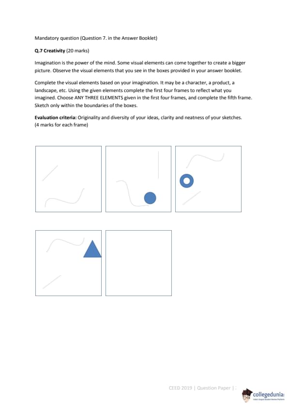
Creativity (20 marks): Imagination is the power of the mind. Some visual elements can come together to create a bigger picture. Observe the visual elements that you see in the boxes provided in your answer booklet. Complete the visual elements based on your imagination. It may be a character, a product, a landscape, etc. Using the given elements complete the first four frames to reflect what you imagined. Choose ANY THREE ELEMENTS given in the first four frames, and complete the fifth frame. Sketch only within the boundaries of the boxes.

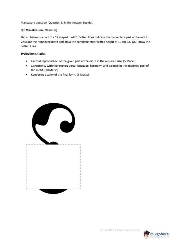
Visualization (20 marks): Shown below is a part of a "S shaped motif". Dotted lines indicate the incomplete part of the motif. Visualize the remaining motif and draw the complete motif with a height of 15 cm. DO NOT draw the dotted lines.

Comments