




The Class 12 Geography Practical Work in Geography Chapter 3 Graphical Representation of Data textbook PDF is the official NCERT source for every board and CUET question on line graphs, bar diagrams, pie diagrams, wind rose diagrams, and flow charts. It carries about 5 to 6 marks in the CBSE board exam and teaches the practical skills students need to convert raw geographical data into clear visual form.
- Official NCERT Practical Work in Geography Class 12 Chapter 3 PDF covering line graphs, polygraphs, bar diagrams, pie diagrams, wind rose diagrams, and flow charts with worked examples.
- 5-6 marks CBSE board-paper weightage for Chapter 3; the official textbook is the only source CBSE references when it sets graphical and practical questions.
- Pair with the matching NCERT Solutions, Notes and Handwritten Notes for full chapter coverage.
Student Feedback
In a 2026 Collegedunia poll of 9,200 students, 81% said reading this NCERT PDF improved their answers on graphical methods more than any guide book.
What This Chapter Covers in the NCERT Class 12 Book
The graphical representation of data class 12 geography chapter teaches students to turn raw numbers into visual forms that make patterns immediately visible. The official NCERT PDF is the only document CBSE references for practical and short-answer questions here, so students preparing for the 2026-27 board paper should work through every example before any guide book.
The PDF first states the three general rules for any diagram (suitable method, suitable scale, and design components like title, legend, and direction), then works through line graphs, polygraphs, four bar-diagram variants, pie diagrams, wind rose diagrams, and flow charts, each illustrated with Indian data on population, sex ratio, rainfall, literacy, electricity, and trade.
Source: Magnet Brains on YouTube
Topics in the Chapter (Section-Wise Map of the NCERT PDF)
The table below maps each section of the practical work in geography class 12 chapter 3 PDF to its diagram type and dominant exam concept.
| Section | NCERT Sub-topic | Dominant Exam Concept |
|---|---|---|
| Intro | Representation of Data | Definition of graphical representation; Chinese proverb "a picture = thousands of words" |
| General Rules | Selection of method, scale, design | Three rules: suitable method, suitable scale, design components (title, legend, direction) |
| 3.1 | Line Graph and Polygraph | Time-series data (temperature, rainfall, population growth); plotting dots and joining by freehand |
| 3.2 | Bar Diagram (Simple, Multiple, Compound) | Equal width bars; ascending/descending order for comparison; stacked bars for components |
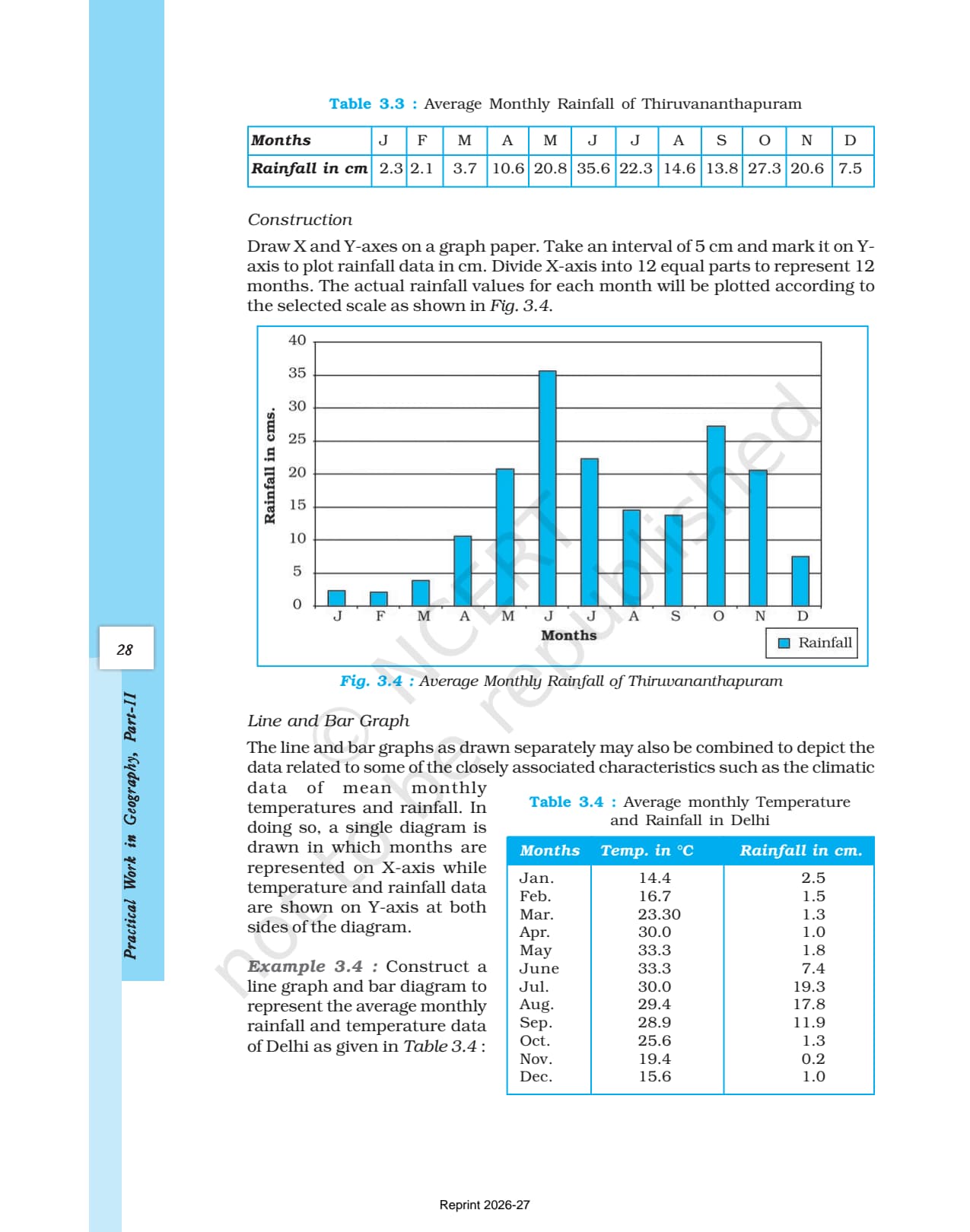
| 3.3 | Line and Bar Graph (Climograph) | Combined diagram for temperature (line) and rainfall (bar) on shared X-axis |
| 3.4 | Pie Diagram | Angle = (value / total) x 360; convert percentage to degrees by multiplying by 3.6 |
| 3.5 | Wind Rose and Star Diagram | Frequency of wind direction; radial lines proportional to percentage frequency |
| 3.6 | Flow Chart | Thickness of arrow proportional to volume of flow (trade, migration, traffic) |
Bar diagrams and pie diagrams contribute the largest share of board-paper questions, because they need both correct construction and accurate calculation of angles or bar heights, which examiners can check precisely.
Key Concepts From the NCERT Class 12 Geography Textbook
Reproducing these NCERT methods and definitions in the board paper is the fastest route to full marks, because examiners check both the construction and the labelling of titles, legends, and axes.
General Rules for Drawing Graphs and Diagrams
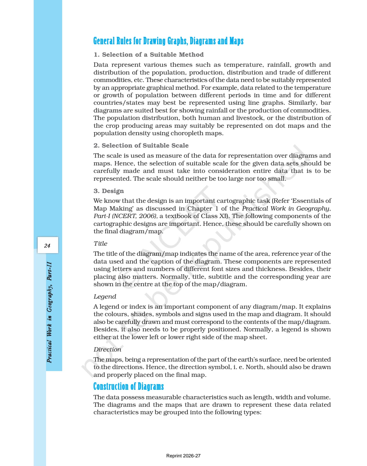
Three general rules apply to every diagram. Rule 1 (suitable method): match the diagram to the data (line graphs for time-series, bar diagrams for comparison, dot and choropleth maps for distribution). Rule 2 (suitable scale): the scale must fit all values, neither too large nor too small. Rule 3 (design): every diagram needs a title (area, year, caption), a legend for all colours and symbols, and a north arrow if it is a map. Examiners deduct marks if any design component is missing.
Line Graph and Polygraph
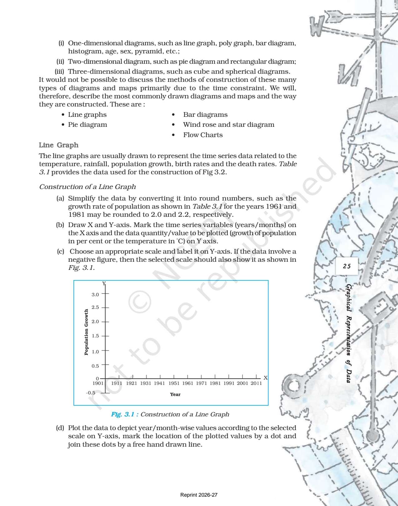
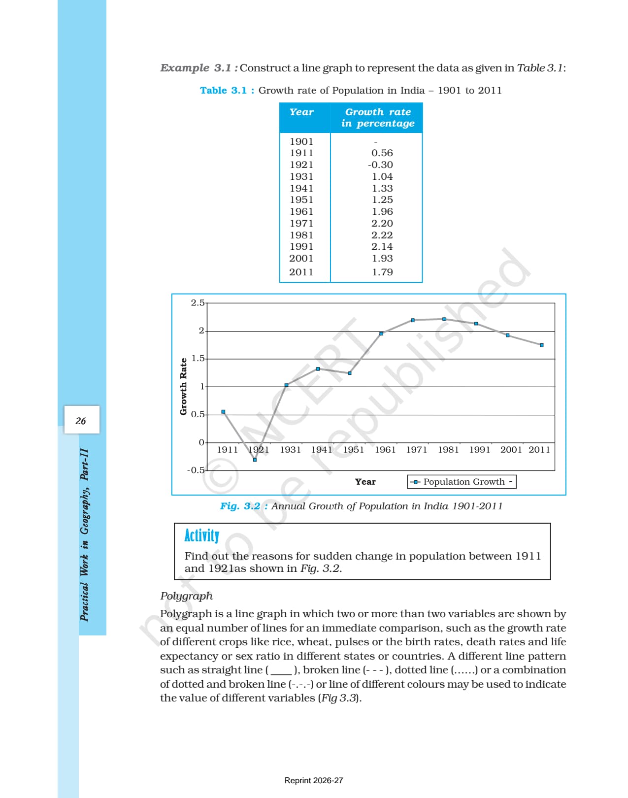
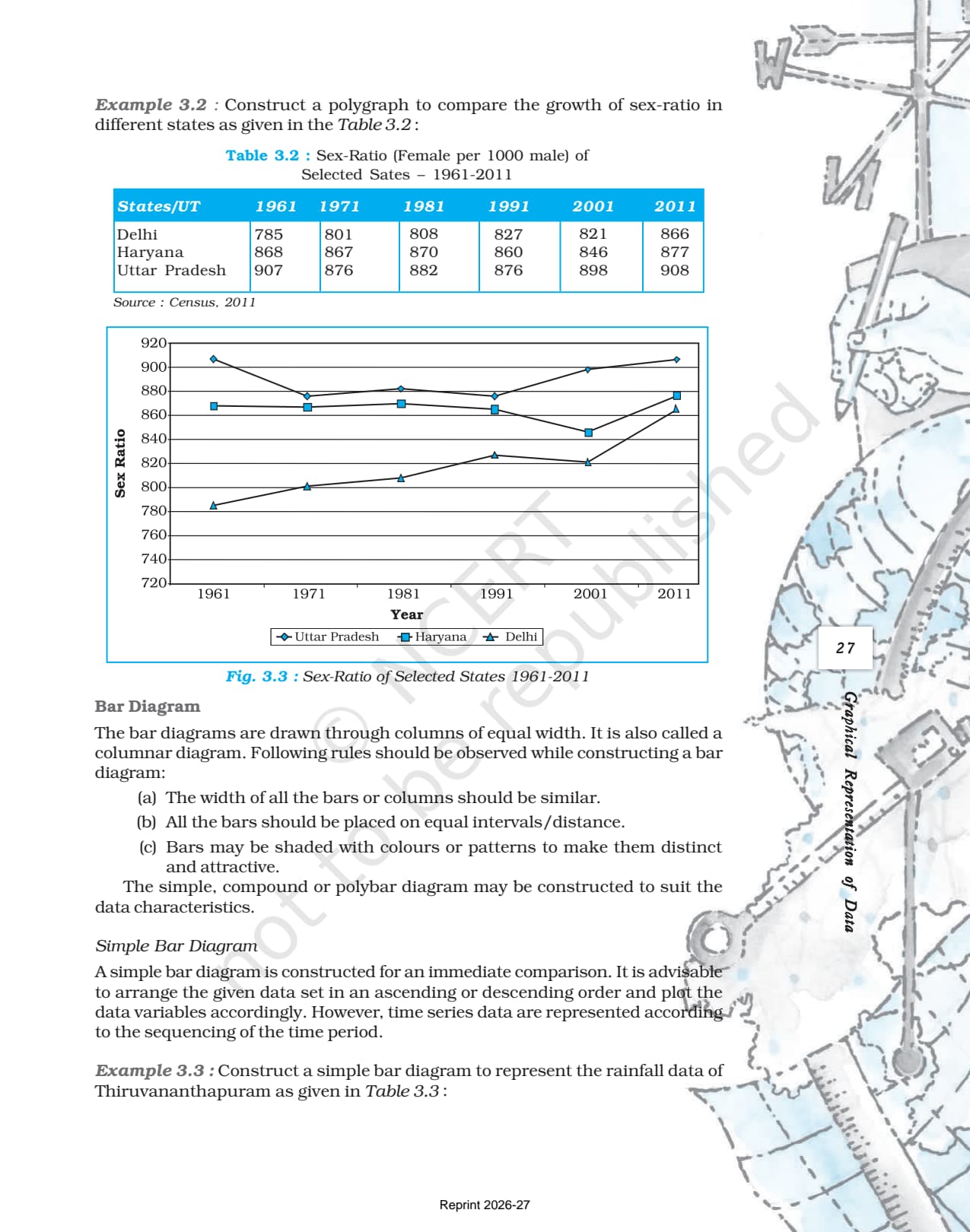
Line graphs show time-series data such as temperature, rainfall, and population growth. Construction: simplify data to round numbers, draw the axes with time on X and the quantity on Y, choose a suitable Y scale (extending below zero if needed), plot each value as a dot, and join the dots by a freehand line. A polygraph shows two or more variables on one set of axes using different line patterns (straight, broken, dotted, dash-dot). The NCERT polygraph example uses sex-ratio data for Delhi, Haryana, and Uttar Pradesh from the 1961 to 2011 census, a board-exam favourite.
Bar Diagrams (Simple, Multiple, Compound)
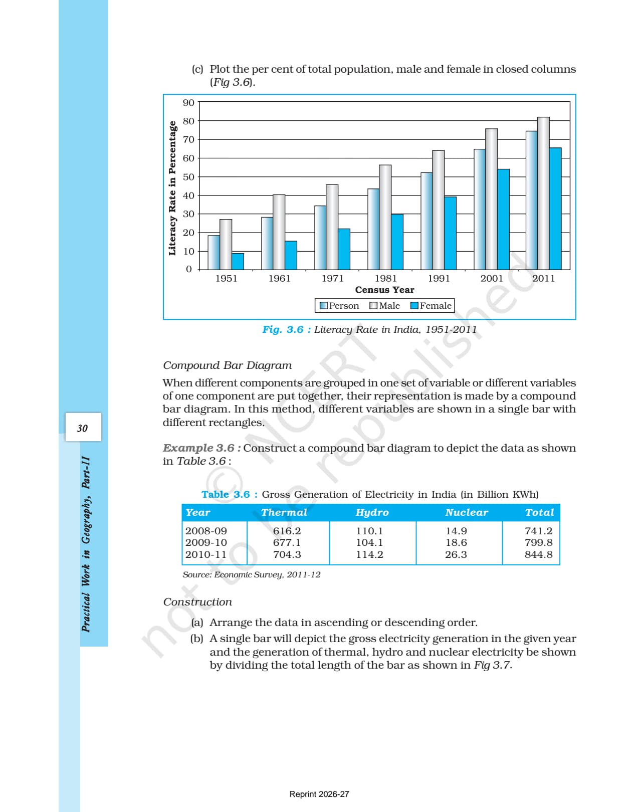
Bar diagrams use columns of equal width and equal spacing, with shading to distinguish them. A simple bar diagram shows one variable, best drawn in ascending or descending order. A multiple bar diagram places bars side by side per group, suited to male-female literacy or crop areas. A compound bar diagram stacks components inside one bar (thermal, hydro, nuclear electricity) to show the total and composition together. The NCERT example uses electricity generation data (Thermal 704.3, Hydro 114.2, Nuclear 26.3 billion KWh in 2010-11).
Pie Diagram and the Angle Formula
A pie diagram (divided circle diagram) splits a circle into sectors. The angle of each sector is (value of region / total value) x 360; for percentages, multiply by 3.6. The NCERT example uses India's 2010-11 exports (Asia and ASEAN 56.2%, Europe 20.2%, America 14.8%, Africa 6.5%, Others 2.3%). Arrange data in ascending order before plotting and label each sector with the region name and percentage.
Previous Year Question Trends From This Chapter
The class 12 geography practical work chapter 3 important questions follow a consistent pattern; students preparing for 2026-27 should expect a similar distribution. This chapter has contributed 5 to 6 marks across recent board papers, mainly through construction-type questions where students draw and label a complete diagram.
| Year | Marks | Question Types | Most Common Topic |
|---|---|---|---|
| 2025 | 5 | 1 MCQ + 1 construction question (5 marks) | Bar diagram construction with literacy data |
| 2024 | 6 | 1 MCQ + 1 short answer + 1 construction | Pie diagram with angle calculation |
| 2023 | 5 | 2 MCQs + 1 construction question | Line graph and polygraph interpretation |
| 2022 | 5 | 1 short answer + 1 construction question | Compound bar diagram for electricity data |
| 2020 | 6 | 1 MCQ + 1 two-mark + 1 construction | Pie diagram or bar diagram with Indian data |
The most repeated type is a five-mark construction question to draw a bar or pie diagram from a data table, with full marks only when it has a title, labelled axes, a legend, correct shading, and values plotted to scale.
Connecting This Chapter to the Rest of Practical Work in Geography
This chapter is the practical core of the book. Data collected in Chapter 1 and processed in Chapter 2 become the tables students visualise here, while Chapter 4 (Spatial Information Technology) uses computerised forms of the same principles. Construction questions carry five marks each, so a large share of the practical paper tests skills from this chapter.
| Related Chapter | Connection to Chapter 3 |
|---|---|
| Chapter 1: Data Its Source and Compilation | Primary and secondary data collected in Chapter 1 become the tables that students graph in Chapter 3 |
| Chapter 2: Data Processing | Measures of central tendency and frequency distributions from Chapter 2 are the data inputs for polygraphs and bar diagrams in Chapter 3 |
| Chapter 4: Spatial Information Technology | GIS and remote sensing in Chapter 4 use computerised mapping that builds on the manual cartographic principles established in Chapter 3 |
Quick Glossary From the NCERT Chapter
Students should be able to define each of these testable terms in a single line for one- and two-mark answers.
- Graphical representation: Transformation of data through visual methods like graphs, diagrams, maps, and charts to make patterns easy to understand and compare.
- Line graph: A graph drawn by plotting values as dots and joining them by a freehand line; used for time-series data such as temperature, rainfall, and population growth rates.
- Polygraph: A line graph showing two or more variables simultaneously using different line patterns (straight, broken, dotted) for direct comparison.
- Bar diagram: A diagram using columns of equal width placed at equal intervals; bars may be simple, multiple, or compound.
- Compound bar diagram: A bar diagram where different components of a total are stacked inside a single bar to show both totals and composition.
- Pie diagram: A circular diagram where the total value is represented by a full circle and sub-sets are represented by sectors; also called a divided circle diagram.
- Wind rose diagram: A radial diagram showing the frequency of wind from different compass directions; the length of each radial line is proportional to the percentage frequency of wind from that direction.
- Flow chart: A diagram using arrows of varying thickness to show the volume of movement (trade, migration, traffic) between places on a map.
- Legend: A key explaining the colours, shades, symbols, and signs used in a diagram or map.
Also Explore Other Resources for Class 12 Geography Chapter 3
| Resource | Link |
|---|---|
| NCERT Solutions | Class 12 Geography Chapter 3 PWG NCERT Solutions |
| Revision Notes | Class 12 Geography Chapter 3 PWG Notes |
| Handwritten Notes | Class 12 Geography Chapter 3 PWG Handwritten Notes |
| Subject Hub | Class 12 Geography All Chapters |
All Chapters: Class 12 Geography NCERT Book PDF (Practical Work in Geography)
| Chapter | NCERT Book PDF |
|---|---|
| Chapter 1 | Data: Its Source and Compilation NCERT Book PDF |
| Chapter 2 | Data Processing NCERT Book PDF |
| Chapter 3 | Graphical Representation of Data NCERT Book PDF (You are here) |
| Chapter 4 | Spatial Information Technology NCERT Book PDF |
Frequently Asked Questions on Class 12 Geography Chapter 3 PWG NCERT Book PDF
Ques. Where can students download the official NCERT Class 12 Geography Practical Work Chapter 3 PDF?
Ans. Students can download the official graphical representation of data class 12 NCERT book PDF directly from the download card at the top of this page. The PDF is the single-chapter file from the Practical Work in Geography textbook, aligned to the 2026-27 CBSE syllabus and covering all six diagram types with worked examples.
Ques. What are the three general rules for drawing graphs and diagrams according to the NCERT textbook?
Ans. The three general rules stated in the NCERT chapter are: (1) Selection of a suitable method - match the diagram type to the nature of the data (line graph for time-series, bar for comparison, choropleth for density); (2) Selection of a suitable scale - accommodate all values without making the diagram too large or too small; (3) Design - every diagram must carry a title (area, year, caption), a legend explaining all symbols and shading, and a north arrow if it is a map.
Ques. What is the formula for calculating angles in a pie diagram as given in the NCERT Class 12 Geography chapter?
Ans. The NCERT gives two formulas. When data are in actual values: angle = (value of given region / total value of all regions) x 360. When data are already in percentage form: angle = percentage x 3.6 (because 360 / 100 = 3.6). Students should arrange the data in ascending order before calculating and plotting, then label each sector with both its name and percentage value.
Ques. What is the difference between a simple bar diagram, a multiple bar diagram, and a compound bar diagram?
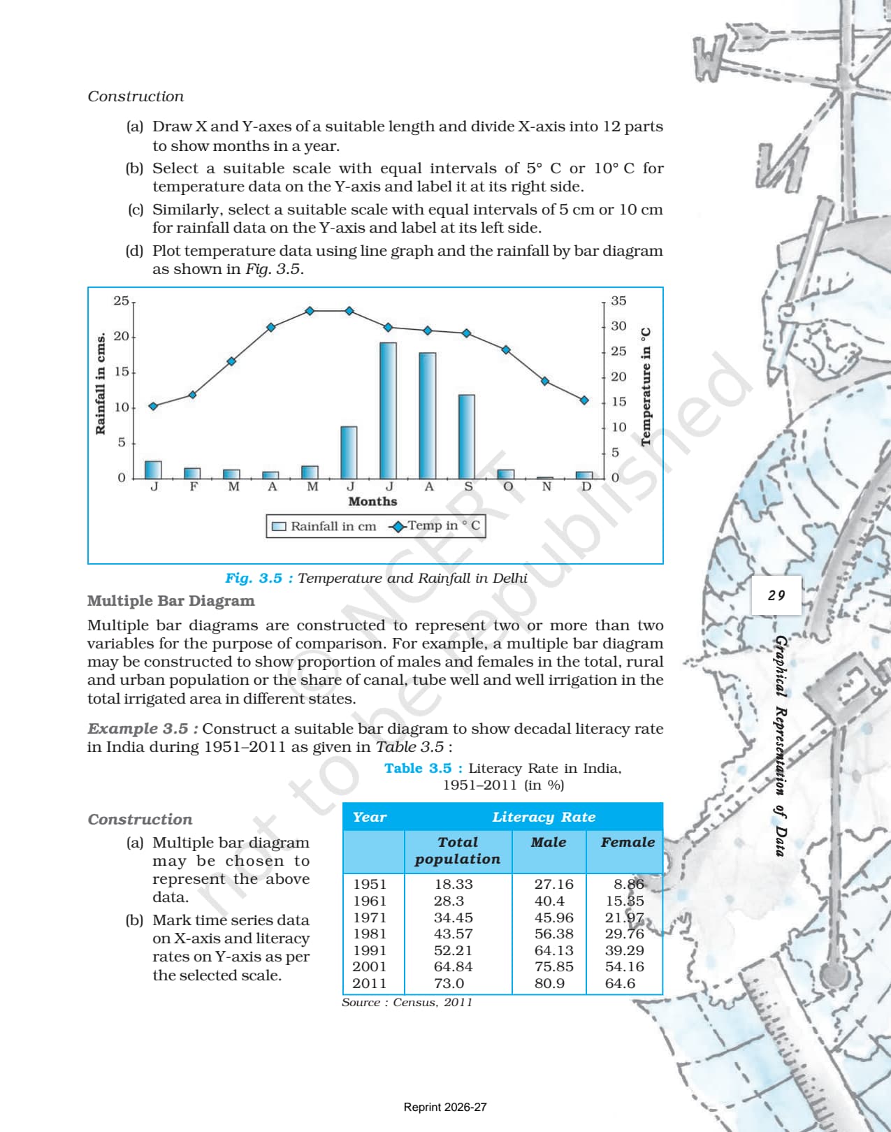
Ans. A simple bar diagram uses one bar per variable and is best for immediate comparison of a single variable across categories or time periods. A multiple bar diagram places two or more bars side by side in each group to compare several variables simultaneously (for example, male, female, and total literacy rates). A compound bar diagram stacks different components inside a single bar to show both the total and the composition at the same time (for example, thermal, hydro, and nuclear electricity within total power generation).
Ques. What is a polygraph and when should students use it according to the NCERT textbook?
Ans. A polygraph is a line graph in which two or more variables are shown simultaneously using the same pair of axes but different line patterns: straight, broken, dotted, or dash-dot. It is used when students want to compare the trend of multiple related variables at a glance, such as the sex ratio in Delhi, Haryana, and Uttar Pradesh across census years, or the birth rate, death rate, and life expectancy over time. Different line patterns make each variable visually distinct without needing separate diagrams.
Ques. What is a wind rose diagram and how is it constructed as per the NCERT?
Ans. A wind rose diagram is a radial diagram that shows the frequency of wind from different compass directions at a given station. To construct it, draw radial lines outward from the centre in each main compass direction (North, NE, East, SE, South, SW, West, NW). The length of each radial line is drawn proportional to the percentage frequency of wind blowing from that direction. The diagram shows at a glance which direction dominates wind flow at that location. A star diagram follows the same construction but is used for any directional frequency data.
Ques. What is a flow chart in geography and how is it different from other diagrams?
Ans. A flow chart in geography uses arrows drawn on a map or diagram where the thickness of the arrow is proportional to the volume of movement (trade between countries, migration between states, traffic on roads). This makes it different from bar and pie diagrams, which show values at fixed locations. Flow charts show movement between places, so they are used to represent export-import flows, migration patterns, or traffic density on road networks. The thicker the arrow, the larger the volume of flow it represents.
Ques. Which diagram type does the NCERT recommend for time-series data?
Ans. The NCERT recommends line graphs for time-series data, which means data recorded at regular intervals over time such as annual temperature, monthly rainfall, decadal population growth rates, or year-wise birth and death rates. Time is plotted on the X-axis and the measured quantity on the Y-axis. When the scale on the Y-axis needs to include negative values (as in a year with negative population growth), the axis is extended below zero, as shown in the NCERT worked example using India's population growth rate data from 1901 to 2011.
Ques. What are the five end-of-chapter exercises in the NCERT Class 12 Geography Chapter 3?
Ans. The NCERT chapter ends with five practical exercises. Exercise 1 asks students to represent a two-variable data set with a suitable diagram. Exercise 2 asks for a polygraph to show literacy ratio, enrolment ratio, and gender breakdown for 1950-51 and 1999-2000. Exercise 3 asks for a pie diagram showing India's land use in 1950-51 and 1998-2001. Exercise 4 asks students to construct a multiple bar diagram, a pie diagram, a dot map, and a choropleth map using rice area and production data for six states. Exercise 5 asks for a suitable diagram to show temperature and rainfall data for Kolkata.
Ques. Is the Class 12 Geography Practical Work syllabus changing for 2026-27?
Ans. No major changes have been announced. The Practical Work in Geography textbook chapter structure remains the same for 2026-27, and the official NCERT PDF available on this page is aligned to the 2026-27 CBSE syllabus. CBSE marking schemes continue to reward correct construction with full cartographic design components (title, legend, labelled axes) in practical questions.
Ques. What is the best order to use the NCERT PDF, Notes, and Solutions for Class 12 Geography Practical Work Chapter 3?
Ans. Read the NCERT PDF with graph paper beside you, constructing each worked example as you read. Then open the Class 12 Geography Chapter 3 PWG Notes to review the construction steps in condensed form. Attempt all five end-of-chapter exercises and check them against the NCERT Solutions. Use the handwritten notes the night before the exam to revise the pie formula, bar diagram rules, and cartographic design components.



Comments