


UP Board Class 10 Chitrakala Question Paper 2025 PDF (Code 830 DB) with Answer Key and Solutions PDF is available for download here. UP Board Class 10 exams were conducted between February 24th to March 12th 2025. The total marks for the theory paper were 70. Students reported the paper to be easy to moderate.
UP Board Class 10 Chitrakala Question Paper 2025 (Code 830 DB) with Solutions
| UP Board Class 10 Chitrakala (830 DB) Question Paper with Answer Key | Check Solutions |

How many types of design are there in terms of texture?
View Solution
Step 1: Understanding texture in design
Texture in design refers to the surface quality of an object or artwork. It gives a sense of how things might feel if touched. Texture can be visual (seen) or tactile (felt). In the field of design and art, texture plays a very important role in adding depth, dimension, and realism.
Step 2: Types of texture-based design
There are generally four types of designs in terms of texture:
1. Actual (Tactile) Texture – The real texture that can be physically felt by touching (e.g., roughness of stone, smoothness of glass).
2. Visual (Implied) Texture – The illusion of texture created on a flat surface through artistic techniques (e.g., painting fur, wood grain).
3. Invented Texture – A created or imaginative texture that does not represent reality but adds creativity (e.g., abstract patterns, symbolic textures).
4. Simulated Texture – When a two-dimensional design is made to look like a real texture (e.g., wallpaper prints mimicking bricks or fabric).
Step 3: Eliminating incorrect options
- Option (A) Three → Incorrect, since there are four standard classifications.
- Option (B) Two → Incorrect, as texture is studied in more than two ways.
- Option (C) Four → Correct, as explained above.
- Option (D) Six → Incorrect, as design textbooks and art theory generally list four types, not six.
Step 4: Conclusion
Therefore, the number of design types in terms of texture is Four.
\[ \boxed{Four} \] Quick Tip: In design theory, always remember: textures are classified into four main types—Actual, Visual, Invented, and Simulated. This helps artists create depth and illusion in artworks.
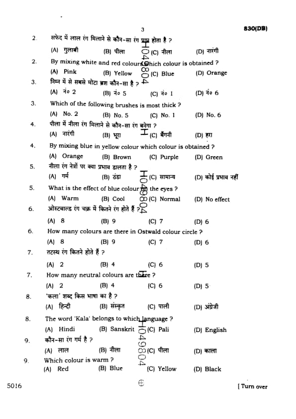
By mixing white and red colours, which colour is obtained?
View Solution
Step 1: Understanding the mixing of colours
In colour theory, when we mix two colours, the resulting shade depends on whether we are using additive (light-based) or subtractive (pigment/paint-based) colour mixing.
Here, since the question is about painting colours, we are dealing with the subtractive method.
Step 2: White and Red combination
- White is not a strong pigment; instead, it is used to lighten any colour.
- Red is a primary colour.
- When red pigment is mixed with white pigment, the red colour becomes lighter and softer.
Step 3: Resulting colour
Mixing white with red produces a light red shade, commonly known as Pink.
This is a widely accepted principle in both art and design.
Step 4: Elimination of incorrect options
- Option (B) Yellow: Made by mixing red and green (light) or other pigments, not by red + white.
- Option (C) Blue: A primary colour itself, not formed by mixing red and white.
- Option (D) Orange: Formed by mixing red and yellow, not red and white.
Conclusion:
Therefore, the correct answer is clearly:
\[ \boxed{Pink} \] Quick Tip: Remember: Adding white to any colour produces a lighter shade of that colour. For example, red + white = pink, blue + white = light blue.
Which of the following brushes is most thick?
View Solution
Step 1: Understanding brush numbers
Brushes are identified by numbers that denote their thickness and size. Smaller numbers such as No. 1 or No. 2 are fine brushes, while larger numbers such as No. 5 or No. 6 indicate thicker brushes.
Step 2: Comparing the given options
- No. 1 → the thinnest brush, used for detailing.
- No. 2 → thin, but slightly thicker than No. 1.
- No. 5 → medium thickness brush.
- No. 6 → the thickest among these options, used for broad strokes and filling backgrounds.
Step 3: Conclusion
Thus, the thickest brush among the given choices is:
\[ \boxed{No. 6} \] Quick Tip: Always remember: larger brush numbers mean thicker brushes. Use thin brushes for fine details and thick brushes for bold strokes.
By mixing blue in yellow colour which colour is obtained?
View Solution
Step 1: Primary and secondary colours
The three primary colours are red, blue, and yellow. By mixing any two of them, we obtain secondary colours.
Step 2: Mixing blue and yellow
When blue is mixed with yellow, the resulting secondary colour is green.
Step 3: Eliminating wrong options
- Orange → obtained from red + yellow.
- Brown → obtained by mixing complementary colours, not blue and yellow.
- Purple → obtained from red + blue.
- Green → correctly obtained from yellow + blue.
Step 4: Conclusion
Therefore, the correct resulting colour is:
\[ \boxed{Green} \] Quick Tip: Secondary colour rule: Red + Yellow = Orange, Yellow + Blue = Green, Blue + Red = Purple.
What is the effect of blue colour on the eyes?
View Solution
Step 1: Understanding blue colour
Blue is considered one of the primary colours in both light and pigment colour systems. It is often associated with water, sky, and calmness.
Step 2: Psychological effect of blue
Blue has a calming and soothing effect on the human eye and mind. It reduces tension, creates a feeling of relaxation, and is widely recognized as a cool colour in colour theory.
Step 3: Elimination of incorrect options
- (A) Warm: Warm colours are red, orange, and yellow, not blue.
- (C) Normal: Blue produces a distinct emotional effect, so not neutral.
- (D) No effect: Incorrect, because blue does have a cooling and soothing effect.
Conclusion:
Thus, blue colour produces a cool effect on the eyes.
\[ \boxed{Cool} \] Quick Tip: Remember: Red, orange, and yellow are warm colours, while blue, green, and violet are cool colours in colour psychology.
How many colours are there in Ostwald colour circle?
View Solution
Step 1: Understanding Ostwald colour circle
The Ostwald colour system was developed by Wilhelm Ostwald, a German chemist, in the early 20th century. It was designed to scientifically organize colours based on hue, saturation, and brightness.
Step 2: The main colours in the Ostwald circle
The Ostwald colour circle is based on 8 main hues. These 8 colours are arranged systematically around the circle. Between these 8, mixtures are created to form intermediate shades, but the basic structure is made of 8.
Step 3: Elimination of incorrect options
- (B) 9: Incorrect, Ostwald’s circle has 8 and not 9.
- (C) 7: Wrong, 7 is generally linked with rainbow (VIBGYOR), not Ostwald’s theory.
- (D) 6: This relates to primary + secondary colours, not Ostwald’s full system.
Conclusion:
Therefore, the Ostwald colour circle contains 8 colours.
\[ \boxed{8} \] Quick Tip: In colour theory, Newton’s prism experiment gave 7 colours of light, but Ostwald’s colour circle is a scientific model with 8 basic hues.
How many neutral colours are there?
View Solution
Step 1: Understanding neutral colours
Neutral colours are those which do not appear on the colour wheel and are considered "balanced" colours. They are neither warm nor cool and are often used to provide background or support to brighter colours.
Step 2: Standard neutral colours
The four main neutral colours are:
1. Black
2. White
3. Grey
4. Brown
Step 3: Why not more or less?
- If only 2 were considered, that would usually mean black and white, but art theory recognizes more than that.
- 5 or 6 would include tints and shades, but in standard art theory, the recognized set of neutral colours is 4.
Step 4: Conclusion
Thus, the number of neutral colours is:
\[ \boxed{4} \] Quick Tip: Neutral colours (black, white, grey, brown) are often used to balance strong colours in design and make compositions look more natural.
The word 'Kala' belongs to which language?
View Solution
Step 1: Understanding the word 'Kala'
The word 'Kala' has multiple meanings, such as "art," "skill," "time," and "black" depending on the context. It is widely used in Indian classical literature, art, and philosophy.
Step 2: Linguistic origin
The root of 'Kala' is in the Sanskrit language, one of the oldest Indo-Aryan languages. Sanskrit texts such as the Vedas and Upanishads frequently use 'Kala' to denote both time and art.
Step 3: Eliminating incorrect options
- Hindi → Derived from Sanskrit, but 'Kala' originates earlier.
- Pali → Related to Sanskrit but does not hold the original root.
- English → Borrowed words only, not the source.
Step 4: Conclusion
Therefore, the correct answer is:
\[ \boxed{Sanskrit} \] Quick Tip: Remember: Many cultural and artistic terms in Indian languages (like 'Kala' for art) have their origins in Sanskrit, the mother of most Indian languages.
Which colour is warm?
View Solution
Step 1: Warm vs. Cool colours
Colours are generally divided into two categories: warm colours and cool colours.
- Warm colours include red, orange, and yellow.
- Cool colours include blue, green, and violet.
Step 2: Effect of Red colour
Red is one of the primary colours and is strongly associated with warmth, energy, passion, and fire. It gives a feeling of heat and intensity.
Step 3: Elimination of incorrect options
- (B) Blue: Blue is a cool colour, associated with calmness and water.
- (C) Yellow: Though yellow is also a warm colour, in the given options, red is the most prominent answer.
- (D) Black: Black is a neutral/achromatic colour, not categorized as warm.
Conclusion:
Among the given choices, Red is the correct warm colour.
\[ \boxed{Red} \] Quick Tip: Warm colours (red, orange, yellow) create energy and excitement, while cool colours (blue, green, violet) create calmness and relaxation.
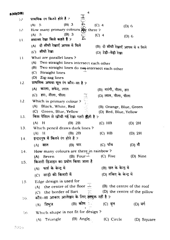
How many primary colours are there?
View Solution
Step 1: Definition of primary colours
Primary colours are the fundamental colours that cannot be created by mixing other colours. They serve as the base for creating all other colours.
Step 2: Types of primary colours
In traditional pigment (subtractive) theory: the primary colours are Red, Yellow, and Blue.
In modern light (additive) theory: the primary colours are Red, Green, and Blue (RGB).
Step 3: Elimination of incorrect options
- (A) 5: Incorrect, as standard systems recognize 3 primary colours.
- (C) 4: Incorrect, no standard system uses 4 primaries.
- (D) 6: Incorrect, 6 refers to primary + secondary, not primaries alone.
Conclusion:
The universally accepted number of primary colours is 3.
\[ \boxed{3} \] Quick Tip: Remember: In pigments (RYB) the primaries are Red, Yellow, Blue; in light (RGB) the primaries are Red, Green, Blue. In both systems, there are always 3 primary colours.
What are parallel lines?
View Solution
Step 1: Definition of parallel lines
Parallel lines are defined as two straight lines that are always the same distance apart and never meet, no matter how far they are extended in either direction.
Step 2: Checking the options
- (A) Incorrect: If two straight lines intersect each other, they are not parallel.
- (B) Correct: Parallel lines are precisely the ones that do not intersect each other.
- (C) Incorrect: "Straight lines" is too general and does not define parallelism.
- (D) Incorrect: Zig-zag lines are not straight and cannot be parallel.
Step 3: Conclusion
Thus, parallel lines are correctly described as:
\[ \boxed{Two straight lines do not intersect each other} \] Quick Tip: A simple way to remember: railway tracks are the best example of parallel lines—they never meet and remain the same distance apart.
Which is primary colour?
View Solution
Step 1: Understanding primary colours
Primary colours are the base colours that cannot be created by mixing any other colours. They are the foundation for all other colours in the colour wheel.
Step 2: Identifying the three primary colours
The three primary colours are: Red, Blue, and Yellow.
By mixing these, we obtain secondary colours:
- Red + Yellow = Orange
- Yellow + Blue = Green
- Blue + Red = Purple
Step 3: Eliminating incorrect options
- (A) Incorrect: Black and White are neutral colours, not primary.
- (B) Incorrect: Orange and Green are secondary colours.
- (C) Incorrect: Green is a secondary colour, not primary.
- (D) Correct: Red, Blue, Yellow are the three primary colours.
Step 4: Conclusion
Therefore, the correct set of primary colours is:
\[ \boxed{Red, Blue, Yellow} \] Quick Tip: Primary colours are the building blocks of all other colours. By mixing them, you can create the entire colour spectrum.
Which pencil draws dark lines?
View Solution
Step 1: Understanding pencil grades
Pencils are graded on a scale from hard (H) to black (B).
- H pencils contain harder graphite and make lighter lines.
- B pencils contain softer graphite and make darker lines.
- HB is a middle grade (Hard + Black), producing medium lines.
Step 2: Identifying the darkest option
Among the given options:
- H → makes very light lines.
- 2H → even harder than H, so lighter.
- HB → medium darkness.
- 2B → softer graphite, produces dark and bold lines.
Step 3: Conclusion
Thus, the pencil that draws dark lines is 2B.
\[ \boxed{2B} \] Quick Tip: Remember: The higher the number with “B,” the darker the line (e.g., 6B is very dark), while higher “H” means lighter lines.
How many colours are there in rainbow?
View Solution
Step 1: Formation of rainbow
A rainbow is formed due to the dispersion of sunlight by raindrops. The sunlight splits into its component colours, producing a visible spectrum.
Step 2: Colours in the rainbow
Sir Isaac Newton identified seven distinct colours in a rainbow. These are remembered by the acronym VIBGYOR:
- Violet
- Indigo
- Blue
- Green
- Yellow
- Orange
- Red
Step 3: Elimination of wrong options
- (B) Four → too few, not correct.
- (C) Five → also incorrect.
- (D) Nine → incorrect, rainbow has exactly 7 visible colours.
Conclusion:
Therefore, a rainbow has 7 colours.
\[ \boxed{7} \] Quick Tip: Use “VIBGYOR” to easily remember the 7 rainbow colours: Violet, Indigo, Blue, Green, Yellow, Orange, Red.
Edge design is used for
View Solution
Step 1: Understanding edge design
An edge design refers to decorative patterns or motifs that are placed along the boundaries or borders of an object. Unlike central designs, which focus on the middle part, edge designs are created to highlight outlines.
Step 2: Common uses of edge design
- In textiles, edge design is frequently used on the borders of garments, especially saris, dupattas, and shawls.
- In decorative arts, it is applied to the edges of carpets, pottery, and furniture.
Step 3: Checking the options
- (A) Centre of the floor → This is the area for central motifs, not edge design.
- (B) Centre of the roof → This again refers to central decoration, not edge work.
- (C) Border of Sari → Correct, as edge designs are primarily used for sari borders.
- (D) Centre of the pillow → This is also a central design, not edge.
Step 4: Conclusion
Therefore, edge design is used for:
\[ \boxed{the border of Sari} \] Quick Tip: Edge designs decorate the boundaries of objects. For example, sari borders and carpet edges usually feature edge designs.
Which shape is not fit for design?
View Solution
Step 1: Understanding shapes in design
In design, shapes like circles, triangles, and squares are commonly used as the base for motifs, patterns, and structures. These are closed figures and provide balanced forms for decoration.
Step 2: Why angle is not suitable
An angle is not a closed figure—it is only the space between two intersecting lines. Since it cannot form a complete and enclosed design, it is not fit for independent use in design.
Step 3: Evaluating the options
- (A) Triangle → Used widely in rangoli, textile, and geometric design.
- (B) Angle → Not a complete shape; hence not suitable.
- (C) Circle → Common in mandalas and patterns.
- (D) Square → Basic design unit, used in checks and layouts.
Step 4: Conclusion
Therefore, the shape not fit for design is:
\[ \boxed{Angle} \] Quick Tip: In art and design, closed shapes like circles, triangles, and squares form the foundation of patterns. Open figures like angles cannot be used independently as designs.
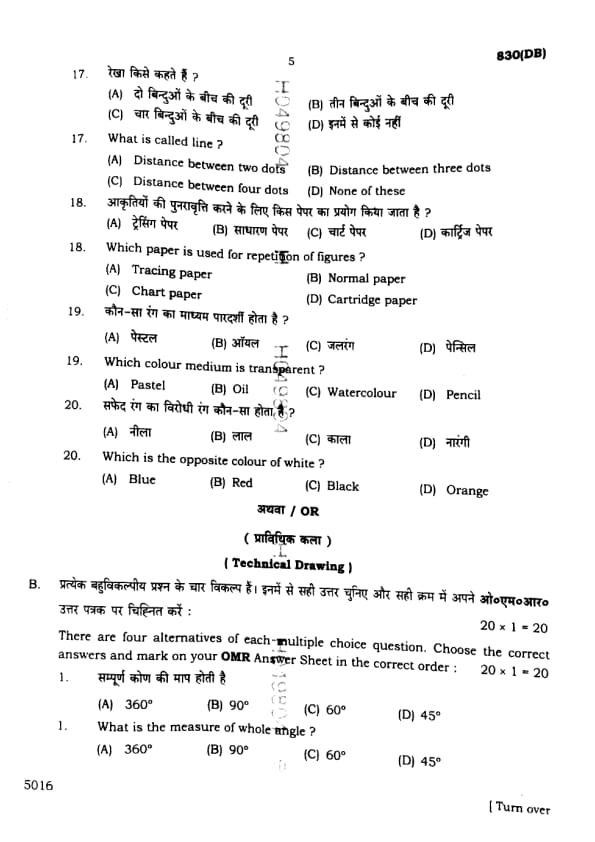
What is called line?
View Solution
Step 1: Understanding the definition of a line
In geometry and art, a line is the simplest form of drawing element. A line is essentially the shortest path that connects two points (or dots).
Step 2: Geometrical explanation
If you mark two dots on paper and connect them, the connection forms a line. More than two dots are not necessary for defining a line.
Step 3: Elimination of incorrect options
- (B) Three dots → With three points, we can form a triangle or angle, not a simple line.
- (C) Four dots → They form more complex figures (like a quadrilateral), not a single line.
- (D) None of these → Wrong, since option (A) correctly defines a line.
Conclusion:
Thus, a line is called the distance between two dots.
\[ \boxed{Distance between two dots} \] Quick Tip: In simple terms: Two dots make a line, three dots make an angle, and four dots can make a quadrilateral.
Which paper is used for repetition of figures?
View Solution
Step 1: Understanding repetition of figures
Repetition of figures means copying or reproducing the same figure multiple times with accuracy. For this purpose, a special type of paper is required.
Step 2: Role of tracing paper
Tracing paper is a thin, transparent paper. Because of its transparency, one can place it over an original figure and trace the design to repeat it easily.
Step 3: Elimination of incorrect options
- (B) Normal paper → Opaque, cannot be used for tracing.
- (C) Chart paper → Thick and opaque, mainly used for posters and projects.
- (D) Cartridge paper → Heavy-duty drawing paper, not suitable for tracing.
Conclusion:
The correct paper used for repetition of figures is Tracing paper.
\[ \boxed{Tracing paper} \] Quick Tip: Use tracing paper when you need to copy designs. Its transparency makes it ideal for reproducing shapes and patterns.
How many types of design are there in terms of texture?
View Solution
Step 1: Understanding texture in design
Texture in design refers to the quality of a surface that can be seen or felt. In art and design, textures add depth, variety, and interest to compositions.
Step 2: The four types of textures in design
There are generally four recognized types of texture-based designs:
1. Actual (Tactile) Texture
2. Visual (Implied) Texture
3. Invented Texture
4. Simulated Texture
Step 3: Eliminating wrong options
- (A) Three → Too few, as standard theory lists four.
- (B) Two → Incorrect, as there are more classifications.
- (C) Four → Correct, matches the established categories.
- (D) Six → Not commonly accepted in art theory.
Step 4: Conclusion
Hence, the number of types of design in terms of texture is:
\[ \boxed{4} \] Quick Tip: Texture can be both real (touchable) and visual (illusion). Always remember the four categories: actual, visual, invented, and simulated.
By mixing white and red colour which colour is obtained?
View Solution
Step 1: Understanding tinting in colours
When white is mixed with a primary or secondary colour, the resulting lighter version is called a "tint." Adding white to red produces a lighter version of red.
Step 2: Result of red + white
Mixing red with white produces the colour pink, which is the tinted version of red.
Step 3: Checking the options
- (A) Pink → Correct, red + white = pink.
- (B) Yellow → Primary colour, unrelated to this mixture.
- (C) Blue → Primary colour, not formed here.
- (D) Orange → Secondary colour (red + yellow), not formed here.
Step 4: Conclusion
Therefore, the correct answer is:
\[ \boxed{Pink} \] Quick Tip: Adding white to any colour produces a tint. For example, red + white = pink, blue + white = light blue.
Which of the following brushes is most thick?
View Solution
Step 1: Understanding brush numbering
In painting, brushes are numbered according to their thickness. The higher the number, the thicker the brush. Smaller numbers indicate thinner brushes used for fine detailing.
Step 2: Analyzing the options
- No. 1 → very thin brush, used for fine details.
- No. 2 → slightly thicker but still fine.
- No. 5 → moderately thick brush, used for broader strokes.
- No. 6 → thicker than all above, suitable for large areas and bold strokes.
Step 3: Conclusion
Thus, among the given options, the most thick brush is No. 6.
\[ \boxed{No. 6} \] Quick Tip: Remember: In brush numbering, higher numbers mean thicker brushes. Use thin brushes for details, thick ones for backgrounds.
By mixing blue in yellow colour which colour is obtained?
View Solution
Step 1: Understanding colour mixing
In subtractive colour mixing (paints/pigments), when two primary colours are mixed, they create a secondary colour.
Step 2: Primary colours involved
- Blue → Primary colour.
- Yellow → Primary colour.
Mixing these two produces a secondary colour.
Step 3: Result of mixing
When blue and yellow are mixed, the resulting secondary colour is Green. This is a standard principle of colour theory.
Step 4: Elimination of wrong options
- (A) Orange → formed by mixing red + yellow.
- (B) Brown → formed by mixing multiple colours, not just blue and yellow.
- (C) Purple → formed by mixing red + blue.
Conclusion:
Thus, the correct resulting colour from mixing blue and yellow is Green.
\[ \boxed{Green} \] Quick Tip: Remember: Primary + Primary = Secondary. Red + Yellow = Orange, Red + Blue = Purple, Blue + Yellow = Green.
What is the effect of blue colour on the eyes?
View Solution
Step 1: Understanding warm and cool colours
Colours are often categorized into two groups based on the psychological effect they create: warm colours (like red, orange, yellow) and cool colours (like blue, green, violet).
Step 2: Effect of blue colour
Blue is universally considered a cool colour. It gives a calming, soothing, and relaxing effect on the eyes. It reduces strain and provides a feeling of peace and coolness.
Step 3: Eliminating incorrect options
- Warm → Incorrect, warm colours are red/orange/yellow, not blue.
- Cool → Correct, blue has a cooling effect.
- Normal → Too vague, does not describe the specific effect.
- No effect → Incorrect, blue clearly influences perception.
Step 4: Conclusion
Therefore, the effect of blue colour on the eyes is:
\[ \boxed{Cool} \] Quick Tip: Blue is a cool colour that calms the eyes and mind, unlike warm colours that excite and energize.
How many colours are there in Ostwald colour circle?
View Solution
Step 1: Understanding Ostwald colour theory
Wilhelm Ostwald, a German scientist, developed a colour system known as the Ostwald colour circle. His model organizes colours scientifically based on complementary pairs and mixtures.
Step 2: Colours in the Ostwald circle
The Ostwald circle contains 8 basic colours: red, orange, yellow, green, blue, violet, and their combinations in a structured arrangement. These are arranged symmetrically to show harmony and contrast.
Step 3: Eliminating incorrect options
- 9 → Incorrect, the circle has exactly 8 divisions.
- 7 → Often confused with the rainbow spectrum, not Ostwald’s circle.
- 6 → Too few, missing proper symmetry.
Step 4: Conclusion
Thus, the Ostwald colour circle contains:
\[ \boxed{8} \] Quick Tip: Remember: Newton’s spectrum has 7 colours, but Ostwald’s colour circle is based on \textbf{8 colours} arranged scientifically.
How many neutral colours are there?
View Solution
Step 1: Understanding neutral colours
Neutral colours are those that do not appear on the colour wheel and are not strongly associated with any hue. They are often used as background or balancing tones in art and design.
Step 2: Examples of neutral colours
The main neutral colours are: Black, White, Grey, and Brown. These colours are called neutral because they are less saturated and combine easily with other colours.
Step 3: Elimination of incorrect options
- (A) 2 → Too few, since there are more than just black and white.
- (C) 6 → Incorrect, as only four main neutral colours are recognized.
- (D) 5 → Incorrect, not a standard classification.
Step 4: Conclusion
Thus, there are 4 neutral colours.
\[ \boxed{4} \] Quick Tip: Neutral colours (black, white, grey, brown) are versatile and often used for shading, contrast, and balancing bright colours in design.
The word 'Kala' belongs to which language?
View Solution
Step 1: Meaning of 'Kala'
The word ‘Kala’ means Art in the Indian cultural context. It is used to denote skills, creativity, and aesthetic expression.
Step 2: Language origin
‘Kala’ is derived from the Sanskrit language, one of the oldest languages of India. Sanskrit has given birth to many terms related to philosophy, art, literature, and culture.
Step 3: Elimination of incorrect options
- (A) Hindi → Though the word is used in Hindi, its origin is Sanskrit.
- (C) Pali → Not the origin of the word ‘Kala’.
- (D) English → Definitely not related.
Step 4: Conclusion
Hence, the word ‘Kala’ belongs to the Sanskrit language.
\[ \boxed{Sanskrit} \] Quick Tip: Many cultural and artistic terms in Indian languages come from Sanskrit. Remember: ‘Kala’ = Art (from Sanskrit).
Which colour is warm?
View Solution
Step 1: Warm vs. cool colours
Colours are grouped into two categories based on their psychological effect:
- Warm colours: Red, Orange, Yellow → They give energy, warmth, and excitement.
- Cool colours: Blue, Green, Violet → They provide calmness and a cooling effect.
Step 2: Checking the given options
- Red → A classic warm colour, symbolizing heat, fire, and passion.
- Blue → A cool colour, not warm.
- Yellow → Although also warm, the most universally accepted answer for "warm" among the options is Red.
- Black → Neutral colour, neither warm nor cool.
Step 3: Conclusion
Thus, the correct answer is:
\[ \boxed{Red} \] Quick Tip: Warm colours (red, orange, yellow) are linked to fire and sunlight, while cool colours (blue, green, violet) are linked to water and sky.
How many primary colours are there?
View Solution
Step 1: Understanding primary colours
Primary colours are the fundamental colours that cannot be made by mixing other colours. They are the building blocks for all other colours.
Step 2: Identifying the set of primary colours
The three universally accepted primary colours are:
1. Red
2. Blue
3. Yellow
Step 3: Eliminating incorrect options
- (A) 5 → Incorrect, there are not 5 primary colours.
- (B) 3 → Correct, red, blue, and yellow are the three primaries.
- (C) 4 → Incorrect, sometimes confused with printing colours (CMYK), but in art it is 3.
- (D) 6 → Incorrect, these would include secondary colours too.
Step 4: Conclusion
Therefore, the correct number of primary colours is:
\[ \boxed{3} \] Quick Tip: Always remember: Red, Blue, and Yellow are the three primary colours. Mixing them gives all other colours.
What are parallel lines?
View Solution
Step 1: Definition of parallel lines
In geometry, two lines are said to be parallel if they are in the same plane and do not meet, no matter how far they are extended.
Step 2: Properties of parallel lines
- They remain the same distance apart at all points.
- They never intersect each other.
- Examples: Opposite sides of a rectangle or railway tracks.
Step 3: Elimination of incorrect options
- (A) Intersecting lines are not parallel.
- (C) Straight lines is too general; not every straight line is parallel.
- (D) Zig-zag lines are not straight, hence not parallel.
Conclusion:
Thus, parallel lines are defined as two straight lines that do not intersect each other.
\[ \boxed{Two straight lines do not intersect each other} \] Quick Tip: Think of railway tracks – they are the best example of parallel lines.
Which is primary colour?
View Solution
Step 1: Definition of primary colours
Primary colours are the basic colours that cannot be formed by mixing other colours. They are the foundation of all other colours in the subtractive colour system (used in painting).
Step 2: The three primary colours
In art (pigment theory), the primary colours are:
- Red
- Blue
- Yellow
Step 3: Elimination of incorrect options
- (A) Black and White are neutral colours, not primaries.
- (B) Orange and Green are secondary colours, made by mixing primaries.
- (C) Green is not a primary; it is obtained from Yellow + Blue.
Step 4: Conclusion
Thus, the correct set of primary colours is Red, Blue, and Yellow.
\[ \boxed{Red, Blue, Yellow} \] Quick Tip: Remember: In painting, the primary colours are RBY (Red, Blue, Yellow). In digital screens, the primary colours are RGB (Red, Green, Blue).
Which pencil draws dark lines?
View Solution
Step 1: Understanding pencil grades
Pencils are graded on a scale from H (hard) to B (black/soft).
- H pencils → Hard leads, produce lighter lines.
- B pencils → Soft leads, produce darker lines.
- HB → Medium grade, balanced between hardness and darkness.
- The higher the number before B, the darker and softer the pencil.
Step 2: Checking the options
- H → Hard pencil, makes very light lines.
- 2B → Softer and darker than HB, good for dark lines.
- HB → Balanced, produces medium lines.
- 2H → Harder than H, makes very light lines.
Step 3: Conclusion
Thus, the pencil that draws dark lines is:
\[ \boxed{2B} \] Quick Tip: Remember: “H” pencils are hard and light, “B” pencils are black and dark. The bigger the number before B, the darker the line.
How many colours are there in rainbow?
View Solution
Step 1: Formation of a rainbow
A rainbow is formed due to the dispersion of sunlight by water droplets in the atmosphere. The light splits into different colours of the visible spectrum.
Step 2: Colours in the rainbow
The rainbow has seven colours, often remembered using the acronym VIBGYOR:
1. Violet
2. Indigo
3. Blue
4. Green
5. Yellow
6. Orange
7. Red
Step 3: Checking the options
- Seven → Correct.
- Four → Too few.
- Five → Incomplete set.
- Nine → More than actual.
Step 4: Conclusion
Therefore, the number of colours in the rainbow is:
\[ \boxed{7} \] Quick Tip: Remember VIBGYOR – Violet, Indigo, Blue, Green, Yellow, Orange, Red – the seven colours of the rainbow.
Edge design is used for
View Solution
Step 1: Meaning of edge design
Edge design refers to decorative patterns placed along the margins or borders of an object, fabric, or surface. These designs are not placed in the centre but along the edges.
Step 2: Practical use in textiles
In textiles, especially traditional Indian attire like saris, edge designs are commonly used on the border to enhance beauty and highlight the outline.
Step 3: Elimination of incorrect options
- (A) Centre of the floor → This uses central designs (Rangoli, Mandala), not edge designs.
- (B) Centre of the roof → Decorative motifs may be used, but not edge designs.
- (D) Centre of the pillow → Embroidery or central patterns are used here, not edge designs.
Conclusion:
Hence, edge design is primarily used for the border of Sari.
\[ \boxed{the border of Sari} \] Quick Tip: Remember: Edge designs are for margins and borders, while centre designs are for the middle portion of fabric or surfaces.
Which shape is not fit for design?
View Solution
Step 1: Understanding shapes in design
Designing often uses geometric shapes like circles, squares, and triangles. These shapes provide balance, harmony, and symmetry in artistic patterns.
Step 2: Why angle is not suitable
An angle is not a complete shape; it is just the meeting of two lines at a point. Unlike a circle, square, or triangle, an angle does not form a closed figure and cannot independently be used for creating a full design.
Step 3: Elimination of other options
- (A) Triangle → A complete shape, widely used in design.
- (C) Circle → Basic and highly important design element.
- (D) Square → Common in patterns and borders.
Step 4: Conclusion
Thus, the shape that is not suitable for design is Angle.
\[ \boxed{Angle} \] Quick Tip: Only closed figures (like circles, squares, triangles) are used in design patterns. An angle is incomplete and hence unsuitable.
What is called line?
View Solution
Step 1: Geometric definition of a line
In geometry, a line is defined as the shortest distance between two points. A point has no dimension, but when two points are connected, they form a line.
Step 2: Analysing the options
- (A) Distance between two dots → Correct, because two points (dots) joined together make a line.
- (B) Distance between three dots → Incorrect, as that would form two line segments, not a single line.
- (C) Distance between four dots → Incorrect, this would involve multiple segments.
- (D) None of these → Incorrect, since option (A) is correct.
Step 3: Conclusion
Thus, a line is best described as the distance between two dots.
\[ \boxed{Distance between two dots} \] Quick Tip: In geometry, two points determine a straight line. Always remember: no line can exist with only one point.
Which paper is used for repetition of figures?
View Solution
Step 1: Purpose of tracing paper
Tracing paper is a semi-transparent paper that allows artists, designers, and students to reproduce figures or drawings by placing it over an image and copying it.
Step 2: Checking the options
- Tracing paper → Correct, because it is specially designed for repeating figures.
- Normal paper → Not transparent, cannot be used for repetition directly.
- Chart paper → Opaque, mainly used for posters and displays.
- Cartridge paper → Thick, used for drawing and painting, not for tracing.
Step 3: Conclusion
Therefore, the paper used for repetition of figures is:
\[ \boxed{Tracing paper} \] Quick Tip: Use tracing paper when you want to copy or repeat a design accurately. It saves time and maintains proportion.
Which colour medium is transparent?
View Solution
Step 1: Understanding transparency in colour mediums
Some art mediums are opaque, while others are transparent. A transparent medium allows light to pass through and shows the paper or layer beneath.
Step 2: Checking each option
- (A) Pastel → Opaque, produces solid coverage.
- (B) Oil → Thick and opaque, not transparent.
- (C) Watercolour → Known for its transparency. Artists use it in washes where the whiteness of the paper shines through the paint.
- (D) Pencil → Produces marks, not transparent colour.
Step 3: Conclusion
Thus, the transparent colour medium is Watercolour.
\[ \boxed{Watercolour} \] Quick Tip: Watercolours are transparent, oils are rich and opaque, pastels give soft textures, and pencils are for drawing outlines.
Which is the opposite colour of white?
View Solution
Step 1: Understanding opposite colours
In colour theory, white and black are not hues but neutral colours. They are considered opposites in terms of brightness and contrast.
Step 2: Properties of white and black
- White → Represents light, brightness, purity.
- Black → Represents darkness, absence of light, depth.
Therefore, black is regarded as the opposite (contrast) of white.
Step 3: Elimination of wrong options
- (A) Blue → Not opposite of white, just a hue.
- (B) Red → Warm primary colour, unrelated to white’s contrast.
- (D) Orange → Secondary warm colour, not opposite to white.
Step 4: Conclusion
The opposite colour of white is Black.
\[ \boxed{Black} \] Quick Tip: Always remember: White and black are complementary opposites in light and design, representing brightness vs. darkness.
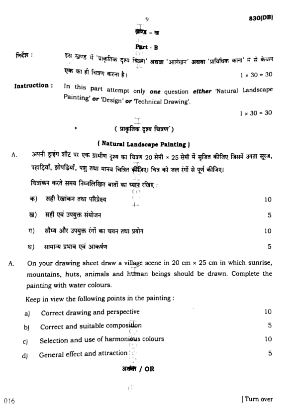
(Natural Landscape Painting)
On your drawing sheet draw a village scene in \(20\,cm \times 25\,cm\) in which sunrise, mountains, huts, animals and human beings should be drawn. Complete the painting with water colours.
Keep in view the following points in the painting:
(a) Correct drawing and perspective
(b) Correct and suitable composition
(c) Selection and use of harmonious colours
(d) General effect and attraction
View Solution

Step 1: Canvas Preparation
Draw a rectangle of size \(20\,cm \times 25\,cm\) lightly with pencil to set the boundary of the painting.
Step 2: Layout Planning
- In the background, sketch the outline of distant mountains with a rising sun behind them.
- In the middle ground, draw small village huts with sloping roofs.
- Add trees near the huts for natural balance.
- In the foreground, sketch simple human figures performing daily activities (like fetching water, walking, or working).
- Include domestic animals such as cows, goats, or hens near the huts.
Step 3: Colour Application
- Use warm tones (orange, yellow, pink) for the sunrise.
- Shade the mountains with light blue or violet to indicate distance.
- Paint the huts in earthy colours like brown and beige.
- Colour the trees with different shades of green and brown.
- Use natural colours for animals and simple, bright colours for human figures’ clothes.
Step 4: Perspective and Depth
- Show depth by making nearer objects larger and more detailed, and distant objects smaller and lighter in tone.
- Use overlapping of huts, trees, and animals to increase the 3D effect.
Step 5: Finishing Touches
- Outline important elements lightly for clarity.
- Blend colours smoothly for a harmonious effect.
- Leave the sky light near the horizon and darker at the top to enhance the sunrise effect.
Quick Tip: When making village scenes, always plan with three layers: background (mountains, sun, sky), middle ground (huts, trees), and foreground (humans, animals). Use warm morning colours for sunrise to create harmony and attraction.
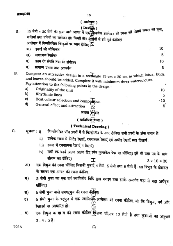
Compose an attractive design in a rectangle \(15\,cm \times 20\,cm\) in which lotus, buds, and leaves should be added. Complete it with a minimum of three watercolours.
Pay attention to the following points in the design:
(a) Originality of the unit
(b) Rhythmic lines
(c) Best colour selection and composition
(d) General effect and attraction
View Solution

Step 1: Design Layout
Start by drawing a rectangle of size \(15\,cm \times 20\,cm\). Lightly sketch the basic design inside the rectangle, focusing on the placement of lotus flowers, buds, and leaves. Ensure that the lotus flowers are spread out and harmoniously arranged, leaving space for the leaves. Add rhythmic, flowing lines to connect the elements and give a sense of movement.
Step 2: Drawing the Lotus and Leaves
- Draw multiple lotus flowers in the centre, making them slightly larger for emphasis.
- Add buds and leaves around the flowers, ensuring the leaves are proportionate and have a flowing rhythm that guides the viewer’s eyes through the design.
- The leaves should have a natural flow, following the curved and spiral patterns to create a balanced composition.
Step 3: Colour Application
- Use at least three watercolours. For example:
- Use soft pinks or whites for the lotus petals, with hints of yellow or orange in the centre.
- Paint the buds in shades of green and yellow.
- Use varying tones of green for the leaves, focusing on darker greens for depth and lighter greens for highlights.
- Add a background wash of light blue or light yellow to create contrast and bring the flowers to the foreground.
Step 4: Composition and Harmony
- Make sure the design flows well and has a balanced composition. The lotus should be the focal point, with buds and leaves complementing it.
- Ensure that the lines and colours work together to create an aesthetically pleasing and unified design.
- Use the principle of rhythmic lines to ensure that the viewer's eye moves naturally from one part of the design to the next.
Step 5: Final Touches
- After the paint dries, lightly outline the lotus flowers and leaves to give definition.
- Make sure that the colours blend well, without any harsh transitions, and that the overall effect is harmonious.
\[ \boxed{Design successfully composed with lotus, buds, and leaves.} \] Quick Tip: When designing floral patterns, always focus on the rhythm of the lines and balance between the elements. Using a variety of tones and shades for the leaves and flowers will create a more dynamic and interesting composition.
Comments