


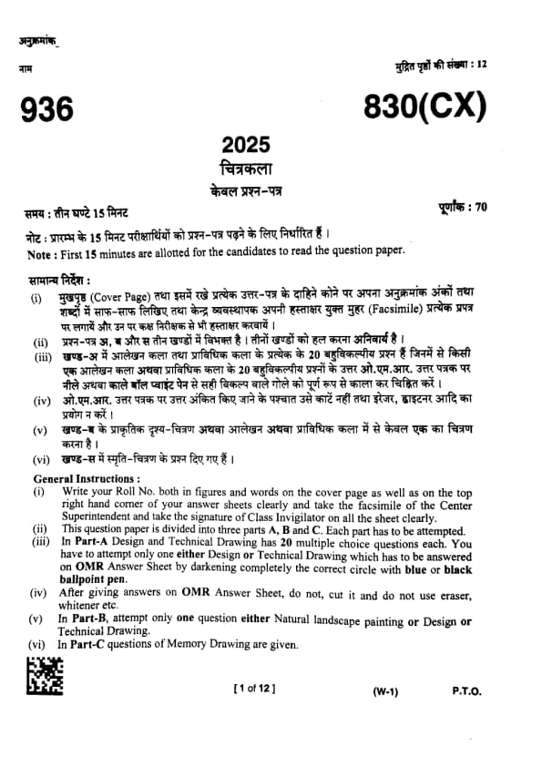
UP Board Class 10 Chitrakala Question Paper 2025 PDF (Code 830 CX) with Answer Key and Solutions PDF is available for download here. UP Board Class 10 exams were conducted between February 24th to March 12th 2025. The total marks for the theory paper were 70. Students reported the paper to be easy to moderate.
UP Board Class 10 Chitrakala Question Paper 2025 (Code 830 CX) with Solutions
| UP Board Class 10 Chitrakala (830 CX) Question Paper with Answer Key | Check Solutions |

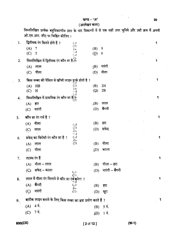
How many secondary colours are there?
View Solution
Step 1: Understanding the Concept:
Primary colours are the fundamental colours from which all other colours are mixed. In the traditional RYB (Red, Yellow, Blue) colour model used in art, there are three primary colours.
Secondary colours are created by mixing two primary colours.
Step 2: Detailed Explanation:
The three primary colours are:
- Red
- Yellow
- Blue
The three secondary colours are created as follows:
- Red + Yellow = Orange
- Yellow + Blue = Green
- Blue + Red = Violet
Therefore, there are exactly 3 secondary colours.
Step 3: Analyzing the Options:
The number 3 is not available in the options. This suggests a potential ambiguity or error in the question. A common interpretation in such cases is that the question is asking for the total number of colours in the primary and secondary palettes combined.
Total colours = (Number of Primary Colours) + (Number of Secondary Colours)
\[ 3 + 3 = 6 \]
This matches option (D).
Step 4: Final Answer:
Based on the most plausible interpretation of the given options, the answer is 6, representing the sum of primary and secondary colours.
Quick Tip: In colour theory questions, always start by recalling the standard Red-Yellow-Blue (RYB) model for pigments unless another model (like RGB for light) is specified. If the direct answer isn't an option, look for alternative interpretations, such as totals or related concepts.
Which is the secondary colour in the following?
View Solution
Step 1: Understanding the Concept:
Primary colours are Red, Yellow, and Blue. They cannot be created by mixing other colours.
Secondary colours are created by mixing two primary colours. The secondary colours are Orange, Green, and Violet.
Step 2: Detailed Explanation:
Let's analyze the options:
- (A) Red is a primary colour.
- (B) Orange is a secondary colour, created by mixing Red and Yellow.
- (C) Yellow is a primary colour.
- (D) Blue is a primary colour.
Step 3: Final Answer:
The only secondary colour listed in the options is Orange.
Quick Tip: Memorize the primary (Red, Yellow, Blue) and secondary (Orange, Green, Violet) colour sets. This is a fundamental concept in art and design and frequently appears in exams.
Which number pencil draws dark line ?
View Solution
Step 1: Understanding the Concept:
Graphite pencils are graded on a scale of hardness. The letter 'H' stands for 'Hard', and the letter 'B' stands for 'Black' or 'Soft'.
- H pencils have a hard lead, which produces lighter, finer lines. The higher the number before 'H' (e.g., 2H, 4H), the harder the lead and the lighter the line.
- B pencils have a soft lead, which deposits more graphite and produces darker, bolder lines. The higher the number before 'B' (e.g., 2B, 4B, 6B), the softer the lead and the darker the line.
- HB is a midpoint between hard and soft.
Step 2: Detailed Explanation:
Let's arrange the given options from lightest to darkest:
1. 2H (Hardest lead, lightest line)
2. H
3. HB (Medium)
4. 2B (Softest lead, darkest line)
The question asks for the pencil that draws a dark line. Among the given choices, 2B is the softest and will produce the darkest line.
Step 3: Final Answer:
The 2B pencil draws the darkest line among the given options.
Quick Tip: A simple way to remember the pencil grading scale is: \textbf{H = Hard = Light line} and \textbf{B = Black = Dark line}. Higher numbers amplify the effect (e.g., 6B is darker than 2B, and 4H is lighter than 2H).
Which is a primary colour in the following?
View Solution
Step 1: Understanding the Concept:
Primary colours are the building blocks of colour in the subtractive (pigment) model. They are colours that cannot be created by mixing other colours. The three primary colours are Red, Yellow, and Blue.
Step 2: Detailed Explanation:
Let's examine each option:
- (A) Green is a secondary colour, made by mixing Yellow and Blue.
- (B) Red is a primary colour.
- (C) Orange is a secondary colour, made by mixing Red and Yellow.
- (D) Violet is a secondary colour, made by mixing Blue and Red.
Step 3: Final Answer:
From the options provided, Red is the only primary colour.
Quick Tip: To easily answer colour theory questions, visualize a simple colour wheel in your mind. The three primary colours (Red, Yellow, Blue) form a triangle on this wheel.
Which is the warm colour?
View Solution
Step 1: Understanding the Concept:
The colour wheel can be divided into warm and cool colours.
- Warm colours are associated with sunlight, fire, and heat. They include reds, oranges, and yellows. They tend to feel energetic and advance in space.
- Cool colours are associated with water, sky, and foliage. They include blues, greens, and violets. They tend to feel calm and recede in space.
- Neutral colours like white, black, and grey do not have a strong temperature.
Step 2: Detailed Explanation:
Analyzing the options based on colour temperature:
- (A) Blue is a primary cool colour.
- (B) Green is a cool colour (though it can lean warm if it has more yellow).
- (C) Red is a primary warm colour.
- (D) White is a neutral colour.
Step 3: Final Answer:
Red is the quintessential warm colour among the choices.
Quick Tip: Think of the sun and fire for warm colours (Red, Orange, Yellow) and think of the sea and forests for cool colours (Blue, Green, Violet). This simple association helps in quickly identifying colour temperatures.
Which is the contrast colour of white ?
View Solution
Step 1: Understanding the Concept:
Contrast refers to the difference between elements. In colour theory, contrast can be achieved through differences in hue, saturation, or value. The highest possible contrast is achieved through the greatest difference in value (lightness vs. darkness).
Step 2: Detailed Explanation:
- White is the lightest possible value.
- Black is the darkest possible value.
When placed next to each other, white and black create the strongest possible value contrast. This is why black text on a white background is the standard for readability. The other options (Red, Blue, Yellow) are colours (hues) that have their own value, but none are as dark as pure black.
Step 3: Final Answer:
The colour that provides the maximum contrast to white is black.
Quick Tip: For questions about contrast, first consider value (light vs. dark). The extremes, black and white, always provide the highest contrast. Complementary colours (opposites on the colour wheel, like red and green) also create high contrast, but in terms of hue.
Natural colours are
View Solution
Step 1: Understanding the Concept:
"Natural colours" typically refer to colours that are commonly found in the natural environment, such as in landscapes, plants, and earth. These are often earth tones, greens, blues, and yellows. The question presents pairs of colours.
Step 2: Detailed Explanation:
We need to identify the pair that most strongly represents colours found together in nature.
- (A) Blue - Red: Can represent sky and sunset, but is a very high-contrast pairing.
- (B) Yellow - Green: This combination is abundant in nature, representing foliage, flowers, fields, and forests (e.g., leaves, grass, lemons). It's a very harmonious and natural pairing.
- (C) White - Black: These are neutral values representing light and shadow, but not typically referred to as "natural colours" in the same way as hues from nature.
- (D) Orange - Violet: These colours appear in sunsets and flowers, but the combination of yellow and green is far more ubiquitous in the natural world.
Step 3: Final Answer:
The pair Yellow - Green is the most representative of colours commonly found in nature.
Quick Tip: When a question uses subjective terms like "natural," think of the most common and widespread examples. For colours, the plant kingdom (greens and yellows) is a primary source of natural imagery.
Which colour will be formed by mixing Red and Yellow?
View Solution
Step 1: Understanding the Concept:
This question tests the fundamental rules of subtractive colour mixing, which applies to pigments like paint. Secondary colours are created by mixing two primary colours.
Step 2: Detailed Explanation:
The primary colours are Red, Yellow, and Blue. The mixing rules are:
- Red + Yellow = Orange
- Yellow + Blue = Green
- Blue + Red = Violet
The question asks for the result of mixing Red and Yellow.
Step 3: Final Answer:
According to the rules of colour mixing, mixing red and yellow produces orange.
Quick Tip: Practicing with a small set of primary colour paints can help solidify your understanding of colour mixing far better than just memorizing rules.
To make fine line which number brush is used?
View Solution
Step 1: Understanding the Concept:
Paintbrushes are sized by a number system. While the exact physical size can vary slightly by brand and brush type, the general rule is that a smaller number corresponds to a smaller brush size.
Step 2: Detailed Explanation:
A smaller brush, especially a round or liner brush, is used for creating fine, detailed lines. Let's compare the given options:
- No. 7 and No. 5 are medium-sized brushes.
- No. 4 is a smaller-medium brush.
- No. 1 is a very small brush.
To create a "fine line," one would need the smallest brush available. Among the choices, No. 1 is the smallest and therefore the most suitable for fine detail work. Brushes can go even smaller (e.g., 0, 00, 000 or 10/0).
Step 3: Final Answer:
The smallest number brush, No. 1, is used for making the finest line among the given options.
Quick Tip: For paintbrush sizes, remember: \textbf{Small Number = Small Brush = Fine Detail}. \textbf{Large Number = Large Brush = Broad Strokes}. This simple rule applies to most standard brush sets.
By mixing Yellow and Blue which colour is obtained ?
View Solution
Step 1: Understanding the Concept:
This question is about creating a secondary colour by mixing two primary colours in the subtractive (pigment) model.
Step 2: Detailed Explanation:
The primary colours are Red, Yellow, and Blue. The rules for mixing them are:
- Red + Yellow = Orange
- Yellow + Blue = Green
- Blue + Red = Violet
The question specifically asks what is obtained by mixing Yellow and Blue.
Step 3: Final Answer:
Mixing yellow and blue pigments yields the colour green.
Quick Tip: Associate the colour mixing rules with real-world examples: Yellow (sun) + Blue (water) = Green (nature/plants). This can be an easy way to remember this specific combination.
Which kind of colour is applied without brush ?
View Solution
Step 1: Understanding the Concept:
Different art mediums have different application methods. We need to identify the medium that is typically applied directly to the surface without a brush.
Step 2: Detailed Explanation:
- (A) Water colour: A water-based paint that is almost exclusively applied with a brush.
- (B) Pastel: Pastels are sticks of pure powdered pigment and a binder. They are applied directly to the surface by drawing with them, much like chalk or charcoal. They are often blended using fingers, paper stumps (tortillons), or other tools, but not typically a brush in the conventional sense (especially not a wet one).
- (C) Oil colour: A thick, oil-based paint that is traditionally applied with brushes (or palette knives).
Step 3: Final Answer:
Pastels are the medium among the options that are applied directly, without the use of a brush.
Quick Tip: Think of pastels as a hybrid of drawing and painting. You hold them and draw like a crayon, but you can blend the colours on the surface like paint. This unique quality is key to remembering their application method.
To decorate roof center which design is suitable?
View Solution
Step 1: Understanding the Concept:
This question relates to the principles of design and the appropriate placement of decorative elements. The name of the design often indicates its intended location.
Step 2: Detailed Explanation:
The question asks what design is suitable for the "roof center".
- (A) A corner design is specifically created for the corners of a space.
- (B) A centre design (or central medallion) is created to be the focal point in the middle of a ceiling or roof.
- (C) A border design is created to run along the edges or perimeter of a surface.
The terminology is direct. To decorate the center, a center design is used.
Step 3: Final Answer:
The most suitable design for decorating the center of a roof is a centre design.
Quick Tip: In design terminology questions, the answer is often literal. Match the location mentioned in the question (e.g., "center," "edge," "corner") with the corresponding design type in the options.
The word 'Kala' is of which language ?
View Solution
Step 1: Understanding the Concept:
The question asks for the linguistic origin of the word 'Kala' (कला), which means art, skill, or craft.
Step 2: Detailed Explanation:
The word 'Kala' is found in several modern Indian languages, including Hindi and Punjabi. However, the root of this word lies in the ancient classical language of India, Sanskrit. Sanskrit is the mother language from which many words in Hindi, Punjabi, and other Indo-Aryan languages are derived. In Sanskrit, 'Kalā' (कला) refers to any of the 64 traditional arts or skills.
Therefore, while the word is used in Hindi and Punjabi, its ultimate origin is Sanskrit. In academic and etymological contexts, the origin is traced back to the oldest source.
Step 3: Final Answer:
The word 'Kala' originates from Sanskrit.
Quick Tip: When questions ask for the origin of words used in modern Indian languages, and Sanskrit is an option, it is very often the correct answer, as it is the classical root language for a vast vocabulary in these languages.
Edge design is used for :
View Solution
Step 1: Understanding the Concept:
The question is about the application of a specific type of design element, the "edge design". An edge design is a decorative pattern that runs along the boundary or perimeter of an object.
Step 2: Detailed Explanation:
Let's analyze the options:
- (A) Center of a pillow: This would require a central motif, not an edge design.
- (B) Floor design: This is too general. A floor can have a central design, a border design, or an all-over pattern.
- (C) Center of the roof: This requires a central design or medallion.
- (D) Border of a sari: A sari is a garment famous for its decorative borders that run along its edges. An "edge design" is another term for a border design. This is a perfect application.
Step 3: Final Answer:
An edge design is used for the border of a sari.
Quick Tip: Synonyms are often key in design questions. "Edge design" is functionally the same as a "border" or "frame" design. Look for the option that describes a perimeter or edge.
Which colour is obtained by mixing Red and Blue ?
View Solution
Step 1: Understanding the Concept:
This question tests the rules of subtractive colour mixing to create a secondary colour from two primary colours.
Step 2: Detailed Explanation:
The three primary colours are Red, Yellow, and Blue. Mixing them produces the three secondary colours:
- Red + Yellow = Orange
- Yellow + Blue = Green
- Red + Blue = Violet (or Purple)
The question asks for the result of mixing Red and Blue.
Step 3: Final Answer:
Mixing red and blue produces the colour violet.
Quick Tip: To avoid confusion, write down the three primary colours (R, Y, B) and draw connecting lines to remember the secondary colours they create: R+Y -> O, Y+B -> G, B+R -> V.
Ostwald is related to
View Solution
Step 1: Understanding the Concept:
The question asks to identify the field with which the person named Ostwald is associated in the context of art.
Step 2: Detailed Explanation:
Wilhelm Ostwald (1853-1932) was a Nobel Prize-winning chemist who had a profound interest in colour. He developed a comprehensive system for organizing colours known as the Ostwald colour system. His work focused on standardizing and scientifically describing colours based on their hue, saturation (purity), and value (black/white content). His colour wheel and colour atlas were influential in art education and industry.
Therefore, Ostwald is directly related to the study and theory of Colour.
Step 3: Final Answer:
Ostwald is related to Colour.
Quick Tip: In art history, a few key names are associated with colour theory: Newton (spectrum), Goethe (psychology of colour), Munsell (colour system), and Ostwald (colour system). Remembering these names and their main contribution can be very helpful.
How many colours are there in the Sun rays?
View Solution
Step 1: Understanding the Concept:
Sunlight, which appears white to our eyes, is actually composed of a spectrum of different colours. This spectrum becomes visible when the light is refracted, for example, by passing through a prism or through raindrops to form a rainbow.
Step 2: Detailed Explanation:
Sir Isaac Newton was the first to demonstrate this phenomenon. He passed white light through a prism and observed it splitting into a continuous band of colours. He famously divided this spectrum into seven distinct colours:
Red, Orange, Yellow, Green, Blue, Indigo, Violet.
This is often remembered by the acronym ROYGBIV. While the spectrum is technically a continuous gradient of colours, Newton's division into seven has become the standard and conventional answer.
Step 3: Final Answer:
There are conventionally considered to be 7 colours in the sun's rays (the visible spectrum).
Quick Tip: Remember the acronym \textbf{ROY G. BIV} (Red, Orange, Yellow, Green, Blue, Indigo, Violet) to list the seven colours of the spectrum in the correct order.
What is the effect of green colour on eyes?
View Solution
Step 1: Understanding the Concept:
This question relates to colour psychology and the classification of colours as warm or cool. These classifications are based on our psychological and cultural associations with these colours.
Step 2: Detailed Explanation:
- Green is strongly associated with nature, such as trees, grass, and plants. These natural settings are often perceived as calming, refreshing, and peaceful.
- In colour theory, green is classified as a cool colour, alongside blue and violet. Cool colours are generally considered to be relaxing and soothing to the eyes.
- Green is located at the center of the visible spectrum, and the human eye is most sensitive to it, requiring very little adjustment to see it, which makes it restful.
- The option "Hot" would apply to colours like red or orange. "Normal" and "No effect" are less descriptive than "Cool".
Step 3: Final Answer:
The effect of the colour green on the eyes is generally considered to be cool and calming.
Quick Tip: Green is often used in interior design for spaces meant for relaxation and concentration (like libraries and hospitals) because it is considered the most restful colour for the human eye.
How many primary colours are there?
View Solution
Step 1: Understanding the Concept:
Primary colours are the base colours from which all other colours can theoretically be mixed. They are the foundation of any colour model. The question refers to the standard model used in art and painting.
Step 2: Detailed Explanation:
In the traditional subtractive colour model (RYB model), which is used for mixing pigments like paint, there are three primary colours:
1. Red
2. Yellow
3. Blue
These three colours cannot be created by mixing other pigments.
Step 3: Final Answer:
There are 3 primary colours.
Quick Tip: Be aware of different colour models. The artists' model has 3 primary colours (Red, Yellow, Blue). The light/screen model (additive) has 3 primaries (Red, Green, Blue - RGB). The printing model (subtractive) has 3-4 primaries (Cyan, Magenta, Yellow, and Black - CMYK). For general art questions, assume the RYB model.
Which number pencil draws light line ?
View Solution
Step 1: Understanding the Concept:
The graphite pencil grading scale determines the hardness of the lead, which in turn affects the lightness or darkness of the line produced. 'H' stands for 'Hard' and 'B' for 'Black' (soft).
- H pencils are hard and draw light, precise lines.
- B pencils are soft and draw dark, smudgy lines.
The number indicates the degree of hardness or softness. A higher number before 'H' means it is even harder and lighter. A higher number before 'B' means it is even softer and darker.
Step 2: Detailed Explanation:
Let's arrange the given pencil grades from darkest to lightest:
1. 2B (Softest, darkest line)
2. HB (Medium)
3. H (Hard, light line)
4. 2H (Harder, lightest line)
The question asks for the pencil that draws a light line. Both H and 2H draw light lines, but 2H is harder than H and will therefore produce the lightest line among all the options.
Step 3: Final Answer:
The 2H pencil draws the lightest line among the given choices.
Quick Tip: For sketching, artists use a range of pencils. H pencils are used for initial, light outlines that can be easily erased, while B pencils are used for shading and adding dark values. Think \textbf{H} for \textbf{Hinting} (light sketch) and \textbf{B} for \textbf{Bold} (dark shading).
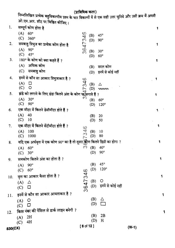
What is the measure of whole angle ?
View Solution
Step 1: Understanding the Concept:
An angle is a measure of rotation of a ray about its initial point. Different types of angles are classified based on their measure.
A whole angle, also known as a complete angle or a full angle, represents a complete revolution or a full circle.
Step 2: Detailed Explanation:
A complete turn or revolution traces a full circle. The measure of this rotation is defined as 360 degrees (360°).
Let's review the other options:
- 60° is an acute angle.
- 45° is an acute angle.
- 90° is a right angle.
Therefore, the measure of a whole angle is 360°.
Step 3: Final Answer:
The correct measure for a whole angle is 360°.
Quick Tip: Remember the key angle types: - Acute: 0° \(<\) x \(<\) 90° - Right: 90° - Obtuse: 90° \(<\) x \(<\) 180° - Straight: 180° - Reflex: 180° \(<\) x \(<\) 360° - Whole/Complete: 360°
Each angle of an equilateral angle is
View Solution
Step 1: Understanding the Concept:
The question uses the term "equilateral angle," which is generally understood to mean an angle in an equilateral triangle.
An equilateral triangle is a triangle in which all three sides are of equal length, and consequently, all three interior angles are equal in measure.
Step 2: Key Formula or Approach:
The sum of the interior angles of any triangle is always 180°.
For an equilateral triangle with three equal angles (let's call the measure of each angle 'x'):
\[ x + x + x = 180° \]
Step 3: Detailed Explanation:
Solving the equation from Step 2:
\[ 3x = 180° \] \[ x = \frac{180°}{3} \] \[ x = 60° \]
So, each angle of an equilateral triangle measures 60°.
Step 4: Final Answer:
The measure of each angle in an equilateral triangle is 60°.
Quick Tip: For any regular polygon (where all sides and angles are equal), the measure of each interior angle can be found with the formula: \(\frac{(n-2) \times 180°}{n}\), where 'n' is the number of sides. For a triangle, n=3.
What do you call 180° angle ?
View Solution
Step 1: Understanding the Concept:
An angle measuring exactly 180° is formed when two rays point in opposite directions from the same vertex, forming a straight line. The standard geometric term for this angle is a straight angle.
Step 2: Detailed Explanation:
Let's analyze the given options:
- (A) Obtuse angle: An angle greater than 90° but less than 180°.
- (B) Simple angle: This is not a standard, precisely defined term in geometry for a 180° angle. It is sometimes used informally to refer to any angle that is not a reflex angle (i.e., less than 180°), which would exclude 180°.
- (C) Equilateral angle: This term relates to the 60° angles found in an equilateral triangle.
- (D) None of these: Since the correct term, "straight angle," is not listed, and the other options are incorrect or non-standard, this is the most accurate choice.
Step 3: Final Answer:
The correct name for a 180° angle is a straight angle, which is not an option. Therefore, the correct answer is "None of these".
Quick Tip: Always use precise terminology in geometry. While some terms might seem similar, their definitions are very specific. Knowing the correct term (Straight Angle for 180°) is crucial for eliminating incorrect options.
Which shape is triangle ?
- (A)
![]()
- (B)
![]()
- (C) O
- (D) www
View Solution
Step 1: Understanding the Concept:
This question requires the visual identification of basic geometric shapes. A triangle is a polygon with three edges and three vertices.
Step 2: Detailed Explanation:
Let's identify each shape in the options:
- (A) ☐: This is a square, a polygon with four equal sides and four right angles.
- (B) △: This is a triangle, a polygon with three sides.
- (C) O: This is a circle, a shape consisting of all points in a plane that are at a given distance from a given point, the centre.
- (D) www: This is a wavy line or sine wave, not a polygon.
Step 3: Final Answer:
The shape shown in option (B) is a triangle.
Quick Tip: Familiarize yourself with the visual representation of common geometric shapes, including different types of triangles (equilateral, isosceles, scalene, right-angled), quadrilaterals (square, rectangle, rhombus), and other polygons.
For raising the flag, pole should be at which angle ?
View Solution
Step 1: Understanding the Concept:
This is a practical application of geometric angles. When a flagpole is raised on level ground, it is meant to stand straight up, perpendicular to the ground.
Step 2: Detailed Explanation:
The term "perpendicular" means that two lines or planes intersect at a right angle. A right angle is, by definition, an angle of 90°.
- An angle of 30° or 60° would mean the pole is leaning significantly.
- An angle of 120° would be an obtuse angle, also indicating a lean.
For the flag to be raised correctly, the pole must form a 90° angle with the horizontal ground.
Step 3: Final Answer:
The flagpole should be at a 90° angle to the ground.
Quick Tip: Look for real-world scenarios that relate to geometric concepts. "Upright," "straight up," "vertical," and "perpendicular to the ground" all imply a 90° angle.
How many decimeters are there in a meter ?
View Solution
Step 1: Understanding the Concept:
This question tests knowledge of the metric system prefixes. The base unit is the meter. The prefix "deci-" denotes a factor of one-tenth (1/10).
Step 2: Key Formula or Approach:
The relationship between meters (m) and decimeters (dm) is:
\[ 1 meter = 10 decimeters \]
Alternatively,
\[ 1 decimeter = \frac{1}{10} meters = 0.1 meters \]
Step 3: Final Answer:
Based on the definition of the prefix "deci-", there are 10 decimeters in one meter.
Quick Tip: Memorize the common metric prefixes: - Kilo- (k) = 1000 - Hecto- (h) = 100 - Deca- (da) = 10 - (base unit) = 1 - Deci- (d) = 0.1 (1/10) - Centi- (c) = 0.01 (1/100) - Milli- (m) = 0.001 (1/1000)
How many centimeters are there in a meter ?
View Solution
Step 1: Understanding the Concept:
This is a unit conversion question within the metric system. The prefix "centi-" means one-hundredth (1/100).
Step 2: Key Formula or Approach:
The relationship between meters (m) and centimeters (cm) is:
\[ 1 meter = 100 centimeters \]
This is because each centimeter is 1/100th of a meter.
Step 3: Final Answer:
There are 100 centimeters in a meter.
Quick Tip: A useful mnemonic is to think of a "century" which has 100 years, and "percent" which means per 100. The prefix "centi-" relates to the number 100.
If in a semicircle one angle is 90° then what is the degree of other angle?
View Solution
Step 1: Understanding the Concept:
The question is likely referring to a polygon inscribed within a semicircle. The key theorem related to this is Thales's Theorem, which states that if A, B, and C are distinct points on a circle where the line AC is a diameter, then the angle ∠ABC is a right angle (90°). The question states one angle is 90°, which fits this theorem.
Step 2: Detailed Explanation:
The phrasing "what is the degree of other angle" is ambiguous.
- Interpretation 1: A Triangle. If the shape is a triangle inscribed in the semicircle with the diameter as one side, then one angle is 90°. The other two angles must add up to 90°. The question does not provide enough information to determine them individually.
- Interpretation 2: A Quadrilateral. Consider a quadrilateral inscribed in a semicircle. It could be a rectangle where the diameter of the circle is also the diagonal of the rectangle. In a rectangle, all four interior angles are 90°. If one angle is 90°, it is possible that the "other angle" referred to is another angle of the rectangle. This interpretation leads to a unique answer from the given options.
Given the multiple-choice format, which expects a single correct answer, the most probable intended question relates to an inscribed rectangle, where all angles are equal.
Step 3: Final Answer:
Assuming the question implies a shape like an inscribed rectangle where all angles are equal, if one angle is 90°, then another angle would also be 90°.
Quick Tip: When a geometry question seems ambiguous or lacks information, re-read it carefully. Consider common theorems (like Thales's Theorem). If it's a multiple-choice question, check if one of the options results from a logical, albeit specific, interpretation (like assuming a regular or common shape, e.g., a rectangle).
What is the degree of right angle ?
View Solution
Step 1: Understanding the Concept:
This question asks for the definition of a fundamental geometric term. A right angle is a cornerstone of Euclidean geometry, representing a quarter of a full turn.
Step 2: Detailed Explanation:
By definition, a right angle is an angle that measures exactly 90 degrees. It is the angle formed by two perpendicular lines.
- 45° is half of a right angle (an acute angle).
- 60° is the angle of an equilateral triangle (an acute angle).
- 120° is an obtuse angle.
Step 3: Final Answer:
The degree measure of a right angle is 90°.
Quick Tip: The symbol for a right angle in diagrams is a small square in the corner of the angle, rather than an arc. Seeing this symbol immediately tells you the angle is 90°.
What is the shape of a circle ?

View Solution
Step 1: Understanding the Concept:
This question requires the visual identification of a circle from a set of basic geometric shapes.
Step 2: Detailed Explanation:
Let's analyze the shapes provided in the options:
- (A) : This is the symbol for a triangle.
- (B) O: This is the symbol for a circle. It represents a set of points equidistant from a center point.
- (C) : This is the symbol for a square or a rectangle.
- (D) None of these: This would be correct if none of the symbols represented a circle.
Step 3: Final Answer:
The shape shown in option (B) is a circle.
Quick Tip: Ensure you can instantly recognize and name the most common shapes: circle, square, rectangle, triangle, oval (ellipse), pentagon, hexagon, etc. These are fundamental building blocks for more complex geometry problems.
Which shape is rectangular ?

View Solution
Step 1: Understanding the Concept:
The question asks to identify a rectangular shape. A rectangle is a quadrilateral (a four-sided polygon) with four right angles (90°). A square is a special type of rectangle where all four sides are of equal length.
Step 2: Detailed Explanation:
Let's analyze the shapes provided:
- (A) O: This is a circle.
- (B) : This is a triangle.
- (C) : This is a square.
- (D) (often depicted as ): This represents a general rectangle. It also has four right angles.
Step 3: Final Answer:
Options (D) is rectangular. In multiple-choice tests of this nature, either answer would be considered correct as a square is a specific form of a rectangle.
Quick Tip: Remember the hierarchy of quadrilaterals: A square is a special kind of rectangle, and a rectangle is a special kind of parallelogram. If asked to identify a rectangle, both squares and non-square rectangles are correct.
Which number pencil is required for dark line ?
View Solution
Step 1: Understanding the Concept:
Graphite pencils are graded based on the hardness of their lead. The scale uses the letters 'H' (for Hardness) and 'B' (for Blackness or Softness).
- H pencils have hard lead, which produces lighter and finer lines. The higher the number before 'H' (e.g., 4H is harder than 2H), the lighter the line.
- B pencils have soft lead, which deposits more graphite and creates darker, thicker lines. The higher the number before 'B' (e.g., 6B is darker than 2B), the darker the line.
Step 2: Detailed Explanation:
The question asks for a pencil that produces a dark line. Among the options, only the 'B' pencil is designed for darkness.
- 2H, 4H, and H are all hard pencils that create light lines.
- 2B is a soft pencil that creates a dark line.
Arranging them from lightest to darkest: 4H \(\rightarrow\) 2H \(\rightarrow\) H \(\rightarrow\) 2B.
Step 3: Final Answer:
The 2B pencil is required for a dark line.
Quick Tip: A simple mnemonic: \textbf{B is for Bold and Black}. \textbf{H is for Hard and Hinting} (light lines).
What is the degree of a square angle ?
View Solution
Step 1: Understanding the Concept:
A square is a regular quadrilateral. One of its defining properties is that all four of its interior angles are equal. These angles are called right angles.
Step 2: Key Formula or Approach:
The sum of the interior angles of any quadrilateral is 360°. Since a square has 4 equal angles, the measure of each angle is:
\[ Angle of a square = \frac{360°}{4} \]
Step 3: Detailed Explanation:
Performing the calculation:
\[ \frac{360°}{4} = 90° \]
Each angle in a square is a right angle, which measures 90°.
Step 4: Final Answer:
The degree of an angle in a square is 90°.
Quick Tip: The terms "square angle" and "right angle" are often used interchangeably in informal contexts and both refer to a 90° angle. Look for the small square symbol in the corner of an angle in diagrams to identify a right angle.
If in a circle one angle is 120° then what is the degree of other angle ?
View Solution
Step 1: Understanding the Concept:
This question is ambiguously worded but most likely refers to the relationship between a central angle and its corresponding reflex angle within a circle. A complete circle measures 360°.
Step 2: Detailed Explanation:
If we consider an angle of 120° formed at the center of the circle, it occupies a part of the total 360° rotation. The "other angle" in this context would be the remaining portion of the circle. This is known as the reflex angle.
The sum of an angle and its reflex angle at a point is 360°.
\[ Reflex Angle = 360° - Given Angle \] \[ Reflex Angle = 360° - 120° = 240° \]
This interpretation leads to option (D), which is a plausible answer. Other interpretations (like angles in a cyclic quadrilateral) do not yield any of the given options.
Step 3: Final Answer:
The degree of the other angle (the reflex angle) is 240°.
Quick Tip: When you see a question about "the other angle" in a circle, first consider the reflex angle. The sum of an angle and its reflex angle is always 360°.
If in a 60° angle one angle is 30° then other angle will be
View Solution
Step 1: Understanding the Concept:
The question implies that a larger angle of 60° is divided into two smaller, adjacent angles. One of these smaller angles is given as 30°. We need to find the measure of the other small angle.
Step 2: Key Formula or Approach:
If an angle is composed of two adjacent angles, the measure of the larger angle is the sum of the measures of the two smaller angles.
\[ Total Angle = Angle 1 + Angle 2 \]
Step 3: Detailed Explanation:
We are given:
- Total Angle = 60°
- Angle 1 = 30°
We need to find Angle 2.
\[ 60° = 30° + Angle 2 \] \[ Angle 2 = 60° - 30° \] \[ Angle 2 = 30° \]
Step 4: Final Answer:
The other angle will be 30°.
Quick Tip: This question is about the Angle Addition Postulate. When a question mentions an angle "in" another angle, it usually implies subtraction to find the remaining part.
What is line ?
View Solution
Step 1: Understanding the Concept:
This question asks for the definition or a key characteristic of a line in geometry. A line is a fundamental one-dimensional geometric object.
Step 2: Detailed Explanation:
Let's evaluate the options:
- (A) Distance between three dots: This is not a standard geometric concept.
- (C) Distance between two dots: This defines the length of a line segment, which is a number, not the line itself. A line is a geometric object.
- (B) Straight line: In geometry, the word "line" inherently implies a "straight line". It is a path that extends infinitely in two opposite directions without any curve. This option describes the fundamental nature of a line.
While not a formal definition, "straight line" is the best description among the choices provided, distinguishing it from a curved line.
Step 3: Final Answer:
The best description for a line among the given options is a "Straight line".
Quick Tip: In geometry, unless otherwise specified, the term "line" always refers to a straight line that extends infinitely in both directions. A "line segment" is a finite portion of a line between two endpoints.
What is the measurement of a square ?
View Solution
Step 1: Understanding the Concept:
The question, though poorly phrased as "measurement," asks for a defining property of a square. We need to identify the statement that best describes a square.
Step 2: Detailed Explanation:
Let's analyze the properties listed:
- (A) Big-Small: This is a subjective comparison, not a geometric property.
- (C) Opposite side lines are equal: This is true for all rectangles and parallelograms. While true for a square, it is not its most specific defining feature. A rectangle that is not a square also has this property.
- (B) Four walls are equal: Interpreting "walls" as "sides," this statement says "Four sides are equal." This is a key property of a square (and a rhombus). Combined with its property of having four right angles, it uniquely defines a square. Among the given choices, this is the most specific and important property listed.
Step 3: Final Answer:
The most accurate property of a square listed is that its four sides are equal.
Quick Tip: To define a square fully, you need two conditions: 1) all four sides are equal, and 2) all four angles are equal (90°). When choosing from options, pick the most specific and unique property available.
How many centimetres there are in a decimetre ?
View Solution
Step 1: Understanding the Concept:
This question requires converting between two units of length in the metric system: decimeters (dm) and centimeters (cm).
Step 2: Key Formula or Approach:
The relationships to the base unit (meter) are:
- 1 meter = 10 decimeters
- 1 meter = 100 centimeters
Step 3: Detailed Explanation:
Since 10 decimeters and 100 centimeters are both equal to 1 meter, we can set them equal to each other:
\[ 10 dm = 100 cm \]
To find how many centimeters are in one decimeter, we divide both sides of the equation by 10:
\[ \frac{10 dm}{10} = \frac{100 cm}{10} \] \[ 1 dm = 10 cm \]
Step 4: Final Answer:
There are 10 centimetres in a decimetre.
Quick Tip: Think of the metric prefixes like a staircase. To go from a larger unit to a smaller unit (like deci- to centi-), you multiply by 10 for each step down. From 'deci' to 'centi' is one step, so you multiply by 10.
Which number pencil is required to draw light line ?
View Solution
Step 1: Understanding the Concept:
The question is about the pencil grading scale. Pencils marked with 'H' (Hard) are used for drawing light lines, while pencils marked with 'B' (Black/Soft) are for dark lines. A higher number before the letter exaggerates the property.
Step 2: Detailed Explanation:
We need to find the pencil that draws the lightest line.
- 2B: This is a soft pencil for dark lines.
- HB: This is a medium-grade pencil, in the middle of the scale.
- 1H (or H): This is a hard pencil for light lines.
- 2H: This is harder than H, and therefore produces an even lighter line.
Comparing the options, 2H is the hardest pencil and will thus draw the lightest line.
Step 3: Final Answer:
The 2H pencil is required to draw the lightest line among the choices.
Quick Tip: On the pencil hardness scale, the lines get lighter as you go from B grades to H grades, and then up the H numbers: ... 2B \(\rightarrow\) HB \(\rightarrow\) H \(\rightarrow\) 2H \(\rightarrow\) 4H ... (Darkest \(\rightarrow\) Lightest).
What is an equilateral triangle ?
View Solution
Step 1: Understanding the Concept:
The question asks for the definition or a key property of an equilateral triangle. The name "equi-lateral" itself means "equal-sided". A key consequence of this is that all three interior angles are also equal.
Step 2: Detailed Explanation:
Let's analyze the options:
- (A) Whose three interior angles are equal. This is a correct property of an equilateral triangle. If the angles are equal, the sides must also be equal. Each angle is 60°.
- (B) Whose three walls are big and small. This option is nonsensical in a geometric context.
- (C) Whose two sides are equal. This is the definition of an isosceles triangle. While an equilateral triangle is technically also isosceles, this is not its specific definition.
Between (A) and the primary definition (three equal sides), both are correct and equivalent properties. Since "three equal sides" is not an option, option (A) is the best and correct choice.
Step 3: Final Answer:
An equilateral triangle is one whose three interior angles are equal.
Quick Tip: An equilateral triangle is also called an equiangular triangle. Remember that these two properties—three equal sides and three equal angles—always go together in a triangle.
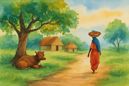
In your drawing sheet prepare a landscape painting in a rectangle of 22 x 18 cm showing a village scene with some huts, a cow sitting under a tree and a lady coming back towards her home with a basket on her head. Use water colour or pastel colour in painting.
Pay attention to the following points in the painting :
(a) Correct construction and perspective
(b) Composition
(c) Selection and use of harmonious colours
(d) General effect and attraction
View Solution
Step 1: Correct Construction and Perspective (Planning and Sketching)
This step is about creating a believable and well-structured drawing.
1. Frame Setup: Use a ruler to accurately draw a 22 cm x 18 cm rectangle on your drawing sheet. This is your canvas.
2. Horizon Line: Lightly draw a horizon line. Placing it lower will emphasize the sky, while placing it higher will emphasize the ground. This line is key for perspective.
3. Perspective: Apply basic linear and atmospheric perspective.
- Linear Perspective: Objects that are further away should appear smaller. For example, huts in the background should be drawn smaller than any huts in the foreground.
- Atmospheric Perspective: Objects in the distance appear lighter in colour and have less detail.
4. Initial Sketch: Lightly sketch the main elements described: the huts, the tree with the cow under it, and the lady. Pay attention to their relative sizes (proportion). For instance, the lady, if she is in the foreground, should be drawn larger than the cow if the cow is in the middle ground.
Step 2: Composition (Arrangement of Elements)
Composition is how you arrange the elements to create a balanced and engaging scene.
1. Rule of Thirds: Avoid placing the most important elements (like the tree or the lady) directly in the center of the rectangle. Imagine your rectangle is divided into a 3x3 grid. Place these key elements along the lines or at their intersections for a more dynamic composition.
2. Focal Point: Decide what the main subject of your painting is. It could be the lady returning home. Use composition and colour to draw the viewer's attention to this point.
3. Balance: Distribute the visual weight of the objects evenly. For example, the large mass of the tree on one side could be balanced by the huts on the other side.
4. Depth: Create a sense of three-dimensional space by having a clear foreground, middle ground, and background. Overlapping objects (e.g., the tree partially in front of a hut) is a simple way to create depth.
Step 3: Selection and Use of Harmonious Colours
This step is about bringing your drawing to life with colour.
1. Colour Palette: Choose colours that are appropriate for a village scene. This would likely include earth tones like browns, ochres, and siennas for the ground and huts; various shades of green for the tree and grass; and blues and whites for the sky.
2. Colour Harmony: Use a colour scheme that is pleasing to the eye. An analogous scheme (using colours that are next to each other on the colour wheel, like yellow-green, green, and blue-green) creates a calm, natural feel. You can add a small amount of a complementary colour (like a red scarf on the lady) to create a pop of interest.
3. Medium Technique:
- Watercolour: Start by applying light washes for large areas like the sky and ground. Then, build up layers of colour, going from light to dark. Allow each layer to dry before adding the next to avoid creating muddy colours.
- Pastel Colour: Block in the main areas of colour first. Then, blend the colours on the paper using your fingers, a cloth, or a blending stump. Use the sharp edges of the pastel sticks to add fine details at the end.
Step 4: General Effect and Attraction (Finishing Touches)
This final step is about refining your painting to make it look polished and attractive.
1. Light and Shadow: Determine the direction of your light source (e.g., the sun) and add shadows and highlights to your objects. This will make them look three-dimensional and realistic. For example, the tree will cast a shadow on the ground and on the cow.
2. Details and Textures: Add fine details to make the scene more interesting. This could include texture on the tree bark, blades of grass in the foreground, patterns on the lady's clothes, or the texture of the thatched roofs on the huts.
3. Overall Cohesion: Step back and look at your painting as a whole. Do all the parts work together? Is the mood of the village scene conveyed effectively? Make any final adjustments to colours or details to unify the artwork.
Quick Tip: Before you begin drawing on your final sheet, create two or three small "thumbnail sketches" on a rough piece of paper. This allows you to quickly experiment with different compositions and decide on the best placement for the huts, tree, and figures before committing to the final, larger drawing.
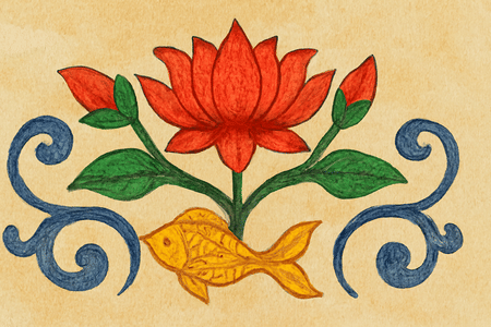
Draw an original ornamental design in a rectangle of 16 x 12 cm on your drawing sheet. Make an ornamental design in it for the centre of the floor, which is based on Lotus flower, its bud, leaves and a fish. Design should be painted in any three water colours. Tracing is not allowed.
Pay attention to the following points in the design :
(a) Originality of unit
(b) Rhythmic lines
(c) Selection of colours
(d) General effect and attraction
View Solution
Step 1: Originality of Unit (Conceptualization and Sketching)
This criterion assesses your creativity in combining the given elements.
1. Frame and Guides: Accurately draw the 16 cm x 12 cm rectangle. To help with a balanced composition for a "centre of the floor" design, lightly draw diagonal lines from corner to corner and lines connecting the midpoints of opposite sides. This creates a central point and divides the space into symmetrical quadrants.
2. Motif Development: Before drawing the final design, practice sketching stylized versions of the required motifs: a lotus flower, a lotus bud, leaves, and a fish. Ornamental design relies on simplified, elegant forms rather than realistic depictions.
3. Creating the Unit: Combine these stylized motifs into a unique arrangement. "Originality" means avoiding common, clichéd designs.
- Example Idea: Place the main lotus flower at the central point. Arrange buds and leaves radiating outwards in a symmetrical pattern into the four quadrants. The fish can be designed to swim gracefully around the central lotus, with their curved bodies contributing to the flow of the design.
Step 2: Rhythmic Lines (Drawing and Flow)
This focuses on the quality and movement of your lines.
1. Flow and Connection: Rhythmic lines are smooth, flowing, and continuous lines that guide the viewer's eye through the artwork. Use graceful curves (like S-curves) to draw the stems of the lotus, connecting the flower, buds, and leaves. The lines should create a sense of harmony and movement.
2. Line Quality: Draw with confident, clean strokes. Avoid hesitant, scratchy lines. The final lines should be clear and well-defined, whether they are fine or bold. The entire design should feel interconnected, as if all the elements are part of a single, flowing dance.
Step 3: Selection of Colours (Painting)
This criterion evaluates your choice and application of the limited colour palette.
1. Choosing Three Colours: You must use only three watercolours. Select a harmonious palette.
- Good Choice: Pink (for the lotus flower/bud), Green (for the leaves/stems), and a contrasting Blue or Yellow (for the fish and water elements). This creates a balanced and traditional feel.
- Alternative Choice: A more modern, analogous scheme could be Red, Magenta, and Violet, using them strategically across all elements.
2. Application Technique:
- Mix your three colours before you start.
- Apply the watercolours as flat, even washes within your pencil outlines. This is a common technique for ornamental design.
- Ensure your colours are clean and not muddy. Wash your brush thoroughly when switching between colours.
- Keep the application neat and within the lines to maintain the clarity of the design.
Step 4: General Effect and Attraction (Finishing and Impact)
This is the overall assessment of your finished work.
1. Balance and Symmetry: The design should look balanced. Since it's for the "centre of the floor," a symmetrical or radially balanced design is usually most effective. Check that no single part of the design feels too heavy or empty.
2. Unity and Cohesion: All the elements—the motifs, the lines, and the colours—should work together to create a single, unified piece of art.
3. Neatness and Presentation: The final work should be clean, with no smudges, unwanted paint spots, or visible erased guide lines. A neat presentation significantly enhances the overall attraction of the design.
Quick Tip: Before starting the final piece, test your three chosen watercolour combinations on a scrap piece of paper. This helps you see how they interact and ensures you are happy with your colour palette. Also, using a compass to draw light circles as guides can help create a perfectly symmetrical and rhythmic floral pattern.
Draw a memory drawing of any one of the following by pencil. The drawing should not be less than 15 cm.
(i) Two Banana
(ii) Papaya
(iii) Mango with leaf
Keep in view the following points in the drawing :
(i) Beauty of lines
(ii) Resemblance of the figure
View Solution

Step 1: General Approach for Memory Drawing
1. Visualize: Before drawing, close your eyes and form a clear mental image of the chosen object. Recall its shape, texture, and how light falls on it.
2. Size and Placement: Lightly mark out a space on your paper that is at least 15 cm to ensure your drawing meets the size requirement. Plan the composition to fit well within this space.
3. Basic Shapes: Start by lightly sketching the basic geometric shapes that make up the object. This helps in getting the proportions correct before adding details.
Step 2: Fulfilling the Evaluation Criteria
- Resemblance of the figure: This is about accuracy. Pay close attention to the unique shape, proportions, and features of the fruit. The drawing should be immediately recognizable.
- Beauty of lines: This refers to the quality of your drawing technique. Use confident, clean lines instead of scratchy, hesitant ones. Use shading (like hatching, cross-hatching, or smooth blending) to create a sense of three-dimensional form, showing light and shadow. The contrast between light and dark areas will make the drawing more dynamic and realistic.
Step 3: Specific Guidance for Each Option
(i) For "Two Banana":
- Resemblance: Bananas have a distinct long, curved shape with angular ends. Notice the slightly flattened planes on their sides. Draw them overlapping or lying next to each other to create depth.
- Lines and Shading: Use long, flowing lines to capture their curves. Shade each banana to show its roundness, paying attention to highlights where the light hits directly. Add a cast shadow where one banana rests on the other or on the ground.
(ii) For "Papaya":
- Resemblance: A papaya has a large, oblong shape, often wider at one end. Its skin is smooth. Capture this unique silhouette and the small stem area.
- Lines and Shading: Use contour lines (lines that follow the curve of the object) to define its form. Use smooth, gradual shading to show its large, curved volume. Add a highlight to make it look round and a cast shadow underneath to ground it.
(iii) For "Mango with leaf":
- Resemblance: Recall the classic "S"-curve or kidney shape of a mango. The leaf is typically long and slender with a prominent central vein. Draw the leaf attached to a small stem at the top of the mango.
- Lines and Shading: Use a confident, sweeping line for the mango's outline. Shade it to appear plump and round. Draw the leaf with more delicate lines, indicating its veins and perhaps a slight curl. The contrast between the heavy fruit and the light leaf can be very effective.
Quick Tip: To improve memory drawing, practice observational drawing first. Spend 5-10 minutes studying an object, then hide it and try to draw it. This trains your brain to notice and remember key details, proportions, and forms.
Draw a memory drawing of any one of the following by pencil. The drawing should not be less than 15 cm.
(i) Table Lamp
(ii) Open Umbrella
(iii) Box and book put on it
Keep in view the following points in the drawing :
(i) Beauty of Lines
(ii) Resemblance of figure
View Solution

Step 1: General Approach for Man-Made Objects
1. Structure and Perspective: Man-made objects are defined by their structure. Start by thinking about perspective. Are you looking at the object straight on, from above, or from the side? This will affect the shapes you draw.
2. Construction Lines: Use light construction lines and basic geometric shapes (cubes, cylinders, cones, spheres) to build the object's form. This is crucial for getting the proportions and perspective right.
3. Size Requirement: Ensure the longest dimension of your drawing is at least 15 cm.
Step 2: Fulfilling the Evaluation Criteria
- Resemblance of figure: For man-made objects, this means getting the perspective, symmetry, and proportions correct. The object should look solid and correctly constructed.
- Beauty of Lines: Use crisp, clear lines for hard edges. Use controlled shading to show different surfaces (e.g., shiny metal vs. soft fabric) and to create a sense of form and volume. The use of light and shadow is key to making the object look realistic.
Step 3: Specific Guidance for Each Option
(i) For "Table Lamp":
- Resemblance: A table lamp is usually symmetrical. Draw a vertical centerline to help you. Construct it from a circular base, a cylindrical or shaped stand, and a conical or cylindrical lampshade. Use ellipses for the top and bottom of the shade and base to show perspective.
- Lines and Shading: Use neat lines for the structure. Shade the lampshade to show it is a curved, three-dimensional form. Indicate a light source and add a cast shadow from the lamp onto the table surface.
(ii) For "Open Umbrella":
- Resemblance: This is a complex form. Start with the central pole and the handle. Then, sketch the domed shape of the canopy. Crucially, draw the ribs that stretch the fabric, radiating from the top center to the outer edge. The edge of the canopy will have a scalloped shape where the ribs end.
- Lines and Shading: Use straight lines for the pole and ribs, and curved lines for the canopy. Shade the individual triangular panels of fabric between the ribs to give the umbrella volume and show its form.
(iii) For "Box and book put on it":
- Resemblance: This is a pure exercise in perspective drawing. Draw the box first as a cube or cuboid using one-point or two-point perspective. Then, draw the book lying on top, making sure its lines also follow the same perspective rules (converging to the same vanishing points). Show the thickness of the book cover and its pages.
- Lines and Shading: Use a ruler for perfectly straight lines if allowed, or draw them carefully by hand. Shade the different faces of the box and book according to an imagined light source (e.g., the top surface is lightest, the side is darker). Add a cast shadow from the book onto the box.
Quick Tip: For drawing man-made objects, especially those with flat surfaces like boxes, lightly sketch a "crate" or box in the correct perspective first. Then, draw the object within this crate. This technique helps ensure the proportions and angles are correct.
Comments